
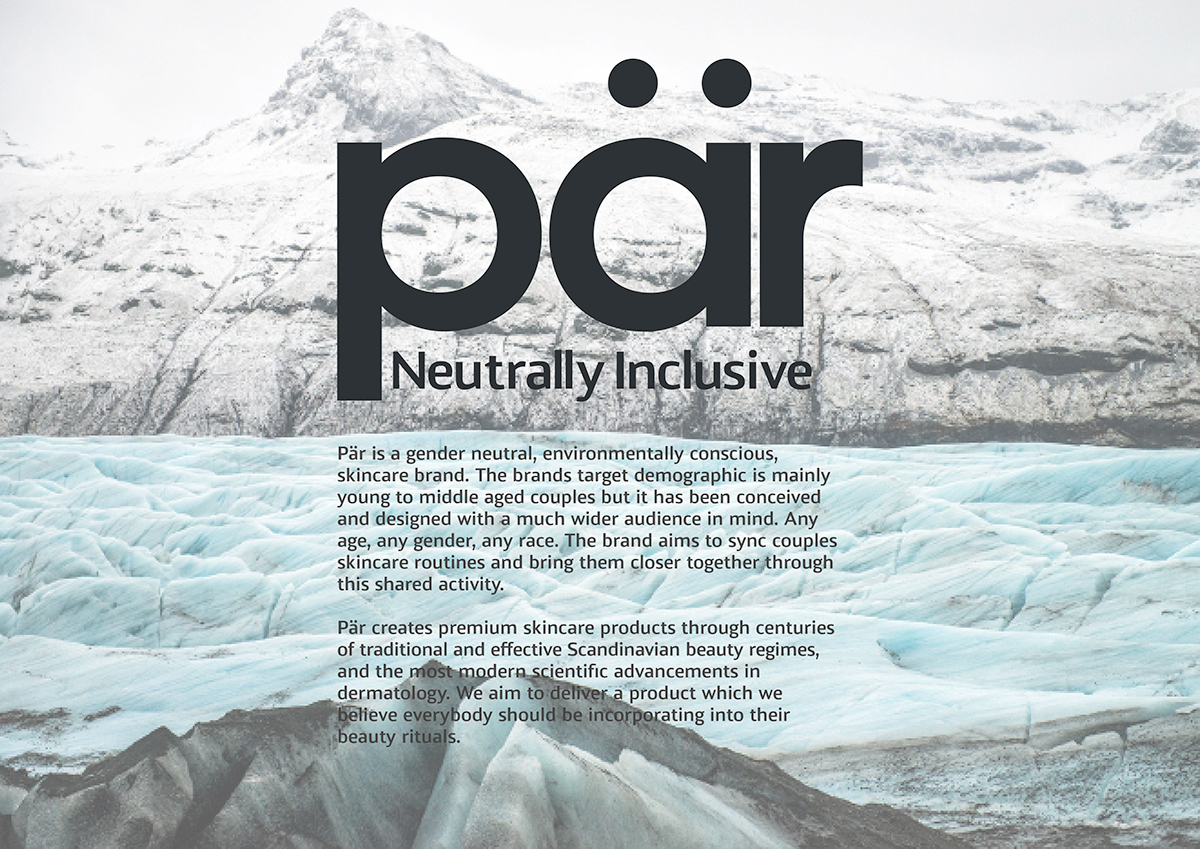
About Pär:


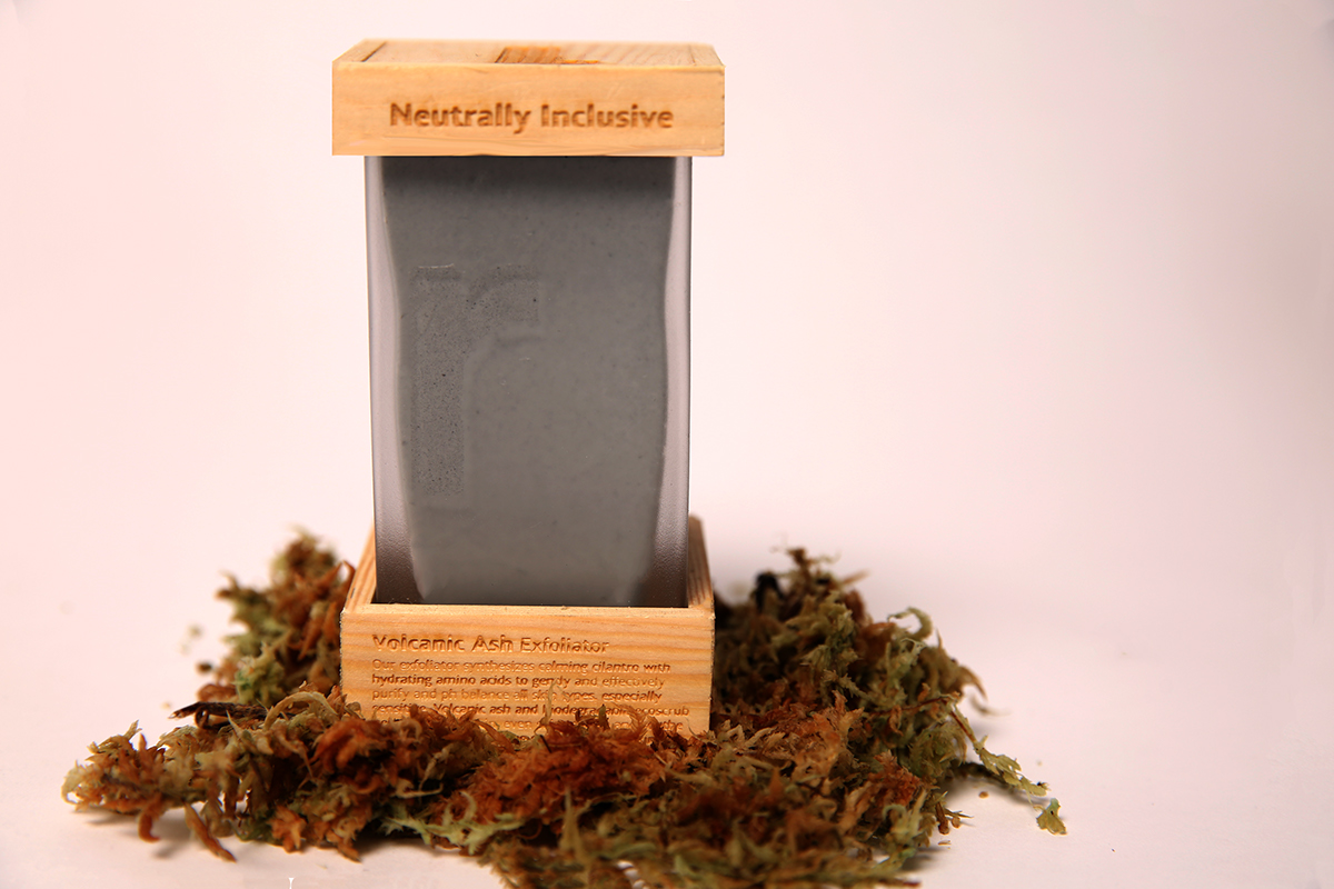
Packaging:
Pär’s packaging is inspired by Scandinavian architecture, steamy Swedish Saunas and frosty Nordic Woodland. This inspiration is reflected in the materials used for the packaging.
The glass on our bottles is frosted to mimic a steamy sauna door. The frosted glass also emanates a cold, fresh, crisp feeling just like the Scandinavian climate does. The packagings angular structure is inspired by the style of Scandinavian architecture. Pine wood is used to compliment the frosted glass as a brings an element of warmth to the packaging which balances the cold frosted glass. Pine forests cover much of the Scandinavian region and the wood is used a lot throughout Scandinavian architecture and also inside saunas. All these elements combined give the packaging an unmistakably Scandinavian aesthetic.


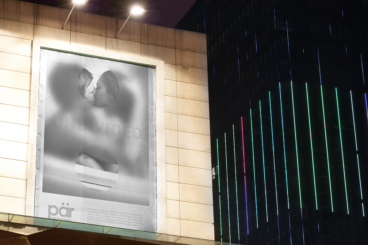
Undivided poster campaign:
Our ‘UNDIVIDED’ poster campaign aims to break down gender and sexuality stigma within today’s society and show that anybody anywhere can use our products. The campaign uses both heterosexual and homosexual couples and includes all genders to reflect the brands liberal and equal values. The umlaut from the logo is rotated 90 degrees and acts as a division sign without the divider. This gives the impression that the couple are unified and stronger as a pair because they use Pär products.


Thankyou for viewing


