Portfolio piece to go with an application for a position with The Coral Project.
I applied for a UX/UI position with The Coral Project, an initiative from Mozilla that has the following goal: "We are creating open-source tools and resources for publishers of all sizes to build better communities around their journalism."
I read that and thought, "HEY! That's super cool!" And the more I learned about what they're doing I felt drawn to their mission and what they're trying to achieve.
I took a look at their user stories and plucked out Selena, a 19-year-old millennial who "reads comments on news sites, but she thinks writing them is for old people." As a 28-year-old millennial, I have a slightly different perspective and I avoid comment sections for other reasons. You don't need to look farther than any thread on a CNN post discussing politics.

I'm going to revisit this soon, but I wondered if the design of a news site had anything to do whether a particular age group engaged with it. I had this idea about setting up profiles that would then present content with custom CSS for a given profile. To keep this example short: a 40-something user could see a site with more serif typefaces, maybe larger text; the Selenas would see sans-serif fonts exclusively (per BuzzFeed) and more opportunities to share to social media accounts like Snapchat.
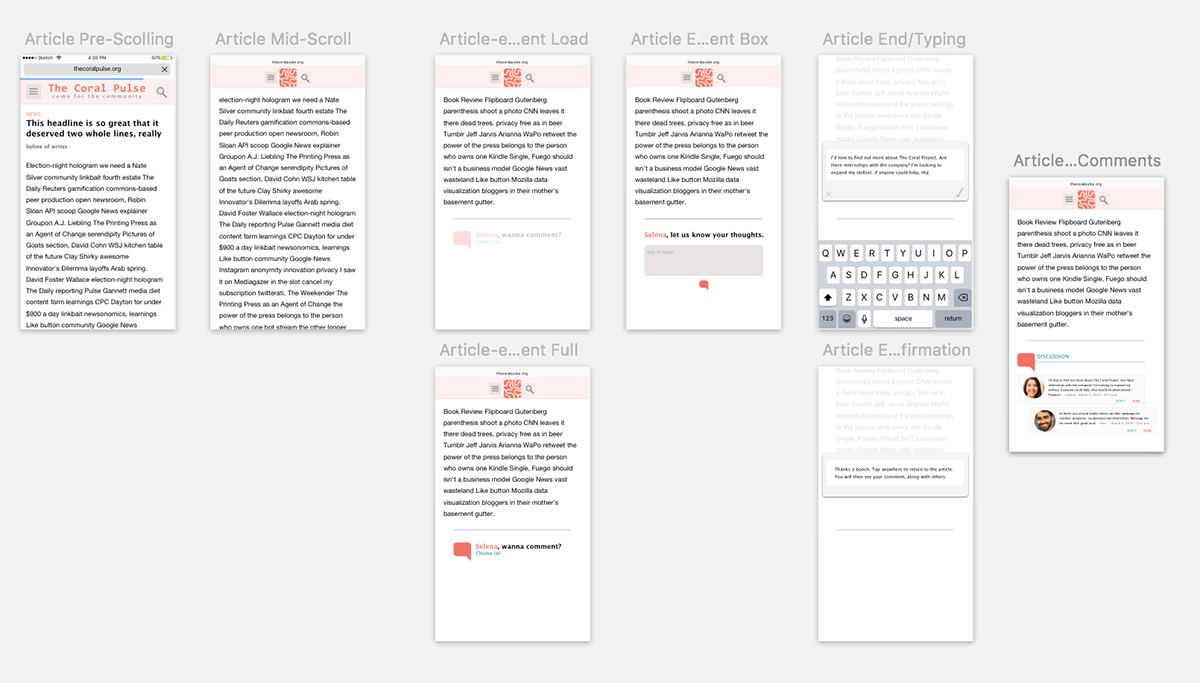
I decided to focus on the general layout of an article displayed on a mobile site — here, an iPhone 6. The basic lauyout is driven off The New York Times' mobile site, with a hamburger menu and search icon. I maintained a sans-serif font throughout. For colors, I relied on The Coral Project's overall dark pink scheme.
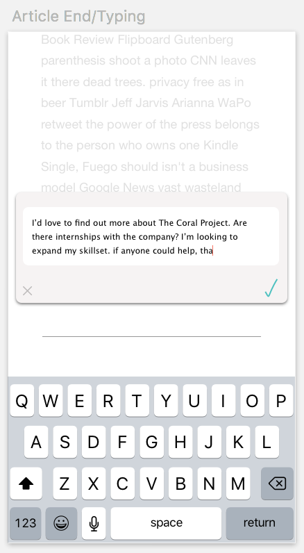
When a user scrolls to the bottom, an invitation to comment would fade in. Selena's name would be populated in the invitation in order to make it a more personal experience (which would be available only upon login). The language is also important ("wanna") to play to a younger audience.

Upon clicking the "Chime in" block, a text box would appear for commenting. A subtle dropshadow was used to lend some depth to the pop-up window for commenting. A simple, hand-drawn checkmark is used for submitting the comment. The text box would adjust in height to adjust for length.
Tapping again returns to the article with the comment populated.

The comment boxes are simple with the standard features (name/signature, timestamp, reply links, etc). Here, I think names (vs. usernames) are imperative as well as profile photos. It helps make the discussion more personal.
Below are zoomed-in screenshots of the various screens.