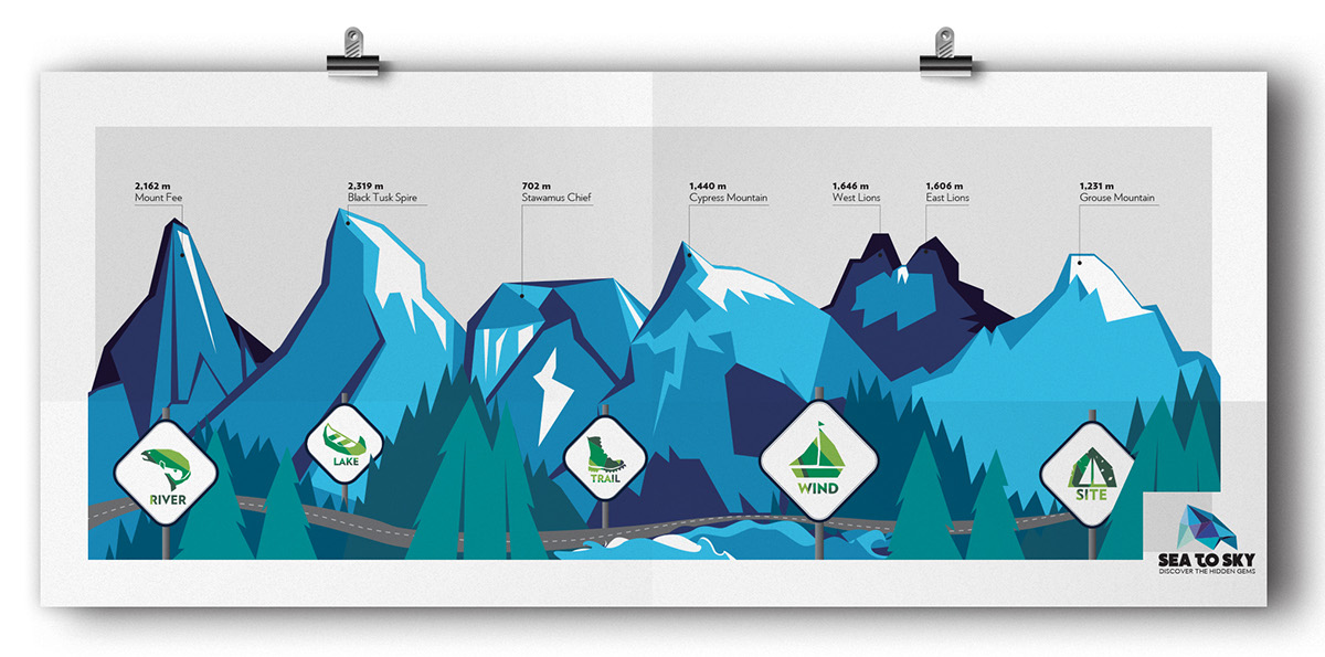
RATIONALE
The design brings to life the concept of discovering and experiencing the hidden gems of coastal British Columbia by using geometric shapes to mimicking light shining through a gem.
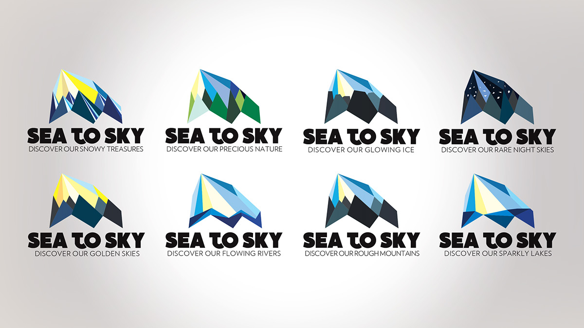
The logo is inspired by the iconic Black Tusk spire rendered into angular vector shapes giving it a diamond look. On your drive up the Sea to Sky Hwy, Black Tusk comes into view on various occasions, allowing for many different perspectives of the spire. The colours used are associated with the natural elements that are found in the sea and sky.
The logo is inspired by the iconic Black Tusk spire rendered into angular vector shapes giving it a diamond look. On your drive up the Sea to Sky Hwy, Black Tusk comes into view on various occasions, allowing for many different perspectives of the spire. The colours used are associated with the natural elements that are found in the sea and sky.