Tracman is a generic, though highly customizable access tracking/control system. Together with the client I set out to really dig into what it was that he had in mind, while also maintaining an open discussion about what would be realistic and what we would need to discard as ideas.
The process itself helped us reach a point where I could comfortably move ideas around and rationalise them in the light of some good ol' market research which yielded a lot of insightful results. The 'competition' in the market had all but resorted to depending on the idea of waves representing (amongst others) RFID fields which were a big component of tracking technology. At least, in access control for buildings. We quickly noticed where the clichés were and avoided them easily.
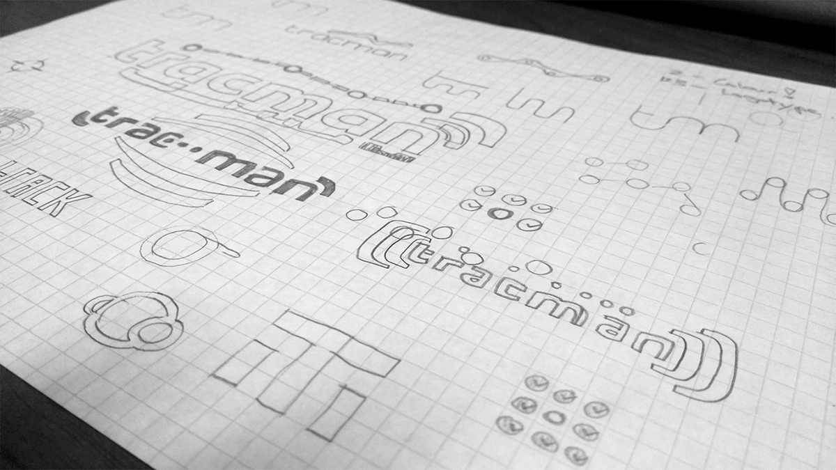
The client wanted something...you guessed it, "Simple, clean & fresh...tra-la-la"! Jokes aside, I had a clear ideas of what might work and developed those.
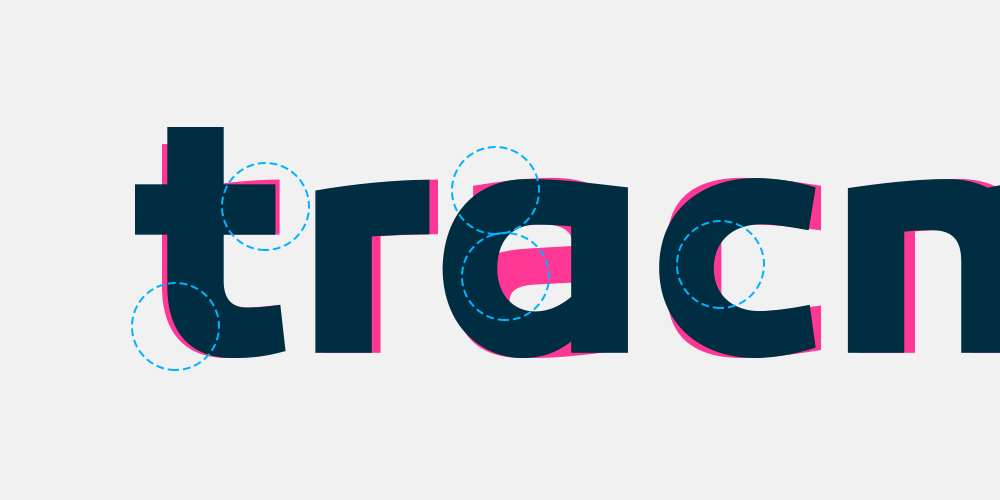
Eventually, having customised letterforms and squeezing unique palettes from various sources, the end-result started taking shape and we had a brand that was sellable to anyone from smaller businesses who needed access solutions, to some of the biggest service-delivery corporations having to track every bit of hardware and tool that left their warehouses at any given time.
This project has proved to be one of my more sucesssful runs in terms of client-to-designer satisfaction ratios! :)
The process itself helped us reach a point where I could comfortably move ideas around and rationalise them in the light of some good ol' market research which yielded a lot of insightful results. The 'competition' in the market had all but resorted to depending on the idea of waves representing (amongst others) RFID fields which were a big component of tracking technology. At least, in access control for buildings. We quickly noticed where the clichés were and avoided them easily.
The client wanted something...you guessed it, "Simple, clean & fresh...tra-la-la"! Jokes aside, I had a clear ideas of what might work and developed those.
Eventually, having customised letterforms and squeezing unique palettes from various sources, the end-result started taking shape and we had a brand that was sellable to anyone from smaller businesses who needed access solutions, to some of the biggest service-delivery corporations having to track every bit of hardware and tool that left their warehouses at any given time.
This project has proved to be one of my more sucesssful runs in terms of client-to-designer satisfaction ratios! :)

Colour application is and testing can be a bugger sometimes (below).
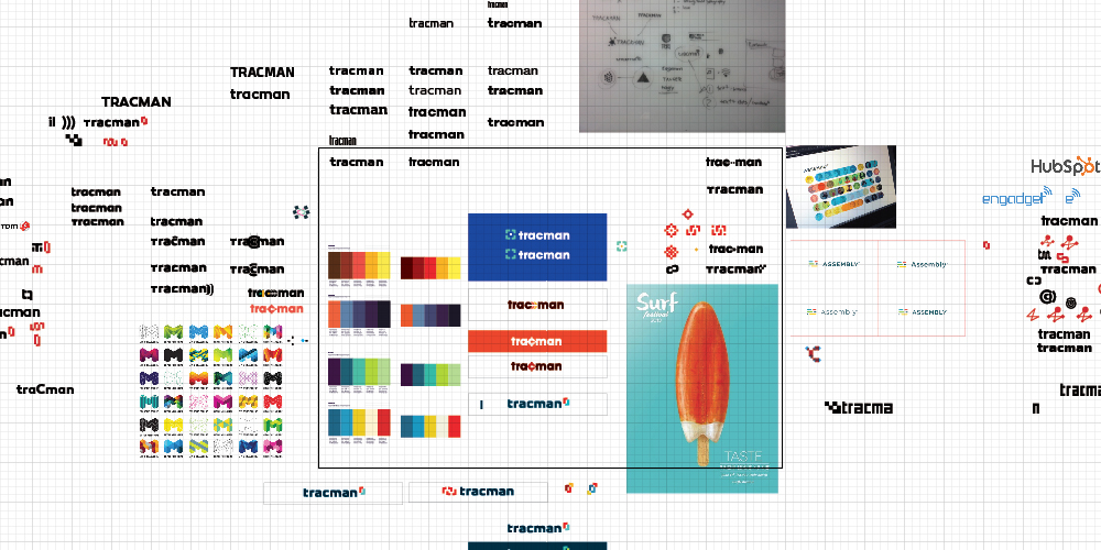


Some icon tests above and letterform customisation below. I used Canaro Black as the base typeface for the design of this logotype.

The final result. Very pleased with it (below)!

An example of the logo in its 'native' environment, where it'll be spending most of its life (below).

