
AN OVERVIEW
This app is based around the idea that "crisis isn't scheduled." What that means is that when individuals need help in between counselling and/or support group sessions, it can be very hard to find that help without feeling like a burden to their friends and family. The premise of this app is to create a platform that connects members of a support group to each other (and to professional help if needed) on a daily basis.
MY ROLE
For this project, I was responsible for:
-the concept and team direction
-the branding
-the user experience design (including personas, user-flow, and ui)
-the interface design
-the final presentation/pitch
-the concept and team direction
-the branding
-the user experience design (including personas, user-flow, and ui)
-the interface design
-the final presentation/pitch
THE PRE-EVENT CONCEPT
This project began as an experimental personal project and quickly turned into a shared project with several collaborators at a ProtoHack Vancouver event in January 2016.
I came up with the idea lying in bed one night thinking about several friends and family members who struggle with various mental illnesses and how I don't know of a single app that helps these people along. Most are aware of crisis support lines and online chat resources, but what about a tool that comes alongside the individual in their day-to-day lives? And so the idea of an app that streamlined the process of care was born.
Pictured below are some of my preliminary brainstorming stages.
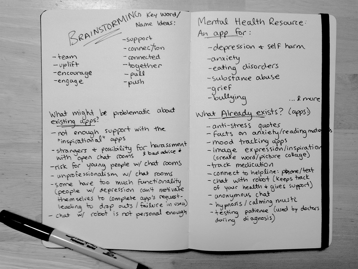

At the time when this idea came to mind I didn't yet know I would be attending ProtoHack Vancouver event in the near future. I just knew that if I didn't get all of my ideas out of my brain and onto paper, I wouldn't be prepared if and when an opportunity to develop the app came. Pictured below are some of my pre-event card sorting exercises.


THE PRE-EVENT BRANDING
I decided to play around with branding. I was doing some reading about famous philosophers and psychologists who had theories regarding mental health. Eventually I landed on the Wikipedia page for Maslow's Hierarchy of Needs. I took a screen shot and started highlighting the words that stood out. Eventually I landed on the word belonging... and so the original name, "Belong" was born. Pictured below are some preliminary branding concepts and sketches.


THE EVENT
Coincidentally, just a few weeks later I heard about the ProtoHack Vancouver event. Of course I knew this would be the perfect place to bring my idea. Pictured below is one of the organizers inviting individuals up to present their ideas. So I went! Presenting my idea in a minute or less to fellow designers, developers, and business people, was thrilling! Soon enough I had a team of four and was ready for the next 10 hours of work! My team members included: a talent & business development manager at Caskadia Technology Labs: Jacqueline Alexander, a business advisor manager at Metascope Software Inc: Bayoush Mengesha, and an environmental health officer at Vancouver Coastal Health: Elden Chan. While I was the only designer on the team, the images from this point and beyond were only made possible through the contribution of all of my team members. Thanks for allowing me to share this work, team!

NEW BRANDING
When bringing the original branding idea to the team, their immediate reaction was that it "didn't feel personable enough." I agreed. While I tried to create a feeling of community by turning the letters in to face each other, it was still a very boxy, cold look. We needed something fresh. While I was still in the middle of sketching out my first logo iteration of the day, a team member created an email for us. She accidentally typed two e's in the word "belong" turning it into "beelong." We instantly made the connection to bees and how they are insects that rely heavily on their colonies and fellow bees. We liked the way it made the word a bit friendlier, and decided to see what it would look like to go forward with our branding as such (making sure to stay away from cheesy and childish looks as much as possible).


FOCUSING ON THE USER NEEDS
It just so happened that we had two possible users in our group. One member had facilitated support groups, and another had gone through depression and attended support groups for help, but didn't get the help he needed. We decided to do some personas in order to hone in on our users' lifestyles, frustrations, and needs.


FINALIZING THE CONCEPT
As a team we had a look at my pre-event concept development and really talked out all of the possibilities. We focused on the users, their needs, and the gaps we could fill. We landed on an app that would connect members of different support groups with their group peers and their facilitator on a day-to-day basis: providing a daily check-in, a check-in feed (to see how other members' check-ins went), a profile (where past check-ins and updates would live long term--creating a solid patient history), plus a private chat (where users could chat with each other, with the facilitator, and with a 24/7 professional). There would be ways to reach out for help in case of an emergency, tools to report bullying, and awesome tracking for growth and improvement.


THE PRESENTATION & CLOSING REMARKS
The presentation went great. We knew our users, our market, our niche, our competitors, our goals, expectations, possible stakeholders, revenue model, and overall concept very well. With only a minute and a half to present to the judges, quite a bit of nerves, and 10 hours of work behind us, our delivery was strong but not strong enough. We didn't "win" the final prize, but our team felt great about what we had accomplished. At this time we're looking into ways the app can be further developed. If you have an interest in pursuing this app alongside us, feel free to reach out.
Thanks for reading.


