AN OVERVIEW OF THE COMPANY
Emerald Custom Creations has a strong and distinctive mission and reputation in the custom design sector in Moose Jaw, Saskatchewan. With the original name of "Emerald Glass," the company dates back to 1987. Over the years it has grown and changed drastically. Every time the company added a new service, it would often add a new name to its repertoire. Names included: Emerald Glass and Art Gallery, Emerald Framing, Gift & Gallery, Vibe Graphics, Vibe Clothing, Emerald & Vibe, and Emerald Creations. As it grew, it also outgrew its name and brand. The goal was to come in-house for four months, redo the branding, redesign the website, and also work on several other graphic design client projects for the company on the side.
To give some context about what the company offers and how hard it was to create one brand/website for a company that reaches so many industries, here is a list of products and services:
SERVICES
Services include: custom framing, custom clothing, and custom engraving.
PRODUCTS
Products include: artwork, home decor, gifts, awards, and special occasion memorabilia for weddings, births, deaths, baptisms, confirmations, retirement, and birthdays.
MY ROLE
I took on this rebranding and website redesign contract for four months in mid-2014.
For this project, I was responsible for:
-the research and brand development
-the company rebranding implementation
-the website redesign
-the information architecture and content strategy
-the content development
-the user experience design
-the interface design
-the website development using Squarespace.com
THE BRANDING
When I arrived, I took some time to look into the existing branding. Over the years as the company grew, several logos were created and used. There was a wide variety of logos, fonts, colours, and overall looks that made it extremely unclear which one to use and when. As such, I took on this branding project knowing that a brand guideline document / graphic standards manual was of utmost importance upon project completion. After so much work it would be a shame to see the branding used incorrectly.
Unfortunately, when I transitioned out of this role I left behind the many many sketches and logo iterations that it took me to get to the final logo. What I can say is that the new logo brings together the old and the new. It lends to the emerald green that had been traditionally used, the traditional diamond, and a desire to move towards a logo that could represent both a design company and an athletic clothing company--since as previously mentioned--this company really does do it all.
The coolest part about developing the new brand for this company was my regular meetings with three generations of the family business owners in the room commenting about my work, and how it made them feel. It was such an experience for me to be able to work with children, adults, and seniors on a design job and to be able to develop something that made them all feel proud of their family business.
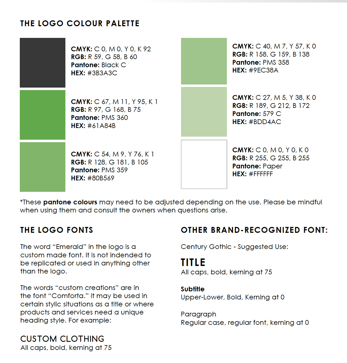
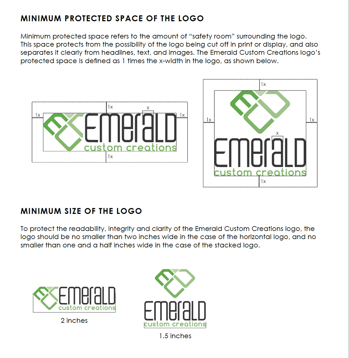
Pictured below are some snapshots from the brand guideline document / graphic standards manual.


THE WEBSITE : FROM OLD TO NEW
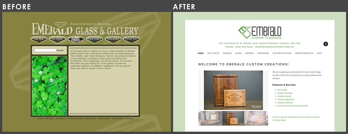
The website was quite a large project in itself. As you'll see below, the site they were previously using was quite old and outdated. The information architecture was impossible to navigate, the readability was terrible, the site did not function properly on most browsers (it was made using Flash), let alone phones, and the overall user experience was lacking immensely. Not to mention the colours were quite yucky and overwhelming!
I started out by reorganizing the information architecture. My original plan included the following top-level categories: home, products, services, and info. Unfortunately after pitching my hierarchy, the owners decided that it was more important for their customers to be able to see all of their products and services at the same time than to have a clean menu. After much discussion, it was decided to do this since the business offers such a wide variety of products and services that they're constantly worried about informing new customers about everything they do. Keeping the "gold above the fold" is often a priority for older businesses on the web (even though it is a print design mindset), and while it is important to challenge these ways of thinking in online contexts, sometimes traditional ways of thinking will always win. When that's the case, it is the designer's job to make it work... so that's what I did.
The next step was to develop the content. Since my job was to come on board and "do the brand and website," I decided to take on the content development as well. I did this because I was in house, I had the time, and I was worried that if I didn't write the content myself, it would get forgotten or I would be asked to pull outdated content from the old website. I must say, the owners of this business have a constant stream of large-scope projects on the go and I really wanted to make the process go as smoothly as possible so as to not take up too much of their time. I don't regret taking on the content and actually enjoyed writing it, since I don't often get to be part of this process. I also took all of the photos featured on the website. It was quite fun, to be honest!
Lastly, I went forward and developed the website using Squarespace. While I considered Wordpress and Drupal, I really wanted to use a platform that was so straightforward that anyone in the shop could figure out how to work with the website if they needed to. With the owners' busy schedule, and the risk of another outdated website in 10 years, my goal was to make the CMS as accessible as possible. The good thing was that Squarespace offers such clean design templates that I was able to easily modify one to match the new branding.

MORE PAGES


