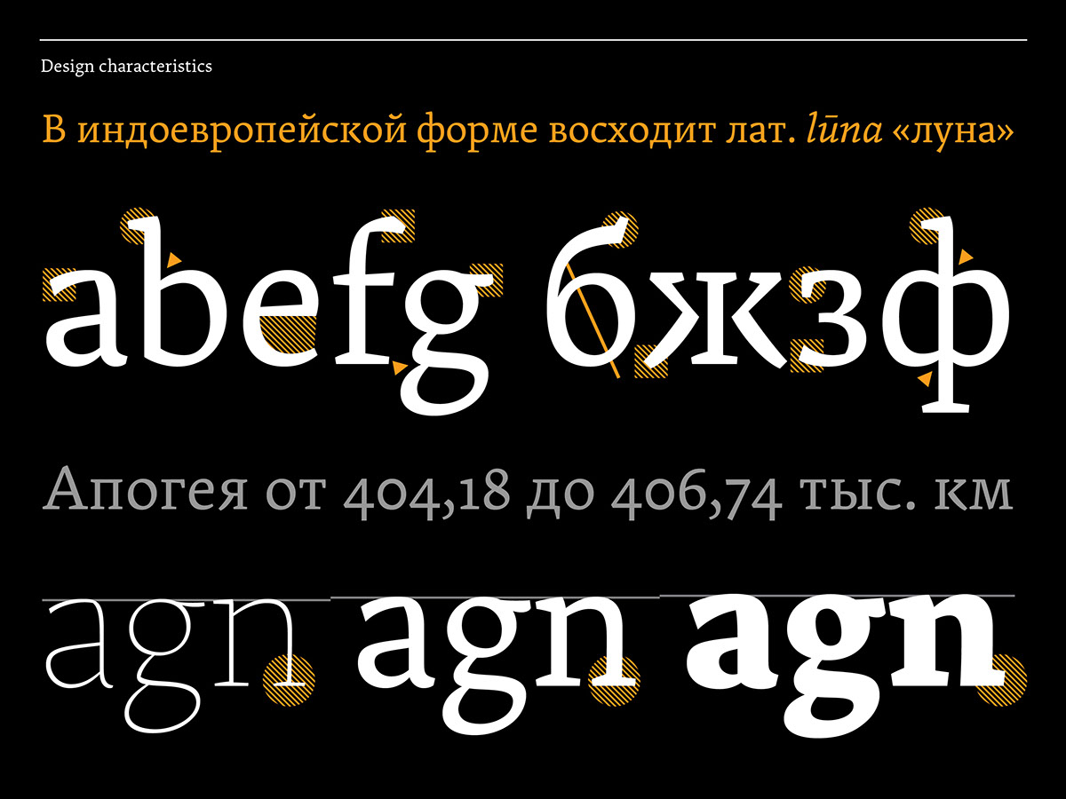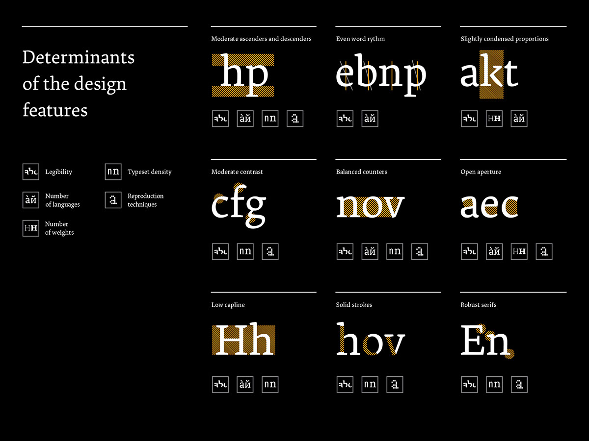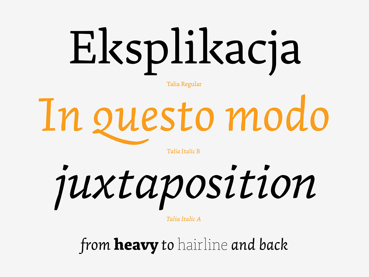
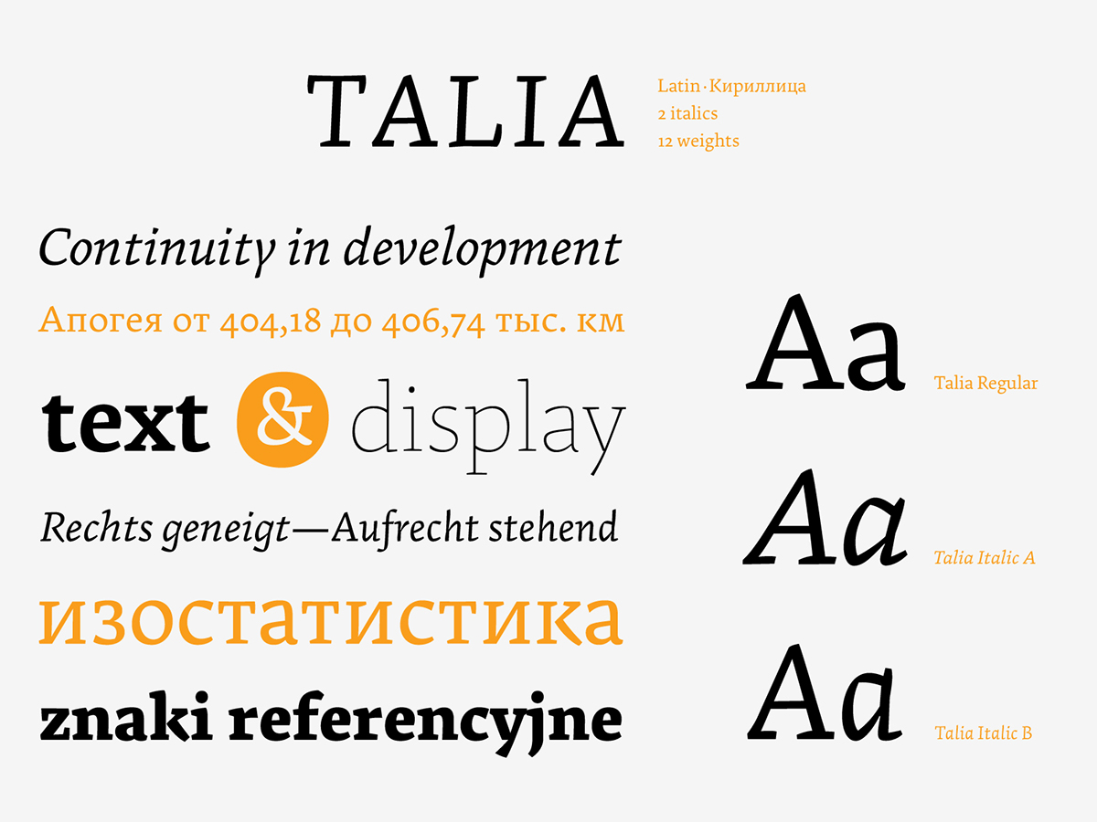
Talia is a type family designed for highly structurized texts, demanding number of means to underline hierarchy of contents. It is suited for texts containing vast number of informations: from quotations, technical terms and references to several levels of titles, section marks etc. (like in technical or academic publications, manuals, schoolbooks or encyclopedias).
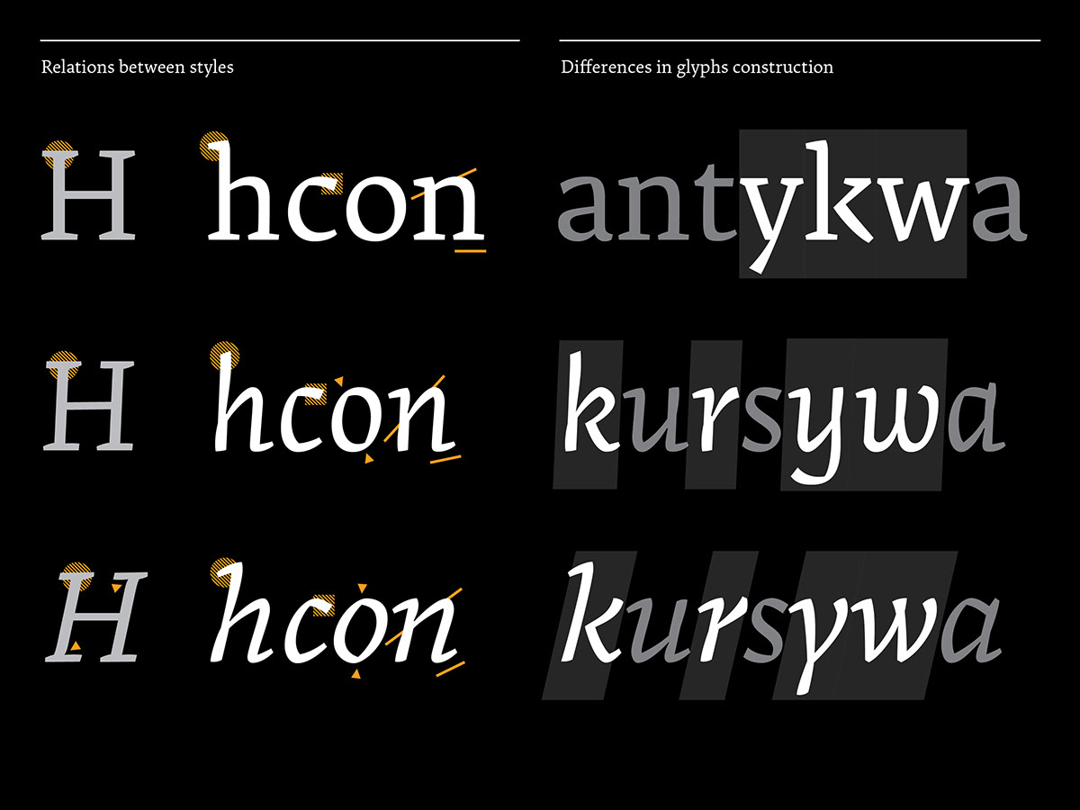
The traditional scheme, based on relation of roman and italic, was in this case expanded to triad. The core of the family consists of roman and two italics, designed to be used simultaneously: for subsequent levels of emphasis or the whole, special parts of publication. The use of second italic might be an alternative to giving an extra space to some words (as a mean of emphasis, if italic has been reserved for other type of information). The still common practice of exaggerated word spacing due to the lack of established adequate solutions, results in braking the integrity of text column and decreases readability.
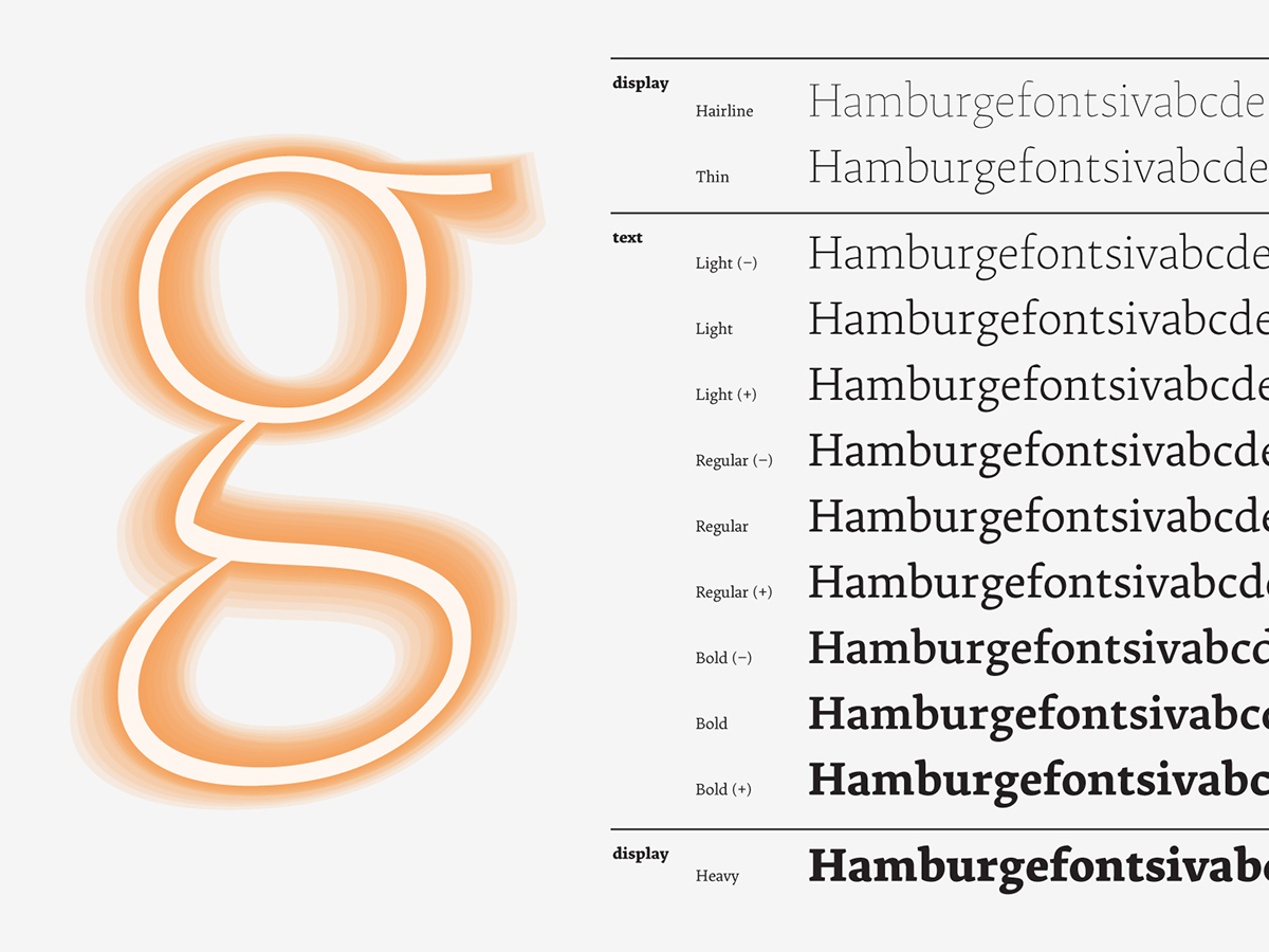
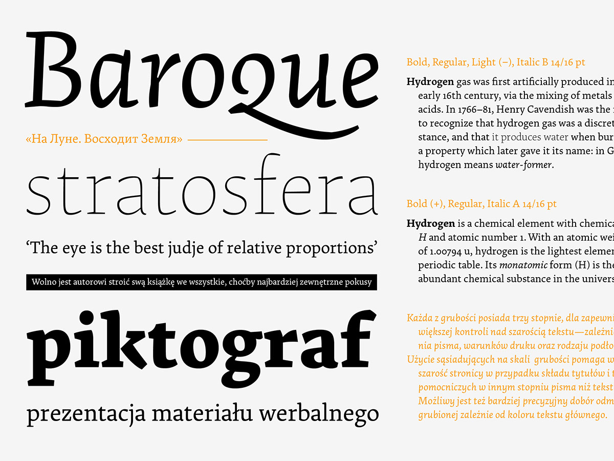
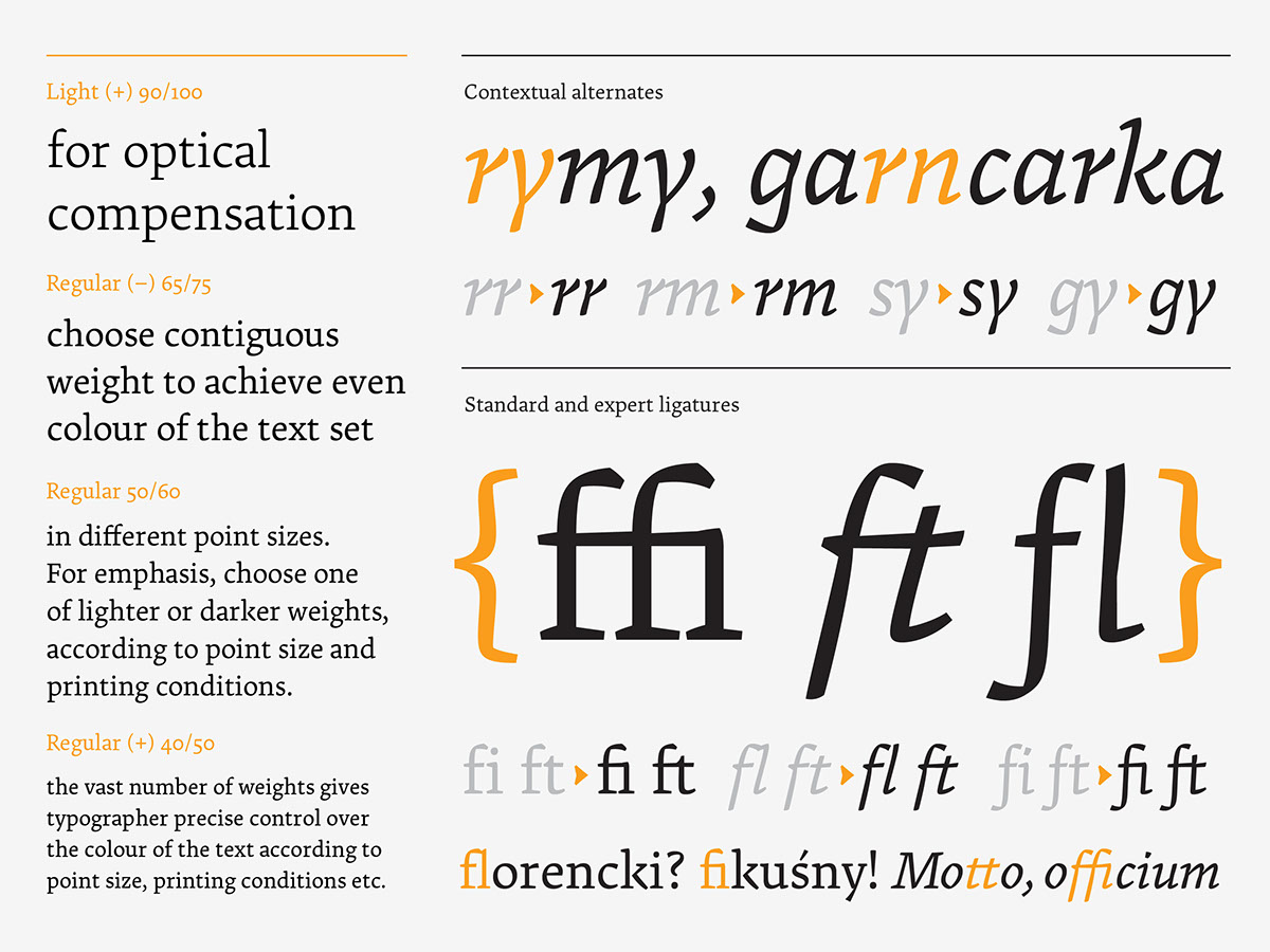
12 weights gives precise control over the color of the text, either for emphasis, or in case of merging different point sizes. Main part of the spectrum was adjusted to work best at smaller sizes, while the extremes share an extra display features.
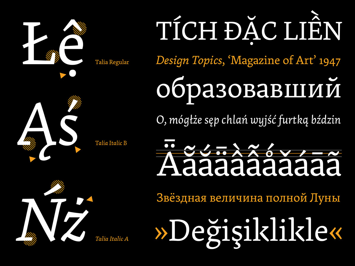
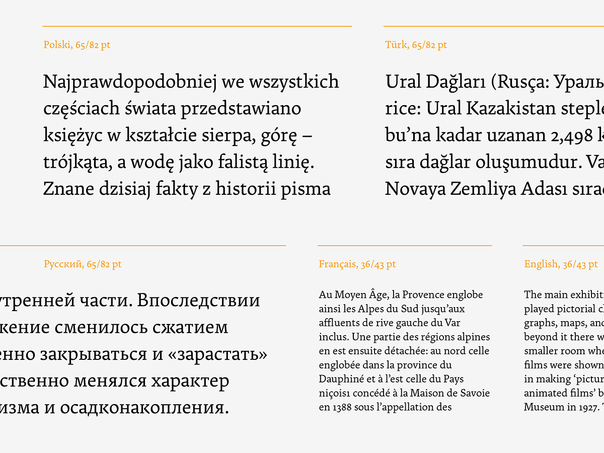
The family comes in two scripts: Latin and Cyrillic, supporting all European languages, as well as Vietnamese.
Talia type family was designed as MA diploma at the Type Design Studio, University of Arts in Poznań, Poland – with help and advise of the professor Krzysztof Kochnowicz and assistant Viktoriya Grabowska.