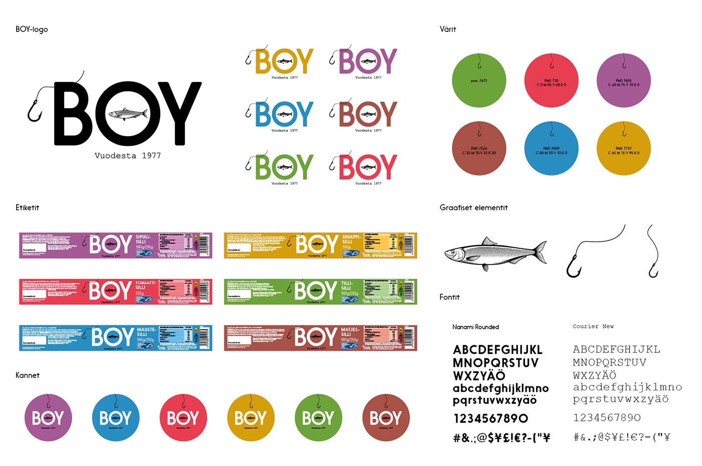


BOY packaging redesign
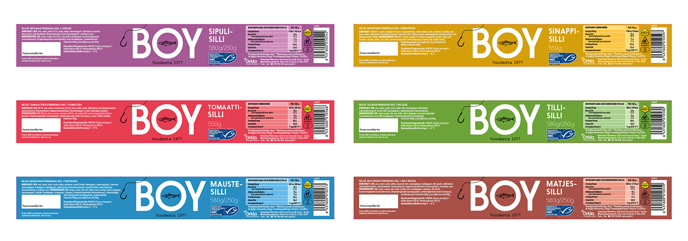
Orkla Foods Finland decided to update their 40-year-old BOY herring brand with a new packaging. Our task was to strengthen the defined brand positioning with a fresh, contemporary design.
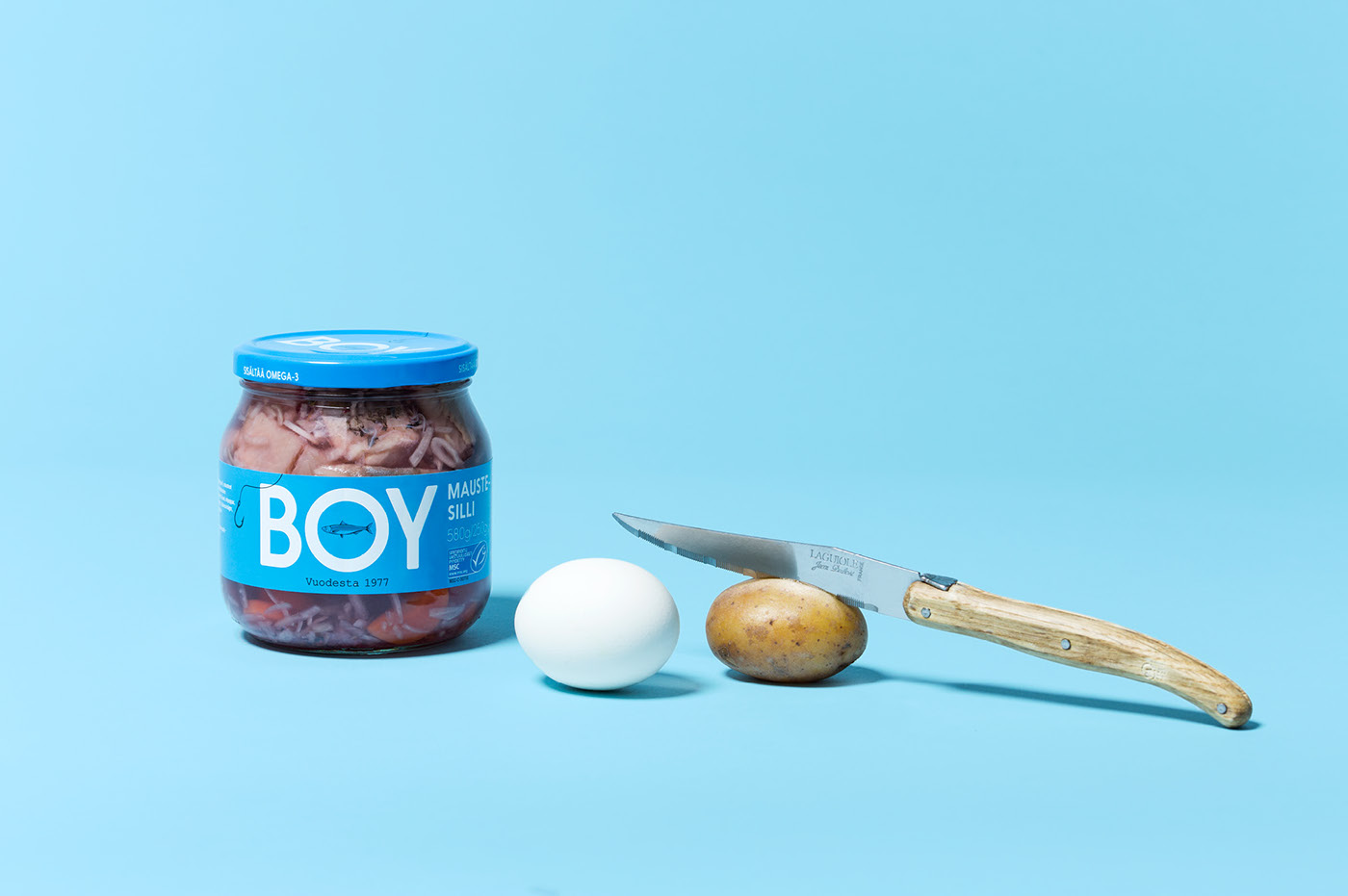
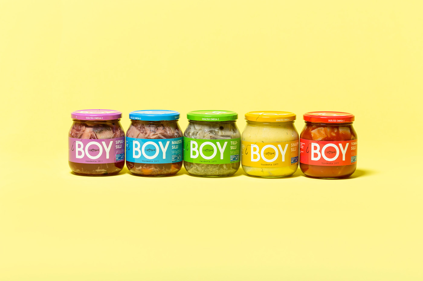
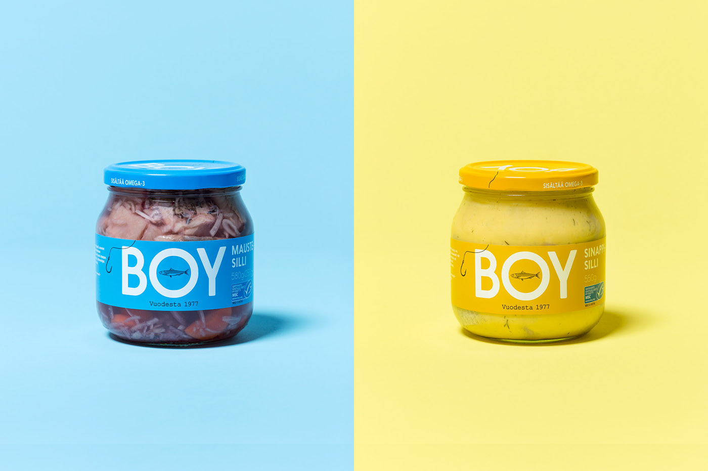
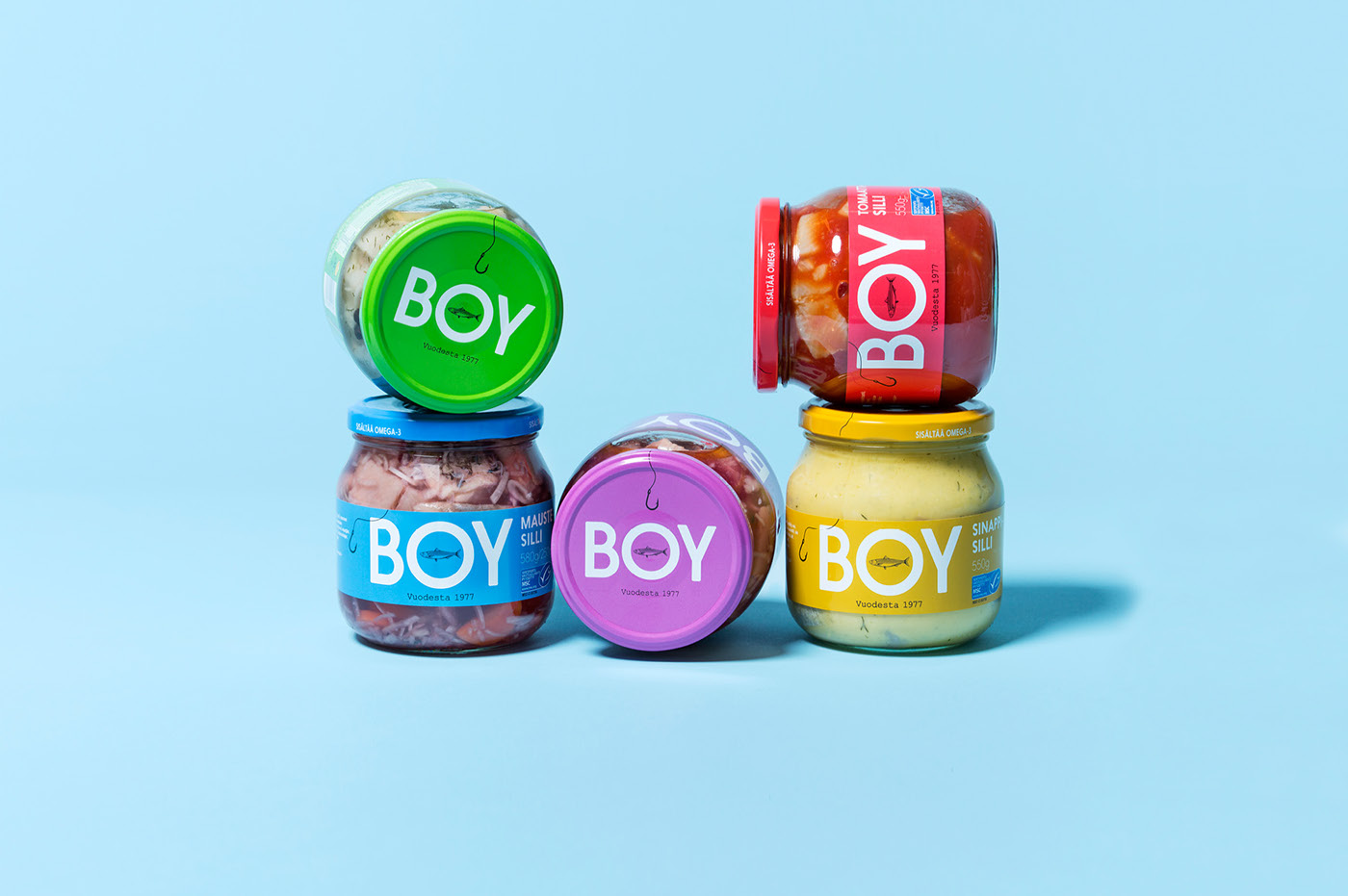
We drew from the brand’s existing simplicity and everyday value image. Our objective was to make herring temptingly attractive also for consumers, who are not regular herring eaters.
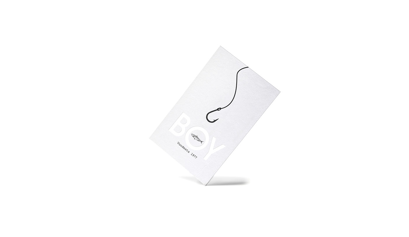
We kept the bright color coding to ensure the recognizability of the legendary BOY herring family. Then we added a couple of new visual elements; a grand logo, a sympathetic little herring inside the letter 'O', the founding year, as well as a hook and a fishing line for a drop of maritime vibe.