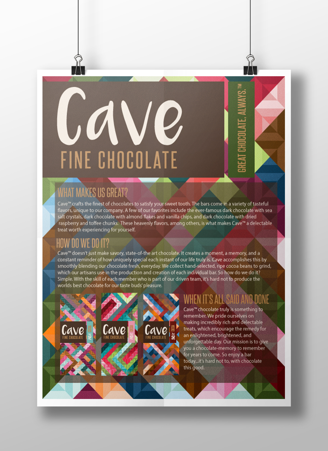
A poster developed to explain the company and collection of chocolate that is sold.
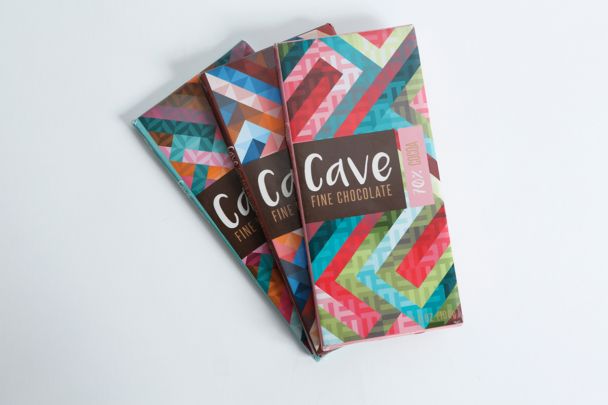
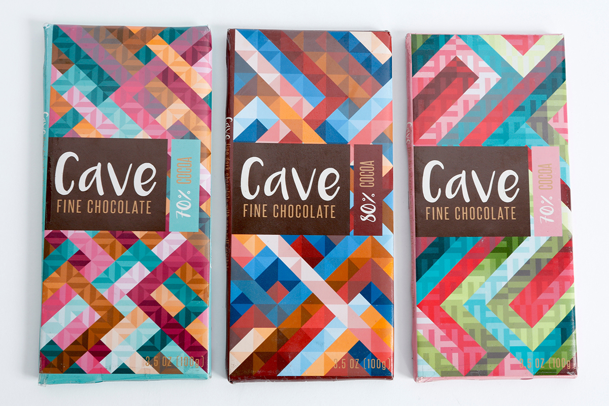
I designed three seperate identites for different flavors of chocolate.
Front view of the designs.

Side view of the designs.
I have always been interested in packaging design, and I found an opportunity to display my first project in a class taken studying Color Theory. These designs were created while following a variety of objectives. The bright, intricate, and modern designs displayed in each individual wrap display the chocolate company I created by evoking a whimsical, fun feel.
This brand was developed for an audience of consumers that enjoy fine chocolate with a unique flavor assortment. Because these flavors were created to be so unique, I wanted to mimic this aspect of the product with eye-catching packaging that told a story about the chocolate before it was even examined.
After developing the gradating patterns on my first design using single visual pathways and a split complementary color scheme, I incorporated a similar design to the other two packages in order to create a cohesive identity among products within the brand.

