


Seen Digital Logo Redesign
Based in southern Brazil, Seen Digital is a digital agency focused on social media, digital marketing and website development. In the year 2015, a major brand study was carried out in order to review its institucional communication and propose a fresh design direction for the future.
The brand research showed that the ongoing visual identity was not compatible anymore to what Seen Digital really represents. Therefore, our objective was to redesign the logo and the brand towards a better communication within the values of the company.

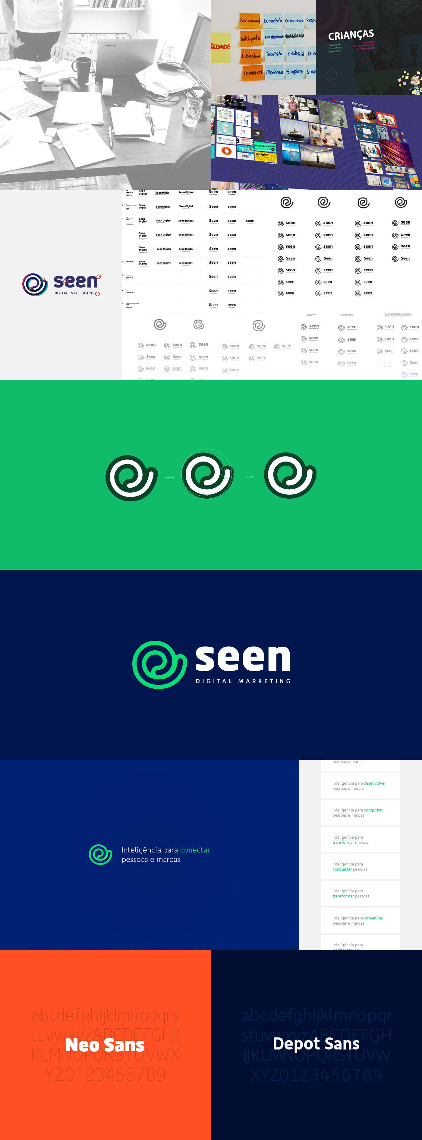
We began by developing a suiting methodology for the project, acommodating all of our avaliable time and resources. It had six major steps, starting on the current brand research and ending on the final brand identity style guide. Through meetings with the agency executives and the planning professional, we received a brand research that informed us how the public was perceiving Seen’s communication efforts.
The results showed that some clients and general public did not know all services that the company offers and they were not aware of the latest published projects. Also, the brand was perceived as professional, intelligent, competent, but a little arrogant and not so different from the other digital marketing agencies. The visual identity was seen as beautiful, fun and contemporary but, on the other hand, it was childish and confusing.

In the meantime, a marketing audit was being conducted in order to analyse the competitors and the current communication system. We saw that the original visual identity was not being always respected, causing a weaknening in the brand’s uniformity. Also, social media was rarely updated and there were different institutional informations across the platforms, along other issues.
In the end, our objective was to update the logo along with the visual identity, aiming to show more profissionalism without losing liveliness, making the general public understand right away what the company is and what does it do.
We revised the company’s vision, mission, values and brand positioning with the goal of defining the key concepts of the brand upgrade, creating moodboards afterwards. Regarding the logo, it was important to keep its established structure, for the brand was already recognizable within the market. So we updated the symbol in order to be better suited in smaller sizes and to work well in different colors, we also changed the typeface, the colors and the tagline.
After the logo was ready, we selected categories of images that represented what the new Seen brand would communicate. Along with that, some examples of the new applied identity were made and we traced some further important steps for the full development of the visual identity.

Brand images research

CREDITS
Graphic Designers
Marcos Duda, Leonardo Prause
Marcos Duda, Leonardo Prause
Planner
Ciro Gusatti
Ciro Gusatti
Executives
Rafael Comin, Roges Pizzatto Luiz
Rafael Comin, Roges Pizzatto Luiz
Made with ♥ in the office of Seen Digital Marketing


