
CONFERENCE EXPLAINED
FRAME is a conference created by architects for architects, in the theme of urban evolution. This event highlights the changing and evolving needs of the individual in this changing urban environment regarding use of space, varying urban lives, and structure of living. The citizens of todays urban cities have constantly been evolving and changing to ever-changing needs. The environment that they live in should meet these needs, but the architecture, many of which has stayed since the beginning of our city, has fallen behind these needs. This conference works to provide a framework for this new ideology behind architecture, where the urban citizen is carefully considered and planned around. It is not the intention to demolish the existing buildings, many of which hold strong ties to our history, but rather work with new structures and people in order to work with current architecture in the mindset of working for the individual.
business cards


In beginning to create a visual system, the logo itself is used in a way that it is rarely seen as a whole. This concept is related to how we see architectural structures. Standing beside a building, you are rarely able to see the entire structure as a whole. Given the size in relation to yourself, you are usually only ever able to see one corner or view at a time.
letterhead + envelope


invitation + registration form


broadsheet


the back of the broadsheet doubles as a poster series

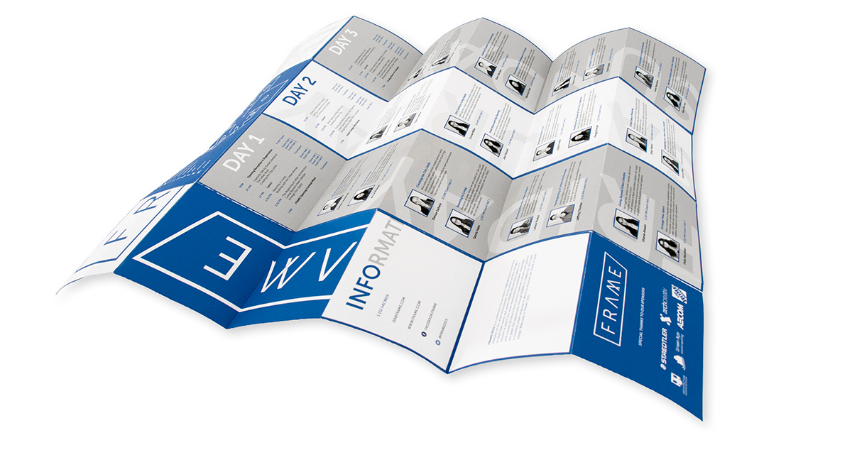
different orientations of broadsheet for various uses
usability was a huge part in this design, to be able to only access the information you needed in different situations


conference package to be given out to participants


RATIONALE
The associations I made initially with this conference was one of structural and three dimensional forms. Many of the architectural forms that I found in my research played with type in ways to further the expression of these forms, and I wanted to emulate that idea.
The FRAME identity draws from these strong themes of architecture and the visual structure of a building. The name FRAME is derived from the ideologies of a new urban environment and a new way of designing the future of architecture. The word “frame” references both the architectural backbone of a building (the framework), as well as framing an idea. Through the conference, the hope is to shape this new ideology, and provide a framework for the future of urban architecture.
The typeface Museo Sans was chosen for its strong plainer forms, drawing back to the architectural forms and angles, of a building. In this way the “A” and the “M” are modified to bring them closer to this idea, and visually becoming a structure on their own.
The frame around the word symbolizes the framing of this new idea in architecture, and as well creates a visual structure around the word to relate to architectural forms. The angle in the outlining box comes from the idea of "shaping a new urban architecture", as the tagline suggests. I want to change what would ordinarily be seen, and what is expected, and put this new shape that relates as well to an architectural form, in its place.
For a colour palate, I chose a dark blue and white, in order to reference architectural blue print plans.


