
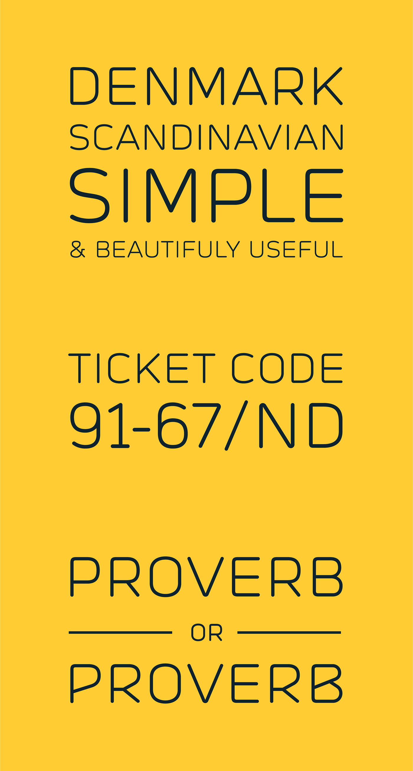
A clean and modern sans serif typeface, inspired by the beauty and functionality of Scandinavian industrial design.
Try it in your next project, because it is the best of both worlds, subtle and strong, light and steady at the same time.
Thin elegant line weight of Prota Basic makes it suitable for large to medium font size usage: Magazine headlines, UI, logos, package designs or posters. I would be especially proud to see it at very large sizes for signs in interior/exterior architecture i.e, because it is designed with that spirit of pure functionality and minimalism on mind. On the other side, recommended minimum size is about 12px.
The idea behind it was to design elegant letterforms which are legible and look serious. The result is relatively wide mono-line typeface with squarish (super-elliptical) curves.
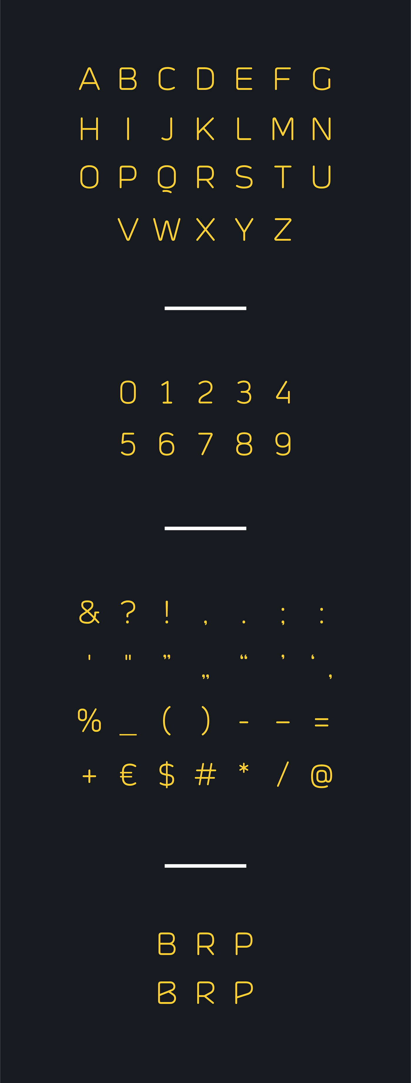
This basic version includes capital letters, numerals, three alternate glyphs, punctuation and necessary additional characters. After this basic version, the idea is to enlarge character set and to expand it to a family.


CREDITS:
Nurenberg Railway Building / Luka Ostojic
Man With Watch / Christopher Campbell
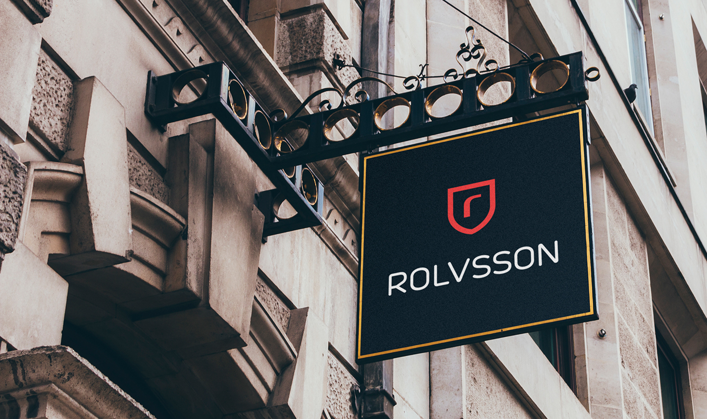
Facade Sign Mockup / Vadim
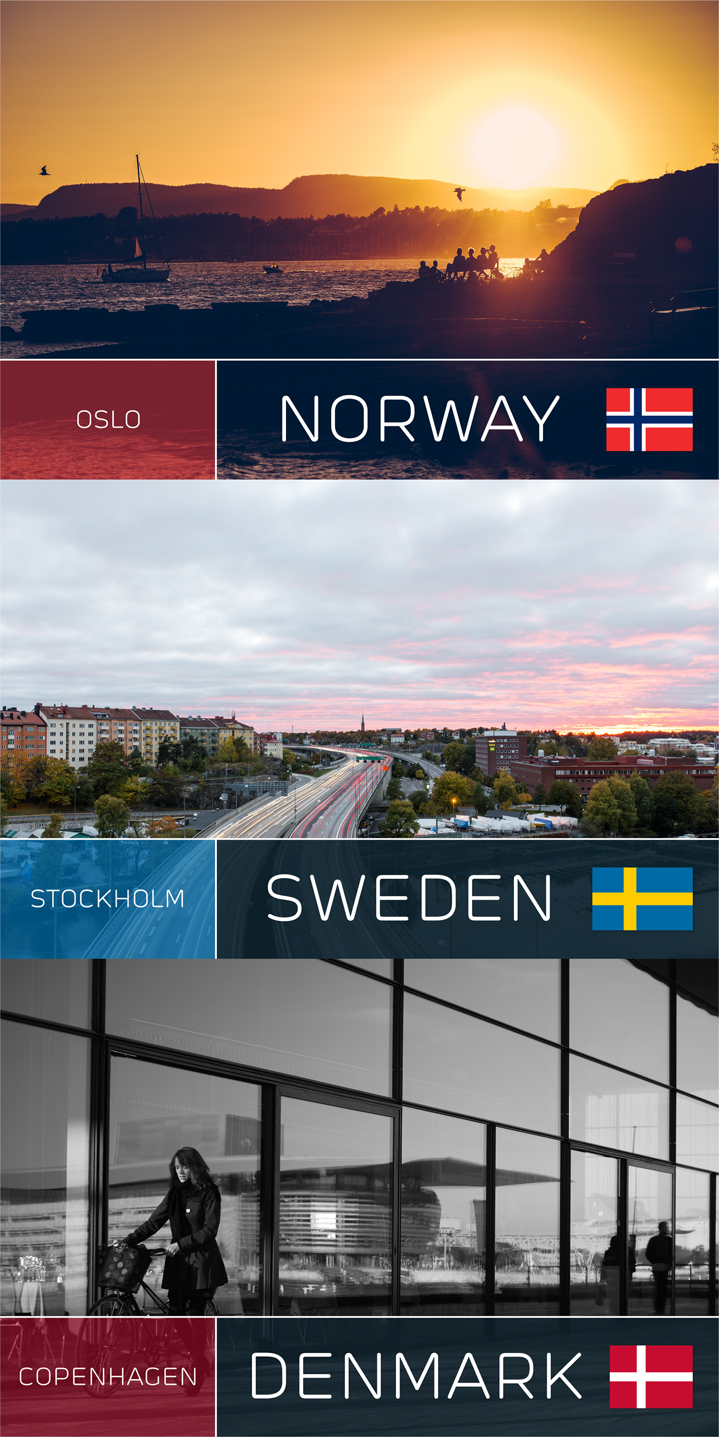
Oslo / Andreas Ronningen
Stockholm / Jon Ottosson
Facade Sign Mockup / Vadim
Oslo / Andreas Ronningen
Stockholm / Jon Ottosson
Copenhagen / Iván S. Pasarín
