


Typographical Poster
The brief here is to devise a type-based poster that sums up a famous person's life and career.
The brief here is to devise a type-based poster that sums up a famous person's life and career.
The following designs experiment with different approaches to conveying a famous person primarily through text. Some ideas are more abstract than others. I have found some designs work most effectively in black and white but was keen to explore colour in some of my designs as well.

I took a sketch of Richard Brautigan and overlaid two of his most wistful poems over the key lines of the image. Using American Typewriter as the typeface summed up the literary nature of the subject matter. The heart is lifted from a heart Brautigan drew around one of his love poems.
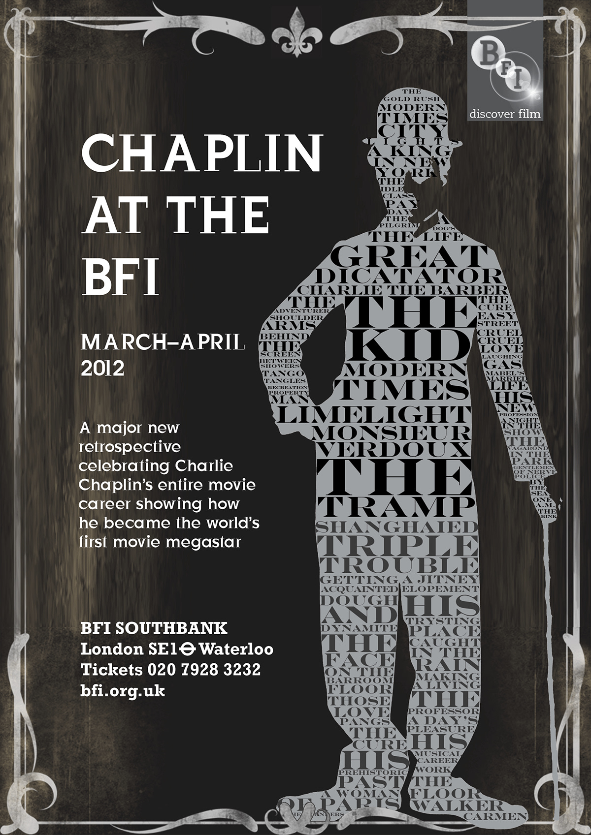
Engravers MT is the key typeface used within the silhouette of Charlie Chaplin. It has a slightly Art Deco feel with hints of modernity in the serifs. JustOldFashioned is the typeface used for the text outside of the shape. The borders add to the nostalgic feel of the design and relate to the content of the film season of films from as early as 1917.
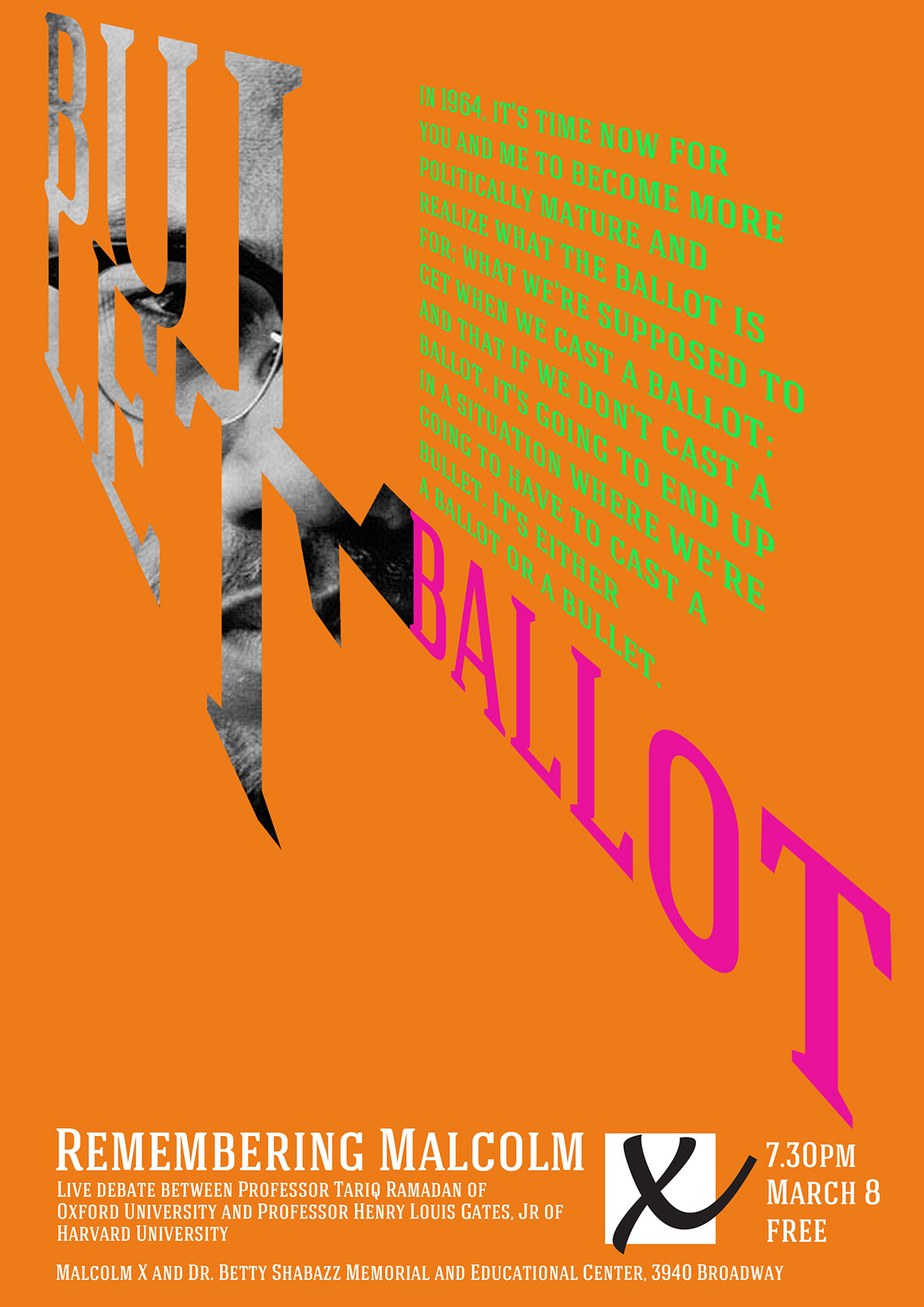
Hagin Caps is used here to present this live debate on one of Malcolm X's most famous speeches commonly referred to as the 'Ballot or the Bullet' speech. Breaking the word Bullet over two lines and using the serif typeface I realised the L and T laid on top of each other resembled a gun. Firing the word Ballot sums up the content of the speech and gives it an incendiary, explosive feel. Matching the content of the speech I used an X in the style of a ballot paper for Malcolm 'X'.

Rather than typographically represent David Lynch himself I wanted to hang this design on the red curtains, a recurring motif of his work. The design here used a shot of the nightclub in Twin Peaks as its starting point. The film titles are laid out in the same diagonal pattern as the floor of the nightclub. The typeface used here is Orator.

The design here is designed to recall the feel of the posters one may have seen advertising a gig such as this in the 1960s when Woody was regular on the stand-up circuit. American Typewriter is used again to reflect the literary nature of much of Woody's humour. I wrapped one of his most famous jokes around his iconic glasses.
This is a more frivolous design inspired by the over the top style of posters from the 1930s and 40s for events featuring magicians, mind readers and mesmerists.

This design is hung on the association between John Cage and his famous 'silent' piece '4'33"'. I have placed an iconic image of Cage within the numbers presented in a bold and contemporary display typeface. The empty bars represent the piece itself.


