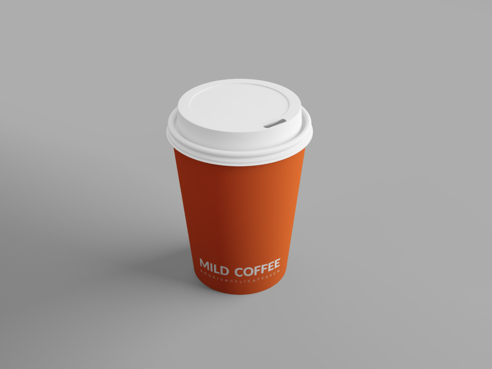
Nourish is a fictitious deli & grocery store located in the heart of Ponsonby Auckland, New Zealand. The brand aims to appeal to young, working professionals who are health & environmentally conscious and are often on-the-go.
The personality of the brand is inspired by the down-to-earth nature of the everyday kiwi. The name "Nourish" was chosen because it has a kind of emotional life to it beyond just a really practical side. The food we like to eat, the food that we're most nourished by, is the food that has a story behind it, the food that has a face behind it, is the food that we can trust and that’s delicious at the same time.
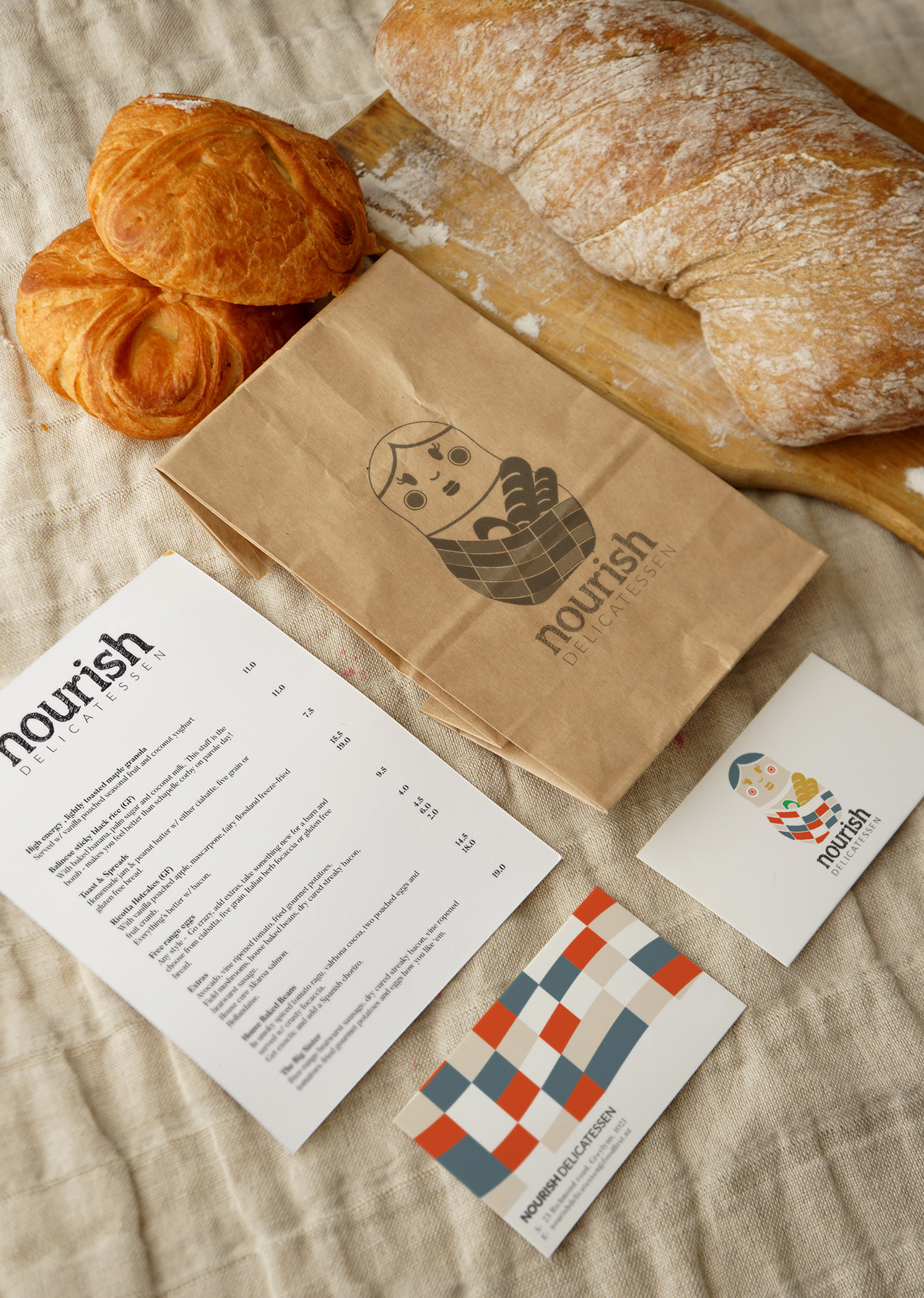
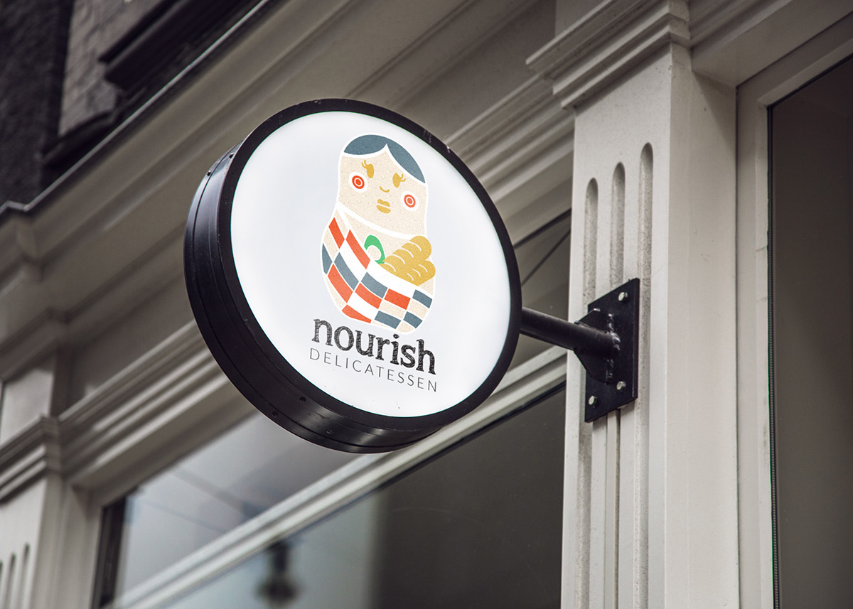
The image of Nourish is represented by a Russian doll like design, which originally represented family. Taking advantage of the concept and meaning behind the design, I used the neutral colours that are seen throughout New Zealand and recreated the doll to have softer edges, bright, lively and eye-catching colour, enhancing the character to become a relatable kitchen companion. With the target audience in mind, the brand uses recycled paper stock for it’s packaging and labeling which is not only economic and environmentally sustainable, it also gives the brand a vintage, down-to-earth feel.