


MIMOODS KNITS
The technique of knitting not only forms the conceptual basis for the clothes of Mimoods, for us it was also the starting point to create their new identity.
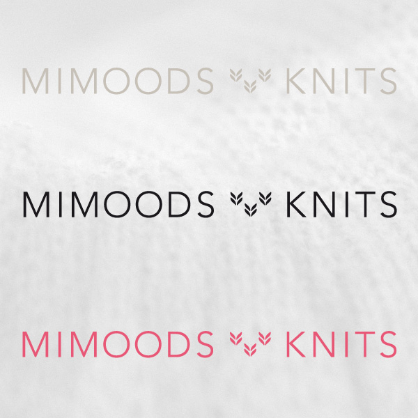
The new logo hints to a knitting loop, the garment cards are shaped as a woolcard. The beautiful paper used and innovatiove printing are a reference to the tactility and emotions of wool as a material.
The new logo hints to a knitting loop, the garment cards are shaped as a woolcard. The beautiful paper used and innovatiove printing are a reference to the tactility and emotions of wool as a material.

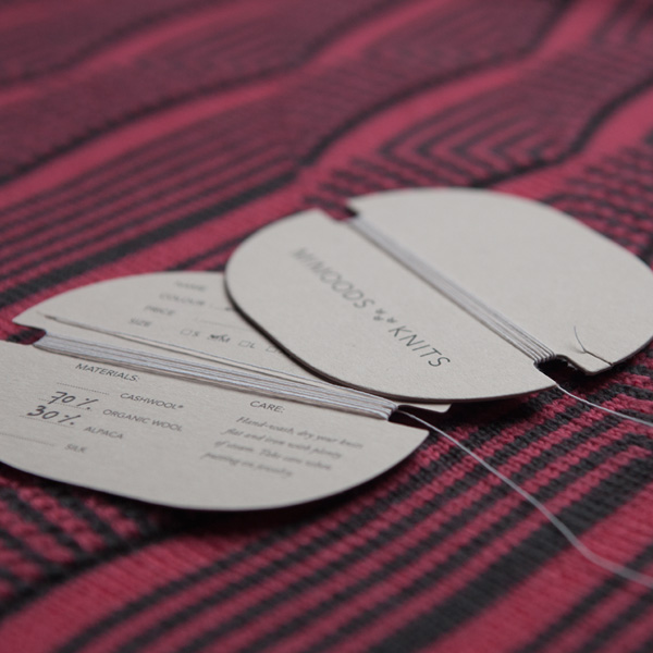
The label cards are inspired by the small cards of wool you can buy in te stores. A bamboo yarn is looped around and makes sure the cards are nicely fastened to the garments.
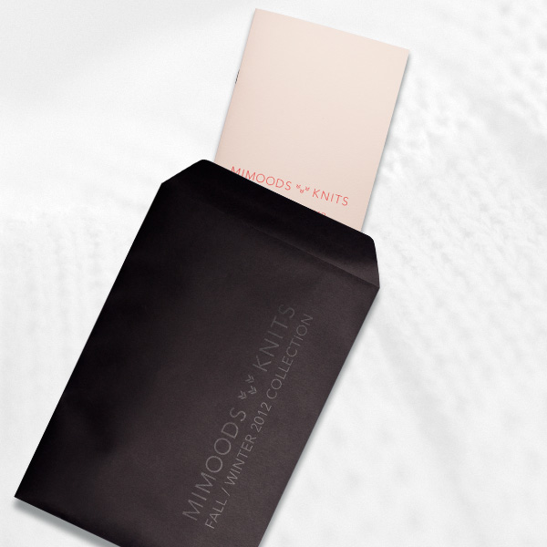
The catalogue was send to shops packed in a black envelop which we had printed with black ink. This black on black gives the envelop a luxurious feel, even though it was very cheap and easy to make.

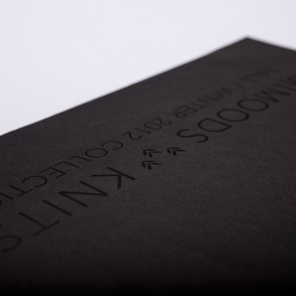
The catalogue's size is 15x30cm. These proportions also define the grid within the catalogue, but also the grid for the website.
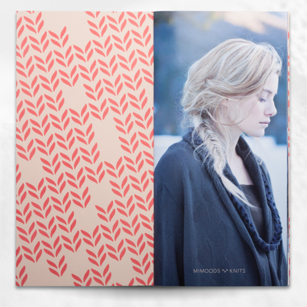


By using a cleartoner coating during the printing process we were able to add an almost invisible texture to the parts of the pages that are white.
The new website
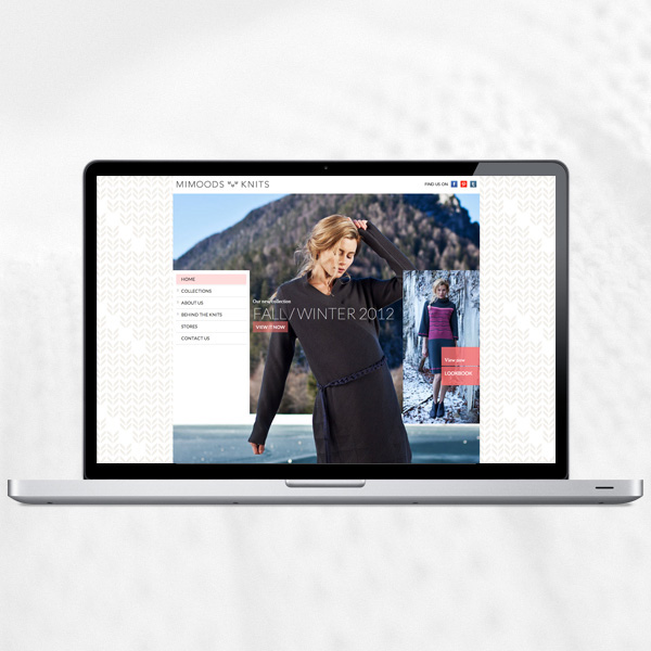
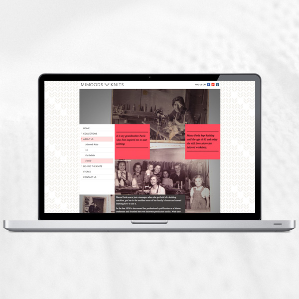
The brand experience plays an important role for Mimoods, and the website reflects this by being one big moodboard. Or as we called it a Mimoodsboard. The brand story gets knitted in between text and images, creating a visual impression of the label. Therefor the visitors don't need to read everything to understand what Mimoods stands for: unique design, high quality knitwear, made in the spirit of a personal approach to design and production.
The brand experience plays an important role for Mimoods, and the website reflects this by being one big moodboard. Or as we called it a Mimoodsboard. The brand story gets knitted in between text and images, creating a visual impression of the label. Therefor the visitors don't need to read everything to understand what Mimoods stands for: unique design, high quality knitwear, made in the spirit of a personal approach to design and production.
We also shot and produced a "behind the scenes" video of the photo shoot.


