—
About ShereIt
ShereIt is a fintech startup that partners with banks and institutions to create social trading products.
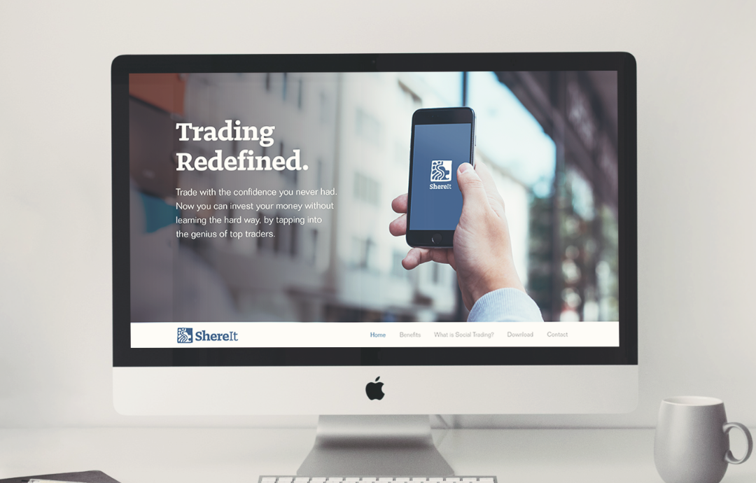
Through an easy-to-use mobile app, ShereIt aims to provide retail investors from all walks of life—moms, dads, and blue collar workers—with the confidence and education to trade the markets. Their brand lives at the intersection of modern technology and the age-old practice of trading.

—
Brand Requirements
The experience we seek to create is warm and humanistic, in contrast to the cold rationality which financial services are usually associated with, allowing the product to be universally accessible. As user and customer experience is central to the ShereIt brand, we created a series of guidelines to ensure a consistent and unique look and feel no matter where it’s seen.
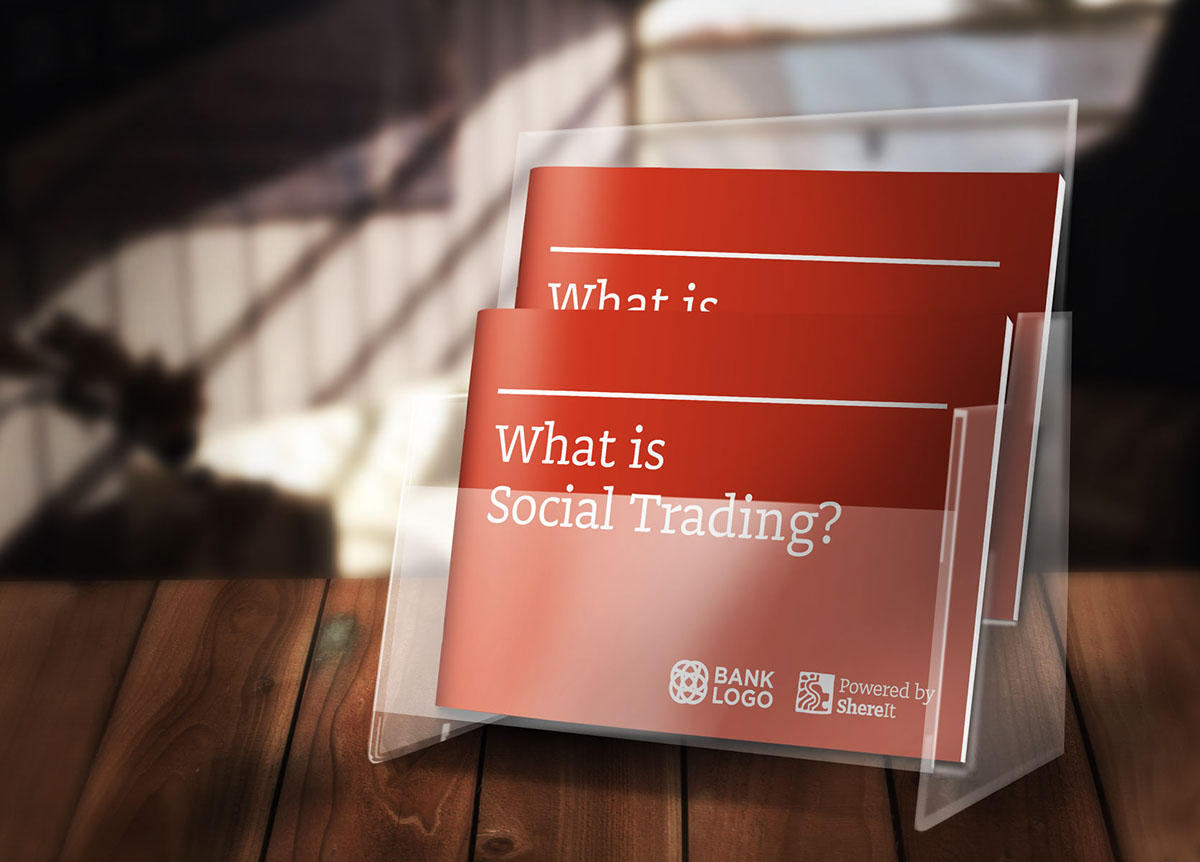
To reflect ShereIt’s position in the marketplace, our brand was designed to work alongside partner banks and firms, in addition to standing out from competing social trading services.
The main objective was to represent a traditional and authoritative brand that is also friendly and accessible, with the use of a lion symbol.
Challenges
The lion is an extremely popular motif across many industries. We had to create something distinct, that encompassed all the necessary qualities.
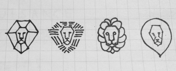
Concept Sketches


Shortlisted Concept:

Final Logomark:

—
The ShereIt Seal
The final ShereIt brandmark comprises of a seal/stamp with organic rough-hewn edges, indicating tradition with a humanistic touch. It features an abstract Asian-inspired lion head in profile view, including a subtle dual-purpose S / $ symbol within.
The word Shere is a romanized spelling of the Hindi word for lion, reflecting the tenacity and Asian origins of the company: initially based in Singapore and India, both nations represented by lions in their national symbols.
Besides the lion motif, Shere is also an apt homophone with the word share— as in trading stocks and shares, forming an additional double-entendré with the traditional meaning of share, reflecting the social sharing aspect of their products.

—
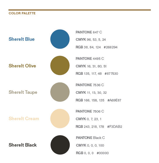
Brand Book
A brand book was created with guidelines on all the essentials: lockups, naming and spelling, tagline, partner branding lockups, clear space, violations, color palette, typography (print + web), tone of voice, image treatments, and other applications.


—
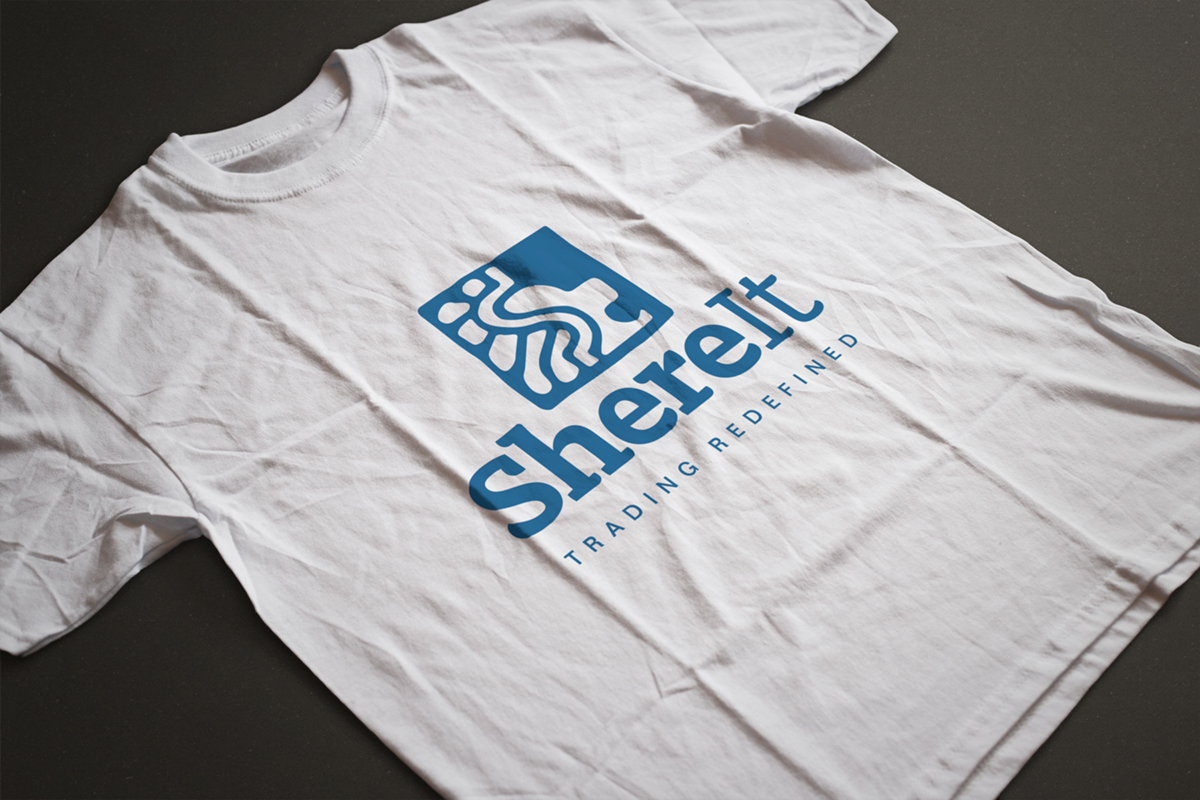
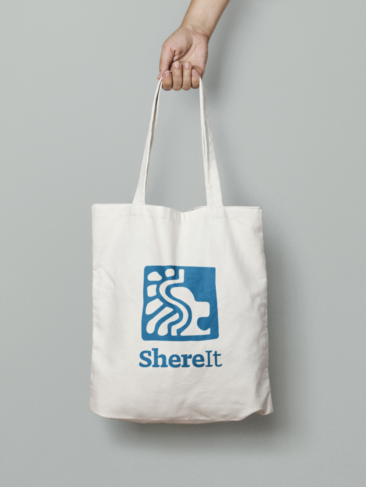
Applications: