
Project Overview
Xesel is an online food delivery service. Users can select meals from the various restaurants that are part of Xesel's network and receive it at their home, work or elsewhere.
Information provided here is limited due to non-disclosure agreement.

Xesel’s interface when I joined (created before my arrival)
Context
There were only 4 people involved with the project when I joined and no budget to be spent. The website was in its infancy and the goal was to increase adoption, customer retention and amount of orders.
I needed to understand how users were interacting with the product and what could be improved without spending money.
Definition of Baseline with Analytics and Heuristic Evaluation
My first steps consisted in setting up tools to collect data. This would help me find possible issues and also validate my future assumptions. I used Google Analytics to collect quantitative data and Inspectlet for qualitative. Inspectlet's free account allowed me to record a few random sessions a day where I could see mouse movement and clicks. It also provides click and scroll heatmaps.
While waiting for a good data sample, I performed a partial Heuristic Evaluation to find major usability issues. Partial because I performed it alone and this sort of review needs to use multiple experts and aggregate their results. Since I couldn’t afford other UX professionals, my own review served to generate assumptions that could be reinforced with data from the previous tools set up.
Competitive Analysis
To have a better understanding of the market and how others were providing the same service, I went on to perform a Competitive Analysis. It consists in identifying your competitors and evaluating their strategies to determine their strengths and weaknesses relative to those of your own product or service. It also involves checking visual elements and interactions inside the website to understand most possible scenarios.

A few competitor examples
Visual Improvement
As happens with most new projects, there were lots of possible things to improve on Xesel. After the initial assessment, one thing that was lacking way behind the competition was the quality of visual elements. While sketching possible modifications to the website, I worked to improve the overall branding strategy.

From left to right: previous logo; new logo

From left to right: previous flyer example; new flyer example
Guerrilla Usability Testing
With a few ideas for improvement and without any resources available, I performed a slim version of Usability Testing with friends when I had the chance. Since ordering food online is an action known by most people, I could at least validate if my proposed user flow made sense.
At first, I validated the steps people expect to have when ordering food online. With the key user journeys defined, I created static mockups and validated them as well.

Sketching flows and concepts
New UI (User Interface)
We then changed most of the UI to be cleaner and to create a more streamlined flow. Without a dedicated front-end developer, I was responsible for creating all HTML, CSS and JavaScript. I also made the site responsive to be able to reach our mobile customers. Previously, we had a few visits from mobile devices but no orders.

Continuous Improvement
With the new UI users are spending a lot less time to complete an order and the number of orders increased. Without users being discouraged by the interface, the next goal is to increase website traffic.
The idea with Continuous Improvement is to set an optimization lifecycle where goals, metrics, user behaviour and feedback are regularly assessed and priorities set for the next actions to be taken.
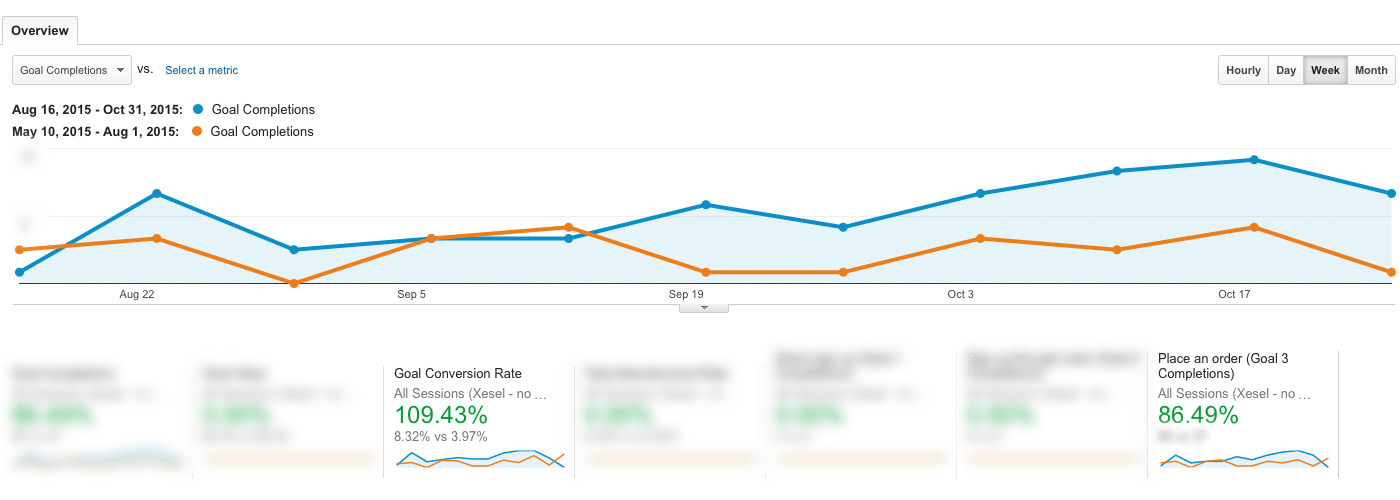
Comparison of goal completion in Google Analytics two and a half months before and after the major UI update

User session recorded using Inspectlet to verify common user behaviour


