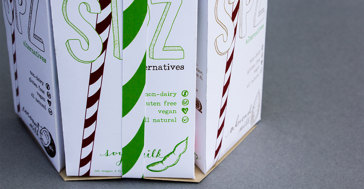
SIPZ ALTERNATIVES PRODUCT CONCEPT
These days, kids are used to eating foods that are unhealthy and readily available. The challenge of this project was to provide high school teens with a healthy alternative that is still desirable, delicious, and available to everyone. From my personal high school experience, I was scared for life by the disgusting milk pouches, containing tons of sugar and tasting awful. I remember wishing that there was some sort of alternative, as opposed to the even more sugary juices. This inspired me to create a package for an alternative milk to be served in high schools; one that is safe for everyone to enjoy. Now that I had figured out my subject, the next challenge was to create a brand and design a package in spite of my
awful milk experience.
awful milk experience.
I began with the basics: healthy, all natural, and delicious—all to be represented by hand-rendered elements. The name, being hip and clever, had to be paired with a desirable color palette—something bright and eye-catching. At the same time, there had to be a message of good health and trust in the brand. This led me to pair the natural colors of the ingredients with the eye-catching red and green, making a brand that says
fun as well as healthy.
fun as well as healthy.


