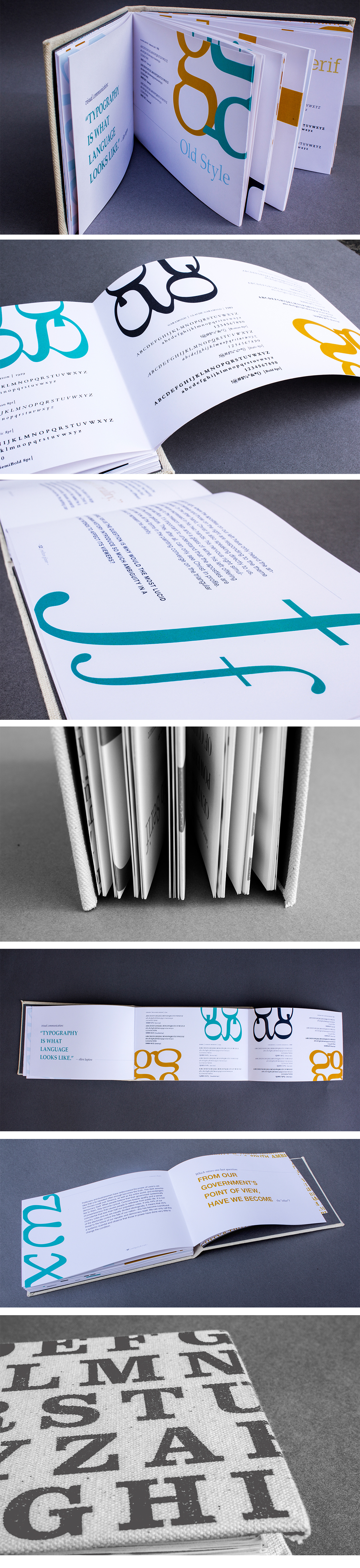
FONT RESOURCE BOOK: PERSONAL TYPEOGRAPHY PROJECT
My love for typography and the art of the letter began in high school when I started drawing letterforms for my high school Associated Student Body group. I would spend the entire class periods making signs to promote events on campus, paying special attention to my lettering techniques and styles. In becoming a design student, this love for letters had only flourished, especially in learning the beauty behind the typeface and it’s many categories.
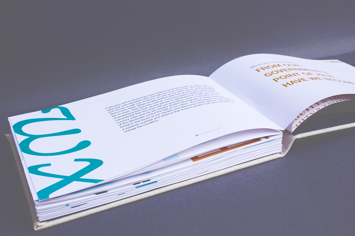
This Font Resource Book was created to be just that—a resource for future projects as an aid in choosing a typeface and when to use them. The design is based off of an essay by Milton Glaser about the rise of the use of ambiguity in design and advertising, and why telling the truth, rather, is essential to good design and even to human life. The layout design uses opacity changes, fold out pages, and scale in order to communicate Glaser’s main points of his speech while also creating a beautiful, yet ambitiously designed book that is both aesthetically pleasing and useful to designers.