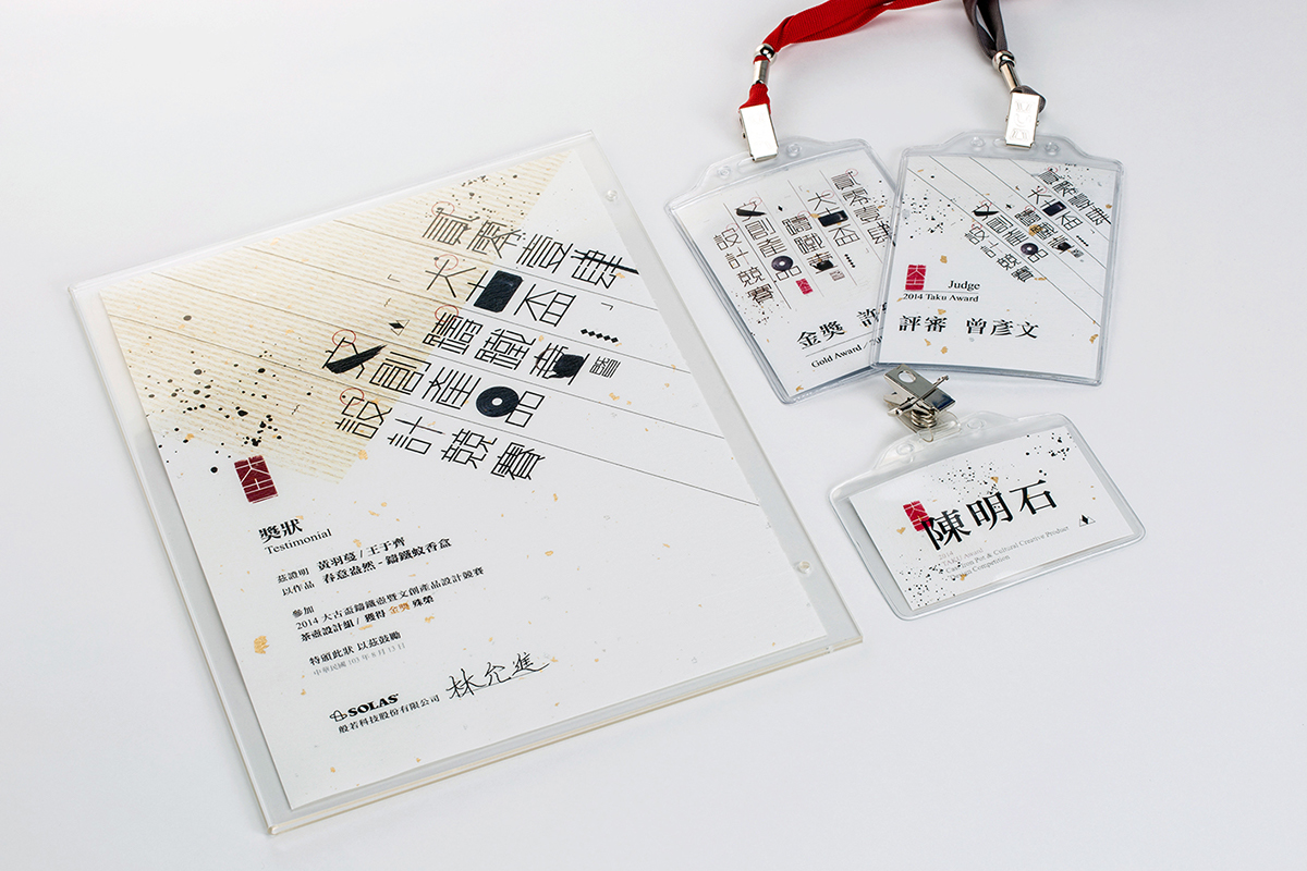
2014 大古盃鑄鐵壺暨文創產品設計競賽
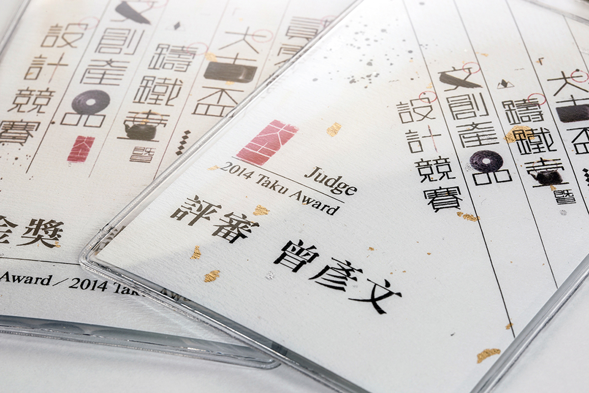
2014 TAKU Award
2014 TAKU Award
∣
Category:Visual Identity
Client:大古鐵器 TAKU IRONWARE
Years:2014
Designer:陳品丞 Chen Ping-Chen
∣
以大古鐵器的品牌形象而言,在設計的調性定位上容易得到「東方風格」的答案,而「文房四寶」便是一個適合應用的視覺語彙。
其他如梅花、書法、龍紋等等雖然都是能夠直接聯想的元素,但若不斷地強調「東方風格」則很可能造成參賽者單一面向的解讀,
因此在設計中除了既有的東方元素之外,我也加入了比較西式的幾何構造表現。
∣
The "TAKU Ironware" brand image design was based on the "Oriental style." The "Four Treasures of the Study" are depicted in the visual design. Other associated elements in the design include plums, calligraphy, dragon lines, and others. However, constant emphasis on an "Oriental style" will likely cause a biased interpretation of the work. Therefore, the design also incorporates Western-style geometric figures along with the aforementioned oriental elements to have a multilateral image.
∣