Infographics are a major part of this fast information, easy understanding world. For this class project, we were tasked with making an infographic that reflected this, by tackling a complex topic and presenting it in a way so that visually, it was a compelling breakdown of all the facts and statistics surrounding that topic. Inspired by magazine design and conceptual presentation, I picked a topic centered around wine and food pairings.
For my design, I wanted to keep the elegant feel that wine brings with it, while making the piece very approachable, while still modern. In my design, I used typefaces and color to reinforce this elegant modern feel. I kept the palette pretty neutral because I knew that there would be a lot of different colors in the posters first off. The typefaces I picked were: Harriet (a modern serif font), Gotham (a geometric sans serif typeface) and Herschel (a roughened old style font that had some finishes that mimic handwriting). I thought these typefaces blended well together, particularly Herschel.
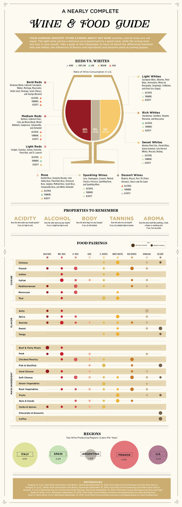
The act of pairing food with wine can be quite subjective (and not really heavy with scientific stats and percentages), so I sought to provide an easy to understand guideline. While the actual presentation of a chart that displayed wine and food pairings was important, I also wanted to explain a little bit about why its important to pick the right wine and show that knowing the properties of a wine is key to choosing a good pairing. I knew that I wanted to take a sort of “top -down” approach to explaining wine pairings. With a poster like this, I was thinking that relevance and longevity should be something that I should strive for in the design and information presented.