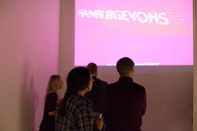
My thesis exhibition for my MFA with an emphasis in graphic design at SDSU ran from April 19-April 30 of 2015.
The exhibition consisted of four separate pieces that functioned as type specimens for the mutable typeface I designed,Model Q, and also represented the different media with which graphic designers must work in contemporary society.
The show included a screenprinted book, an animation styled to start out as an instructive PowerPoint presentation which quickly devolves into something else, an interactive screen and button piece that shuffled through the 315 glyphs I designed for the typeface, and a dark room that included a sculptural piece which I dubbed “the labyrinth” which included 42 pieces of screenprinted acrylic sheets that I cut on a CNC router which fit together using half-lap joints in a modular fashion without adhesives.
Here is my thesis statement:
According to writer, philosopher, and 20th century father of semiotics Umberto Eco, signifiers, or signs that represent a concept, are impossible to define or visualize because every single piece of language—every semantic unit—can only be understood in the context of its relationship to other semantic units. He refers to this idea as the Model Q, an everlasting recursivity that cannot be visualized. Despite this claim, he tries to describe the concept as being like a boundless net; a thing in which every single point is connected or could be connected to every single other point, and is completely dependent upon context and the perceptions of the user.
When we think of written language, however, we think that words, once printed, become solid or everlasting, as if their actual atomic make-up has somehow become permanent when in printed form. This is a concept that linguist Ferdinand de Saussure calls “The Prestige of Writing”; the false idea that written words are permanent and eternal.
Model Q is a typeface I designed during the course of the past two years that is mutable, which means that every letter of the alphabet—both capitals and lowercase—has alternate stylistic variants, also called discretionary glyphs. What this means is that the designer working with the typeface can choose which stylistic glyph they want to use in their design, and no matter what choice is made, all of the letters and their alternate glyphs still work together as a system. Matthew Carter’s 1995 Walker typeface was a precursor to the mutable typeface fad, which was a font that had serifs that could “snap” on or off of the letters to change their appearance. OpenType font software in the 1990s allowed for easier creation and use of glyph variations, and mutable typefaces have become more prominent in the last five years.
My typeface Model Q is a metaphor or allegory for Umberto Eco’s eponymous concept; the stylistic alternate versions of each letter become more abstract as the designer progresses through them, and the final stylistic set becomes so abstract it is hardly legible. However, once the letters are put together to form a word, each letter derives legibility from the letters around it.
Using the typeface Model Q as my medium, I assert that written language is capricious and temporary because every person that reads a text has a unique perspective influenced by culture, environment, life experiences, and even the mood they might be in when the text is read. Therefore, no matter how clearly something is conveyed, one can never predict how another person might interpret it. The very forms of the letters in my typeface, just like the derivation of meaning from a text, are ethereal and changing based on those that view them. There is no ultimate truth or meaning; all signification is derived through context—through the relationship that signifiers have to each other and to the reader of the text.


