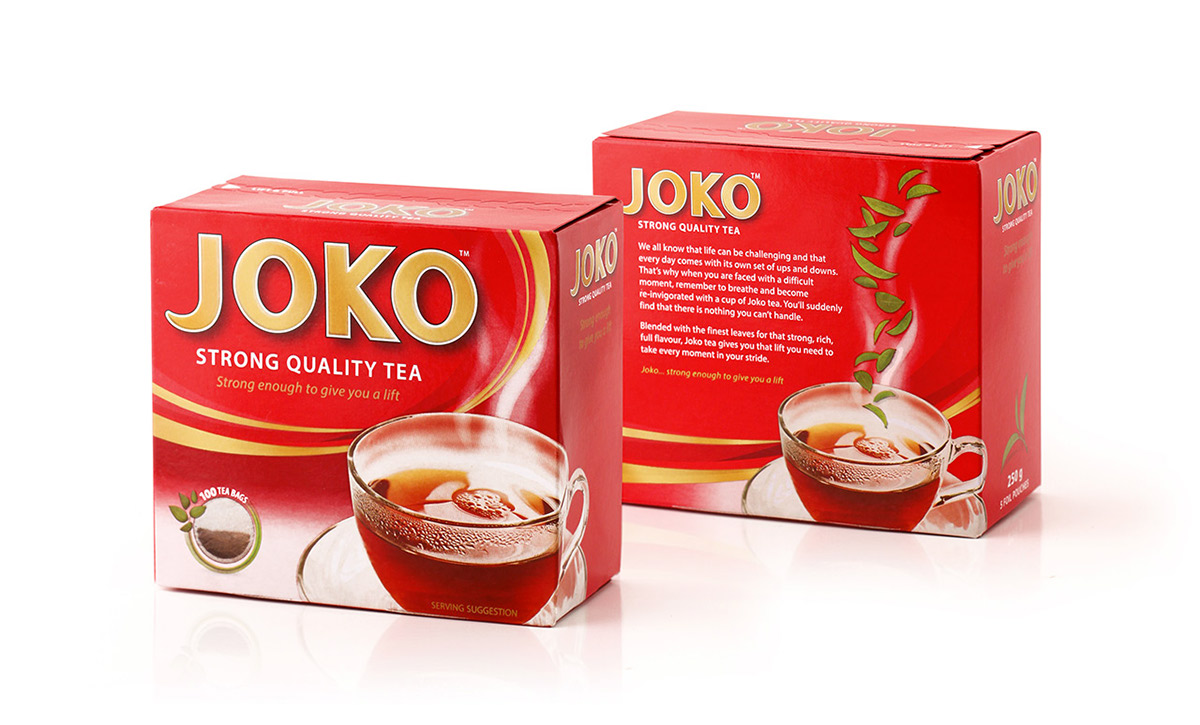
Joko is one of the local jewels in the South African tea market with a rich history and heritage going back to 1904. In recent years, it has come under increasing pressure from competitors, growing slower than the overall category. One of the key needs was a visual upgrade. Just Design was tasked to rejuvenate the packaging, bringing modernity, strength and premiumness to the brand. Part of the job was to increase standout on shelf; improve differentiation between bag and loose tea; and to dial up the taste appeal. Our creative solution introduced movement and energy into a previously rigid pack. The use of interacting layers and colours within the background add depth to the pack and reflect the ‘steeping’ process, which releases the flavour and uplifting qualities of tea. The product image was emphasised and given more taste appeal with the steam rising up from the cup and interacting with the logo. A lock-up creates a strong visual anchor for the design, housing a newly refined Joko logo.
Overall the dynamic and premium new pack brings to life the brand message of ‘strong enough to give you a lift’ and
re-establishes Joko as a leader in the category.