We transform “Akvion” from the brand, which simply produces the vitamin complexes into the company, which gives a modern person an opportunity to escape from the office lifestyle with the lack of movements and to become more active, self-confident and strong, by choosing healthy lifestyle, natural and fresh food and sport activities.
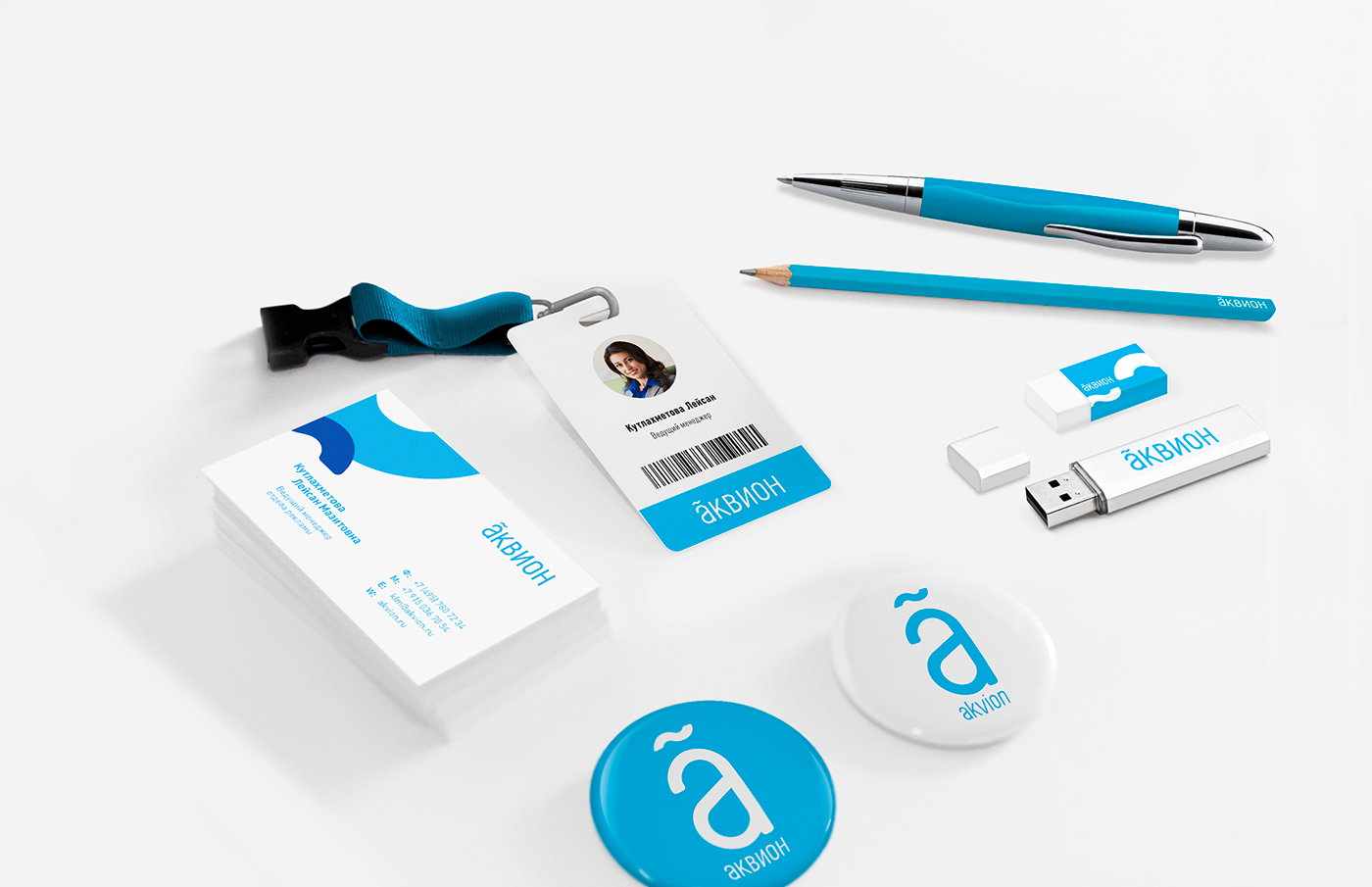
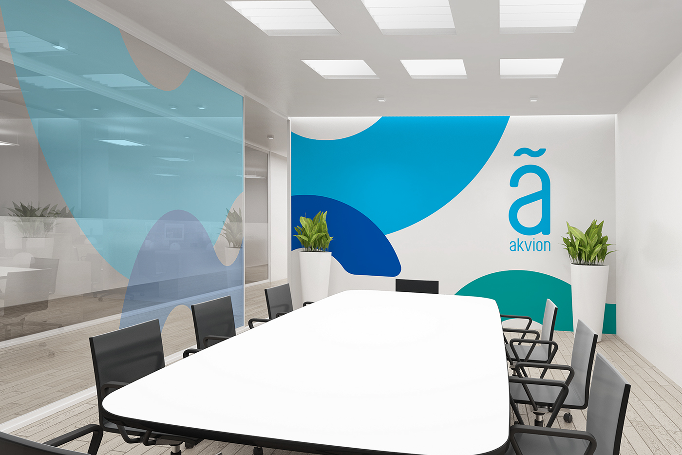
The base of graphic image is letter “A” – the first one in the alphabet, which symbolises water (latin – "Aqua"). Above the letter we place the tilde – sign which in ancient world helped to recognise the number out of the letter. “A” combined with the tilde meant the number “1”.
In the modern context this symbol stands for the source of life, the symbol of birth and action, energy, power and nature.