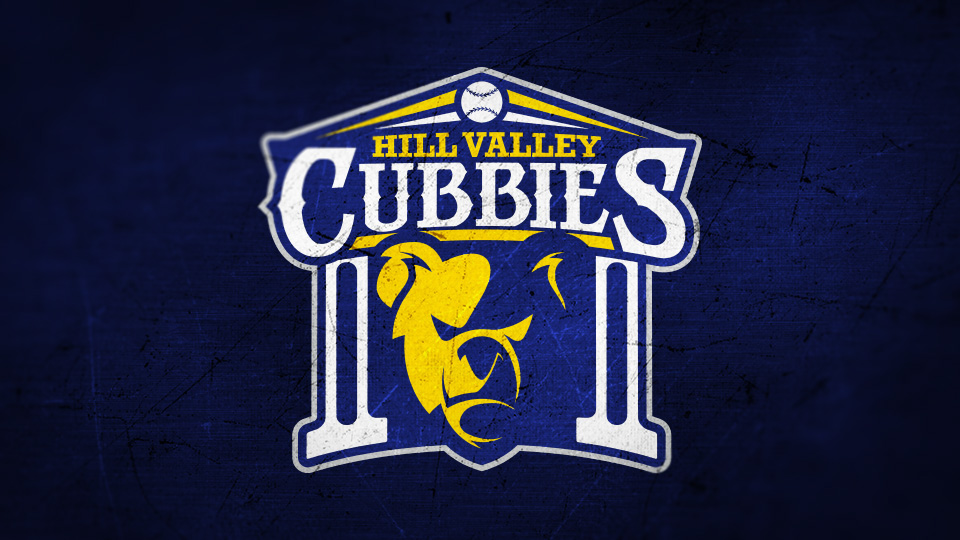
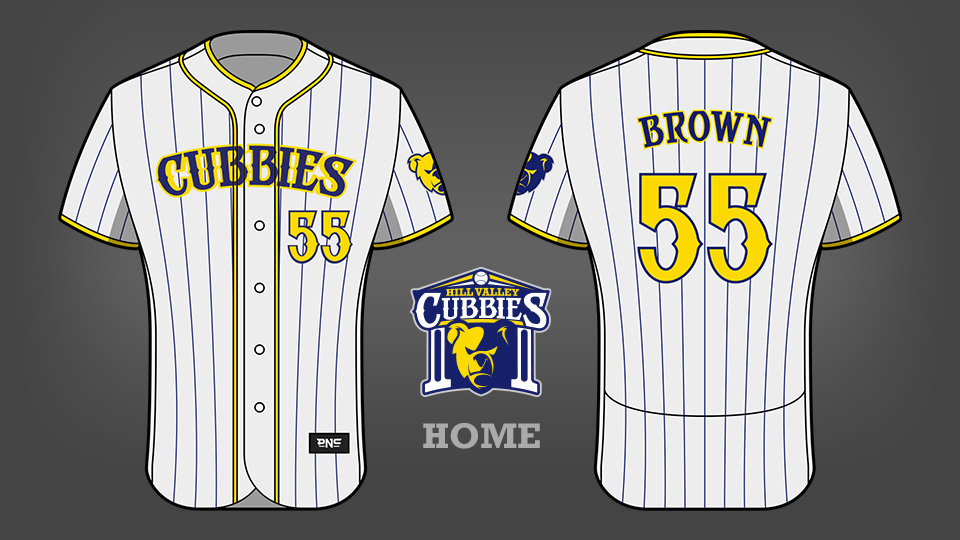
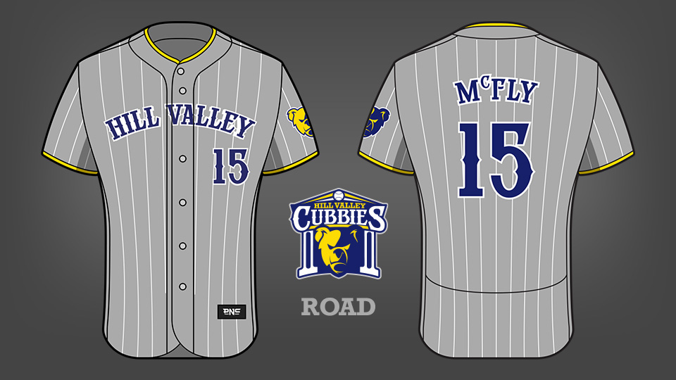
HILL VALLEY CUBBIES
In the lead up to 'Back to the Future Day', I wanted to be able to create something as a tribute to the film series. While other designers and artists are drawing Deloreans and hoverboards and bottles of Pepsi Perfect, I opted to expand on the world building a little by giving Hill Valley a baseball team.
But why baseball?
For those that haven't seen Back to the Future Part 2 or heard others talk about it the protagonist, Marty McFly, time travels to 2015 and learns that the Chicago Cubs win the World Series against the Miami Gators (a fictional team). I chose baseball for the reason that is mentioned in this movie.
But why the Cubbies?
It is a reference to the Chicago Cubs in Back to the Future Part 2 and also the bear seen in Part 3.
Is that the Hill Valley clock tower?
Yes, it certainly is. One of the most recognisable and consistent things about Hill Valley is the clock tower. I like to imagine that a baseball team in Hill Valley would value tradition. The pillars of the clock tower could also represent solidarity.
Are there any other references used in the logo?
The fonts used are inspired by the foundation of Hill Valley in the old west during the late 1800's. Dark blue represents the night sky while yellow represents lightning which struck the clock tower in 1955. The shading on the bear is also meant to resemble a bolt of lightning.