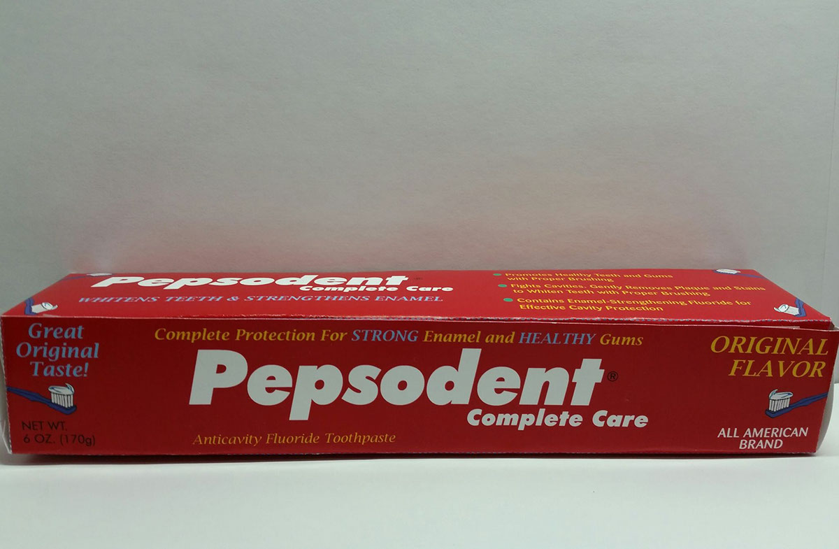
I choose to redesign this toothpaste box because it looked like there was too much blue and I didn't like the fonts that they used. I redesigned it the way I did by changing the bullet points to circles because I think that looks better than squares. I wanted to keep the light blue color and the red to make it a little darker. I really like the fonts that I choose. Also, I wanted to keep the boldness on the words strong and healthy.


