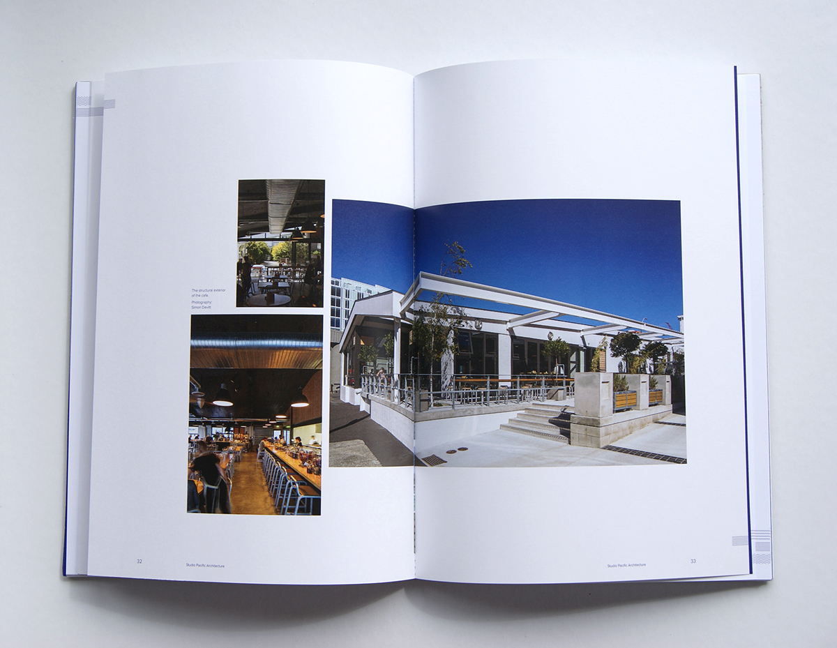
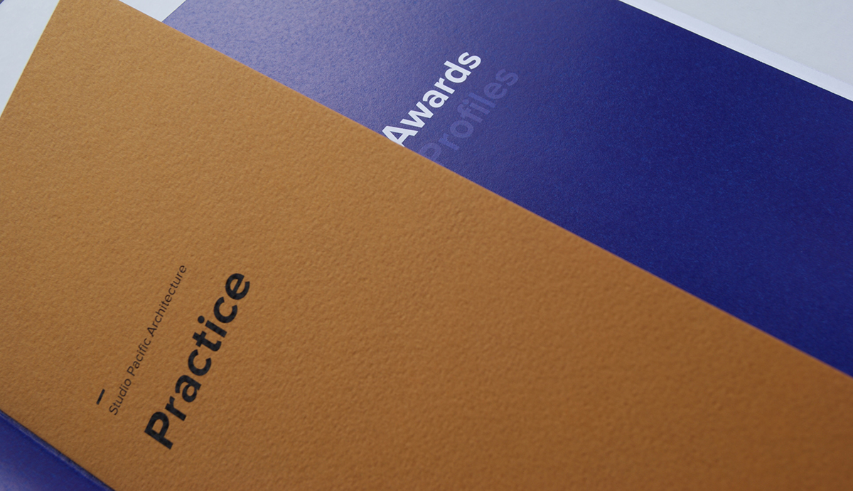
This book, designed for Wellington Architecture firm Studio Pacific Architecture, portrays the Pacific aspect of Studio Pacific as it is seen as their point of difference, setting it apart from other architecture firms. The Pacific notion is illustrated through the patterns on the cover and section openers which have also been merged with architectural forms. The patterns on the edges of Building pages also reference Pacifica while also being indicative of the type of building discussed. The ochre has Pacific connotations while also referencing Studio Pacific Architectures’ brand colour orange. The blue references Pacific while also adding a touch of luxury and prestige. Proxima Nova is a modern, clean and geometric typeface while Garamond adds a stable, historical base, referencing architecture. The cover is made of a natural, raw material but with clean, modern additions; much like Studio Pacific’s work.


