In February of 2015 I did some freelance logo design for a brand-new Jamaican swimsuit brand calleded CALA. The client gave me a logo that a friend had done for her and told me to work from there. These were my steps.
One of the brand's selling points was that it catered to women of all sizes, so they wanted to show that in the logo some how. The client also wanted it to be sexy and fun, but also classy. I started with this simplified female figure swinging because if feel like it hit all of those marks except for the classy maybe. That would be covered by my font choices.

The client thought that the figure was a bit too full-bodied and didn't want the brand to only be associated with their plus-size wear, so I was asked to tone the figure down a bit. Personally I still love all of these figures. I feel like these are some of my best usages of minimalistic design. The way her hair in motion and her head are the same solid shape is really nice to me.

With a font change I rethought the concept just a little bit and had the figure holding on to the type instead of swinging off of a rope. I thought this was way more interesting visually. The figure underlines the type in a really dynamic way that I like.

Finally, I was instructed by the client to put a bikini on the figure since it is a swimsuit brand we're trying to sell. I disagreed a bit with this decision but only because I wasn't sure what the bikini detail would look like one the logo was shrunken down. It ended up working out pretty good in the end.


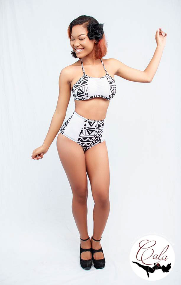
Here is the logo as it features as a watermark - photography done by Cevan Coore - and on the cover photo for CALA's Facebook page.