PF Centro Serif Compressed
Copyright ©2015
Designer: Panos Vassiliou
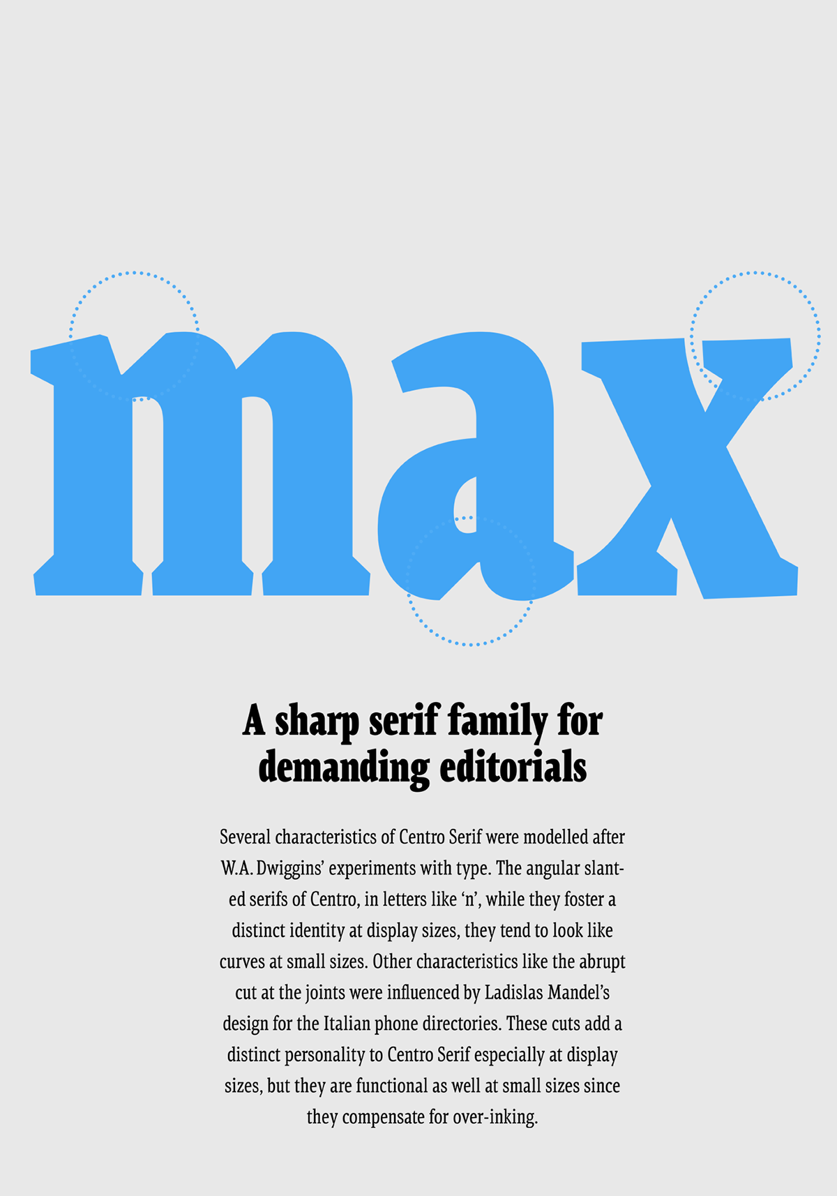
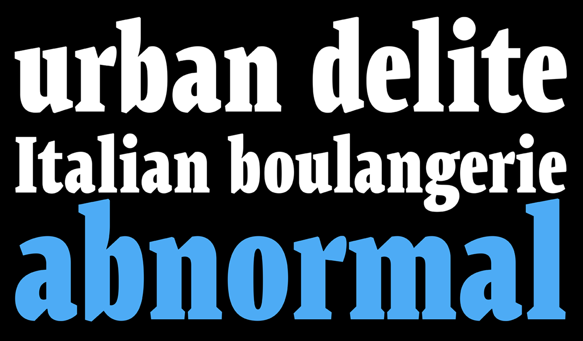
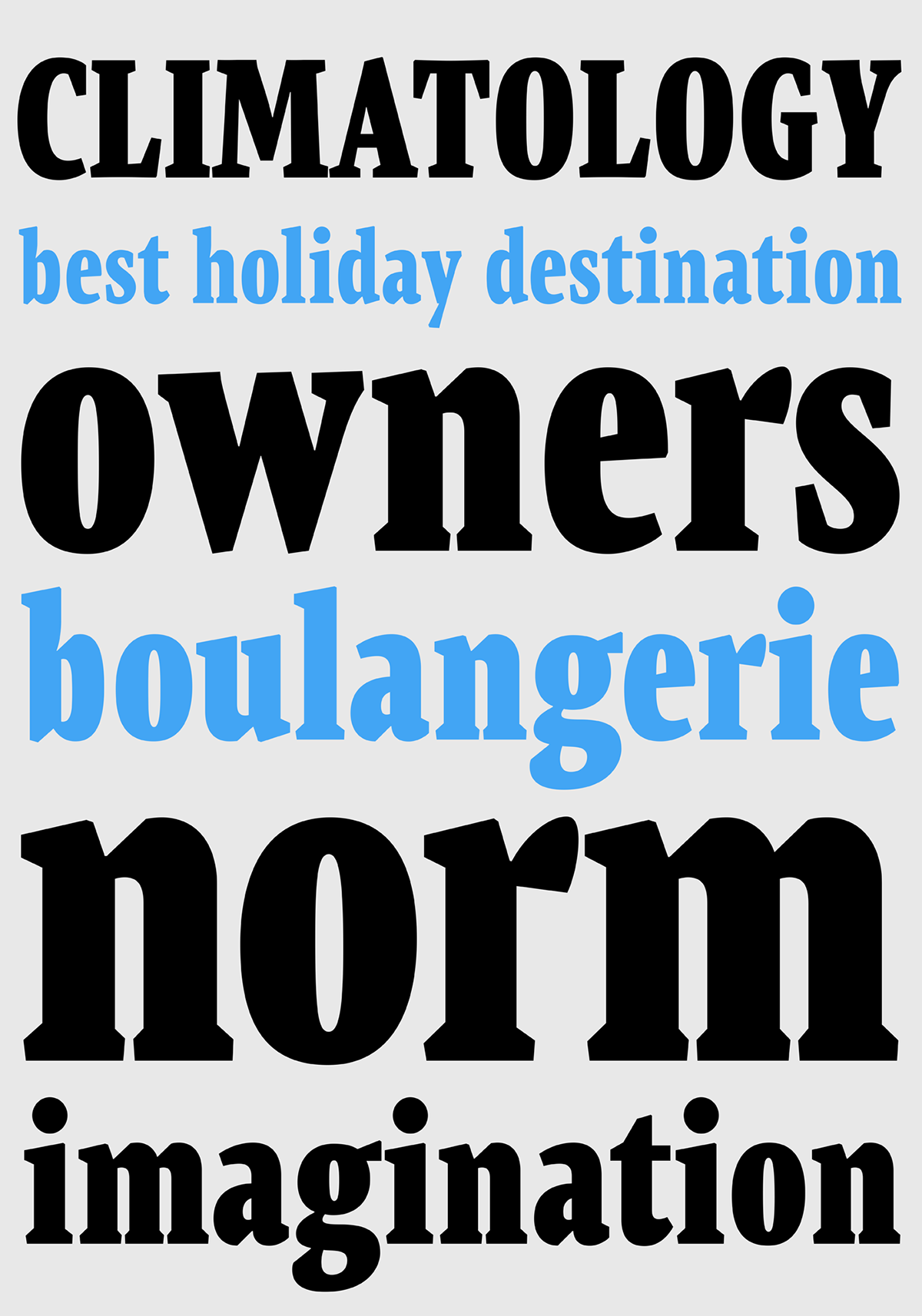
Centro Serif Compressed is part of a larger type system that includes a condensed and an extra condensed version which all together complement the award-winning Centro Serif Pro type family. It was originally developed for the redesign of the Financial Times (Deutschland) newspaper in order to offer a strong readable custom font family which managed to retain the serious reputation of the newspaper. Its robust, low contrast characteristics enhance its readability at small sizes. The angular slanted serifs as well as the abrupt cuts at the joints, while they foster a distinct identity at display sizes, they mellow down and tend to look a lot like curves at small sizes. At the same time, the overpowering effect of the angular serifs is balanced by the ‘tear-shaped’ ball terminals in letters like ‘c’, ‘f’. The x-height is larger than usual which makes it more legible at smaller sizes. Finally, the stress is not quite vertical but slightly inclined. Centro Serif gives you the essence of a very clean, expressive, legible and modern set of typefaces which makes it an ideal choice for newspapers and magazines. Centro Serif Compressed comes with 8 styles including italics, whereas the Centro Serif type system offers a comprehensive range of 32 font variations.