As part of our ever-evolving brand refresh, I took a very dated looking product brochure and gave it a new lease on life. The new design featured colorful photography that avoided the typical cliché pitfalls, and incorporated clean, 2D iconography and graphics. The crowded design was reworked into a more consumable 10-page format with plenty of breathing room for both copy and graphics.
(The old brochure can be viewed at the bottom of this page)

The cover is simple, yet impactful, featuring a bold product name and colorful imagery.

Bulleted lists were enhanced with colorful iconography that reinforced the messaging.

Visual interest was added using large photographs of everyday people. Quick snippets of data points were highlighted with iconography.

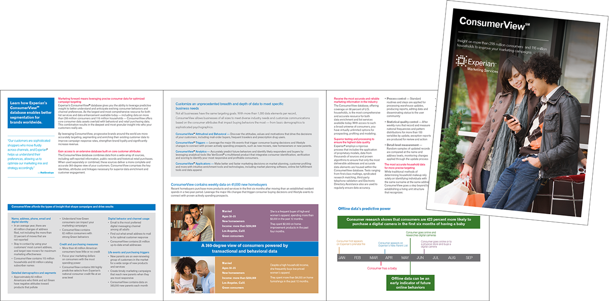
On the right-hand page, Dana – a visual representation of 'your best customer' – was used to illustrate how some customers may look very similar, but when given the 360-degree view our product offers, their buying habits are quite different. The old brochure used cliché stock photography and bulleted copy for this concept, and the effect was lost.
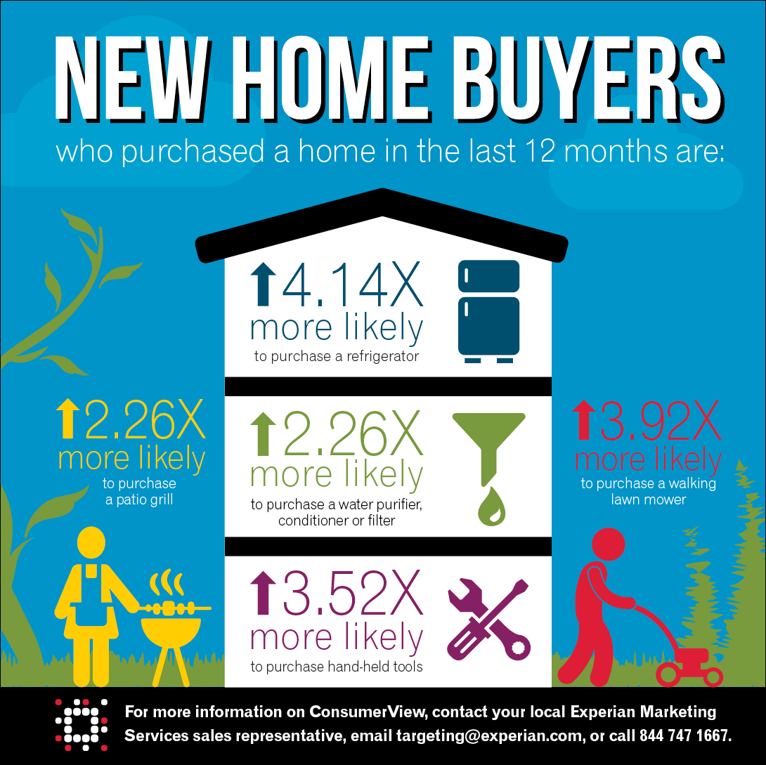
This full-page, colorful infographic focused on new home buyers to illustrate the level of detail down to which the data can be drilled, giving marketers a complete view of their customers. A UV flood was used on this page to further highlight this information in the printed piece.
The old brochure can be seen here. It was a 6-page tri-fold, with very copy heavy pages, cliché photo choices, and very basic graphics.


