A selection of logos and various identities I've created.
From small enterprise and not-for-profit, to large corporations and small sports teams... it's always fun to find each client's appropriate flavour and voice.
I really enjoy creating logos. They all start as scribbles in a sketch book, to end up being precisely built in Adobe Illustrator™.

Ride for a Lifetime, is Kids Cancer Care of Alberta's (KCCFA) motorcycle fundraising ride. This logo was created to celebrate its 10th anniversary. The look and feel needed to be refreshed and keep a 'biker' flavour.
Not really a logo... more like an identity for a special event fundraiser for Kids Cancer Care of Alberta, Parents' Quest for the Cure Gala. Total fun and a great bunch of people to work with!

This logo was created for a capital campaign for Hospice Calgary, to help them raise $7M for a new office and counselling centre.
Calgary Cerebral Palsy Association needed a fresh new look. They insisted on keeping a wheelchair with a parent/child icon. Although, not my favourite type treatment, the client has been really happy with it. This is a great and fun look for a great cause and an amazing group of folks helping families in need of guidance and help.
Children Without Poverty is a Calgary-based organization that helps families in need, giving them a hand up, not a hand out.

Acuity Advantage is a Calgary-based executive assistant company. With a very sophisticated customer base, the client needed a look that was refined, modern and timeless. A custom-made monogram came to mind as the best possible solution.

Developed in conjunction with a freelancer, this logo was a collaboration between the freelancer, the client and I. Typical scenario for a disaster, but not this time around...
Mind you, the client wanted a 'fair' look, with possibly 'monkeys or clowns' on their letterhead...
I kid you not!
Mind you, the client wanted a 'fair' look, with possibly 'monkeys or clowns' on their letterhead...
I kid you not!
Forge Cycle Works was a small custom motorcycle builder based in Calgary. Unfortunately defunct, this little shop has the vision and skills to make it big.
Their customers were high-end corporate people and their logo needed to look elegant, well crafted and reflect their philosophy of attention to details and uniqueness.
Their customers were high-end corporate people and their logo needed to look elegant, well crafted and reflect their philosophy of attention to details and uniqueness.
Alberta Powersports is an importer of used motorcycles, quads, dirtbikes and anything else with a motor that goes 'vroOOom'...

The Calgary Motorcycle Roadracing Association needed a fresh logo. Having to "play" only with its initials, I did not wanted their identity to look cheesy (think flames) yet have a true Canadian flavour to it.

Propipe is a manufacturer of equipment, pumps, etc. for the oil & gas industry. From engineering to manufacturing and implementation.
They needed a rebrand, with funky colours, to accompany this growing company into the world (and boardrooms) of large corporations.
They needed a rebrand, with funky colours, to accompany this growing company into the world (and boardrooms) of large corporations.
RDE is a subsidiary of Propipe, hence the same colour palette. The three letters are the initials of the owners' wife and two children. RDE is a manufacturer of containers and vessels for the oil & gas industry (such as tanks for NGLs).
The circling shape developed illustrates the vessels, containment, but also the family ties, and how strong and connected the two are, in the eyes of the owner.
The circling shape developed illustrates the vessels, containment, but also the family ties, and how strong and connected the two are, in the eyes of the owner.

Horizon is the 'mothership' of a bunch of companies, such as Matrix (see below). They needed a refresh of their identity, which originally contained a rig, a sunset, initials and fully spelled name.
Originally designed to be just initials for uniforms, this logo evolved into a full scale rebrand.
I think it embodies what they do, and the initials can live on their own, for embroidery on uniforms, stickers on hardhats and signage on trucks. Colours were a continuation from the original ID.
Originally designed to be just initials for uniforms, this logo evolved into a full scale rebrand.
I think it embodies what they do, and the initials can live on their own, for embroidery on uniforms, stickers on hardhats and signage on trucks. Colours were a continuation from the original ID.

Matrix Well Servicing, is... what it says it does.
The main idea behind this ID was to create a bold, mechanical-looking logo. Their audience are roughnecks, technicians and engineers, so using a safety-type colour palette seemed appropriate.
The main idea behind this ID was to create a bold, mechanical-looking logo. Their audience are roughnecks, technicians and engineers, so using a safety-type colour palette seemed appropriate.
VERESEN is the new name of Fort Chicago, and energy, pipeline and NGL company based in Calgary. Although this logo evolved thru a grueling process of 20+ versions, this final version kept most of its original concept traits, including a bright burnt orange. Custom typeface is based on Trade Gothic, but has been manipulated extensively.
ENSECO, or ENergy SErvice COmpany is a Calgary-based oil & gas technical service enterprise with a focus on outperforming its competition. Eventually, the maple leaf was dropped (original client request). http://www.enseco.ca/
ENFORm, or ENergy FORmation, offers training programs and continuing education for the oil & gas sector, accredited by CAPP.
I came up with the name in a brainstorming session, and then was tasked to design its new logo. Maple leaf is where the client stepped in.
Sure Energy is a Calgary-based junior oil & gas company. Dynamic and modern, they were not afraid of an edgy techno typeface and bright ORANGE!!...

Iteration Energy is a publicly traded junior oil & gas company in Calgary. Neutraface typeface was a bit of a stretch for this conservative client, but they eventually embraced it.

Trilogy is a spin-off from Paramount Energy Corp. and therefore has a similar palette and look of the parent company. It is a mostly natural gas company based in Calgary. Is that Copperplate??... well, yes, you are so observant! (client's choice)

True Pictures is a Calgary-based film company. They wanted something unique, modern and edgy. The grey is a silver.
Cornerstone is a financial portfolio management company with large accounts and sophisticated customers. They needed an established, bank-like identity, without looking ancient and boring. This custom made type almost achieves the aforementioned parameters.... almost.
This logo has been designed to appear on STARS' red helicopters to thank the communities the organization serves, to reflect on the past 25 years of operating in Alberta and to acknowledge the support of sponsors and donors.
Easy task, right..?
A work in progress.
This logo is still under development, so stay tuned for the final version....
This logo is still under development, so stay tuned for the final version....
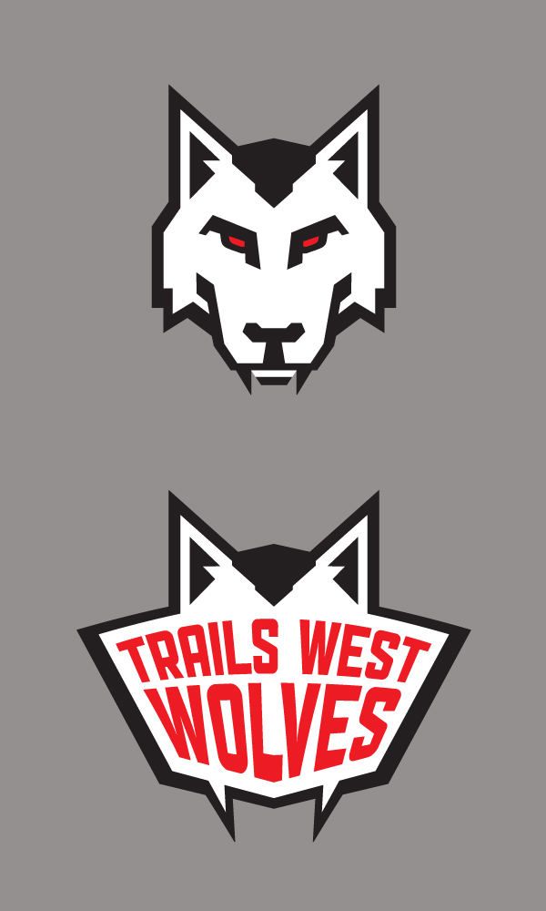
The Trails West Wolves is a junior local hockey team. I've been told that some of these 9 year old kids are so proud of their wolf, they are sleeping in their hockey jerseys...
Ain't that a fun one?...
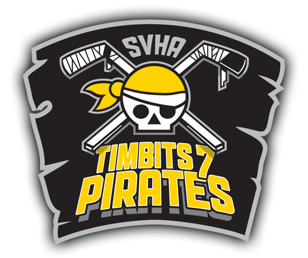
Created that ruthless pirate-looking logo for a friend whose son is playing hockey for that team.
Yaaarhh!!...
Created that ruthless pirate-looking logo for a friend whose son is playing hockey for that team.
Yaaarhh!!...

That's right!... it's Canada, and even the local kids aren't afraid of playing their favourite sport outdoors, in the middle of winter, by -20, uphill, both ways... the old fashioned way!
Logo for the event needed to be screen printed on a green shirt. It also needed to scream Canada and hockey, with a healthy dose of attitude!
Logo for the event needed to be screen printed on a green shirt. It also needed to scream Canada and hockey, with a healthy dose of attitude!


