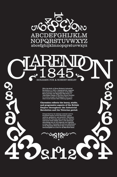
This poster was part of my early Typography curriculum at Drexel University and was designed to show the expressive potential of Clarendon within it's historical context. The layout is inspired from early 20th century product packaging and store-front signage.

I made this poster for a youth design agency in the UK. I found inspiration for this piece in Grime Rap, British currency, and doodling.
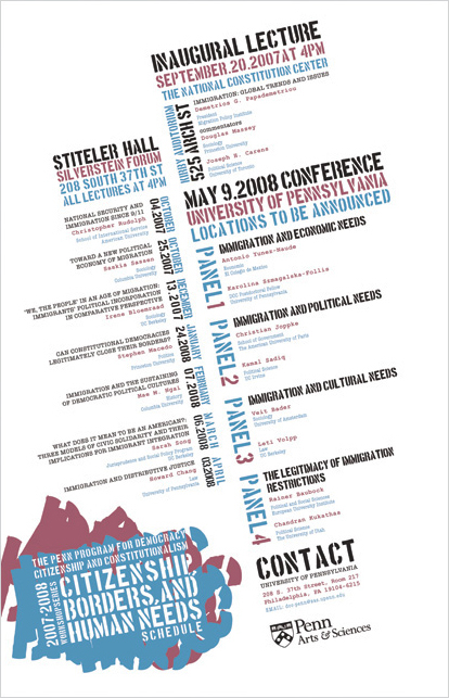
The University of Pennsylvania held a series of lectures dealing with the growing issues of citizenship, borders, and human needs. The event poster was designed to function as a complete schedule and therefore relies purely on typography to manage the content and inspire activism.
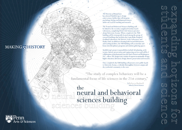
As part of UPenn's Making History campaign, they wanted to promote their newest architectural addition: The Neural and Behavioral Sciences Building. The figure is created using only the floor-plans of the building and is heavily detailed in order to get people closer to read the text.

The Communications Group at UPenn needed some signage to announce their annual open house. They wanted something that was fun and reminiscent of a picnic.
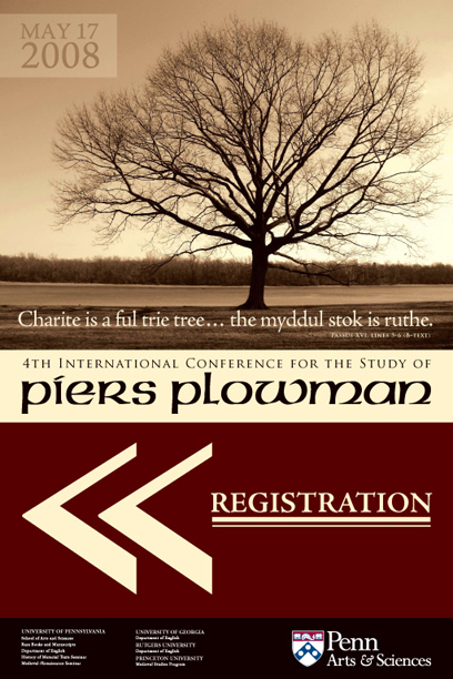
The 4th International Conference for the Study of Piers Plowman (a medieval manuscript) needed a poster series that also functioned as a schedule and directional signage. The type treatment is inspired by the manuscript itself and the imagery comes from the recurring theme of the story.
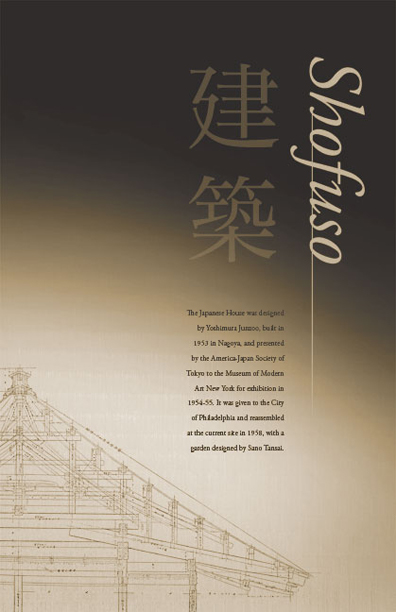
Shofuso is a traditional Japanese house in Philadelphia that functions as a cultural learning center for people to experience first-hand the rich heritage of Japanese domestic life. The design is inspired by tatami-mats (floor-mats that are also modular, architectural units of measurement), natural materials, and light.
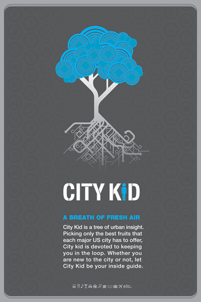
City Kid is an urban youth lifestyle and resource guide. I designed this bus shelter poster as part of a larger project that can be seen here: www.behance.net/AnalogDesign/frame/286657


