This is a project at university where the whole class gets given the same word to base a piece of design on. The word my class was given was:
Stoke-on-Trent
Following on from this we then had to choose a simple quote or fact about Stoke-on-Trent that we could base our design on. My fact was:
"Stoke-on-Trent was the first city to install electric vehicle charging stations"
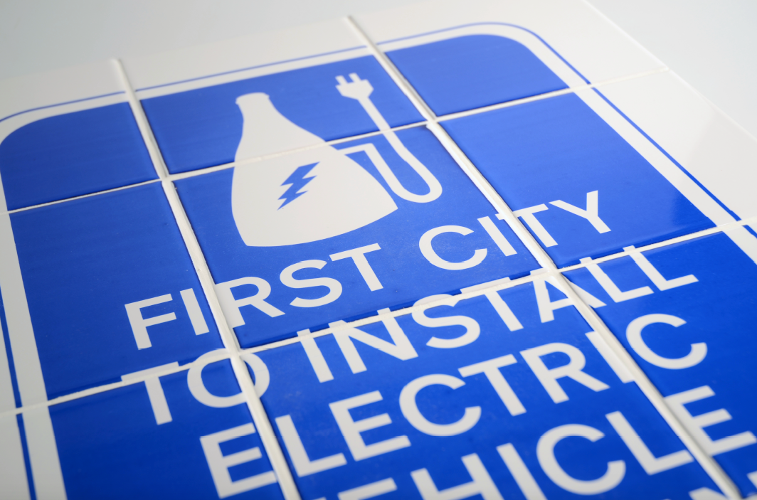
Taking this fact into account I started to create my design for this project. I decided to go with the idea of making a road sign that would be seen above a charging station. I created my own symbol that sits on the road sign – this represents a bottle kiln, something very well known in Stoke due to the potteries. The bottle kiln is mixed with the traditional sign that represents the actual charging station. This symbol alone goes straight to the point about this fact.
To pay homage to Stoke-on-Trent further than the bottle kiln, I decided to relate the project even more to The Potteries. Rather than just having the road sign created on some metal like it usually would be I decided to take this into my own hands and get hands on with some crafts.
I decided I wanted to screen print my design onto tiles. The tiles create a story along with the bottle kiln as the symbol, this closely referring to The Potteries.
Here is a photograph I took throughout the screen printing stage. This is simply the accetate lay on top of my tiles so that I could position exactly where I wanted the artwork to sit.

After making the accetate into a screen for the screen printing, I then had to wash the screen down to prepare it for the job.
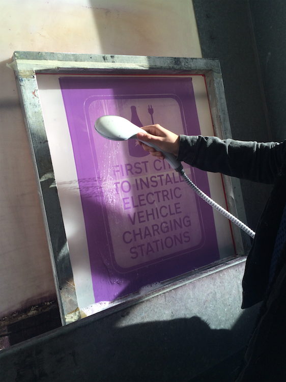


Once I had spread the paint over the tiles I then I had to place all of the tiles into a kiln in order to fire the design on to my tiles. This made sure that my designs wouldnt just scratch off the tiles but infact the paint would 'melt' into the tiles so that they cant be ruined. This is done at an extremely high temperature and takes a few days from the start (putting in) to the send (taking out and allowing enough time to cool).


After allowing my tiles to cool I then grouted them on to some pieces of wood, this gave me the perfect way to display my tiles as the road sign. The wood held the tiles perfectly.
For my signs I decided to make two, one green and one blue.
Green – to represent the environment and that electric vehicles benefit the environment.
For my signs I decided to make two, one green and one blue.
Green – to represent the environment and that electric vehicles benefit the environment.
Blue – to represent The Potteries and the blue colour that is used on a lot of the Fine Bone China.
I also used the legal font that is required on all UK road signs.


These are some photographs of my road signs on display at my degree show. There is a small A5 booklet next to the signs which was available for anyone viewing the exhibition to look at the design process and the production of the road signs.


This is how I have this project presented in my portfolio.


