I was asked by J.A. King's mountain biking team to redesign their team logo to incorporate their three sponsors which included primarily J.A. King: Precision Measurement Professionals as well as ASCEND - Nutrition + Coaching and Revolution Cycles. The completed logo is shown below:

Below are the three logos that were used to create the new team logo.

Since the three sponsor logos have many different elements to them, I went through a number of thumbnails and concepts to make these more united. Below is the thumbnail that was selected by the Sponsorship committee with the large J.A. King crown supporting the other two logos and with three riders climbing its lines. Revolution Cycles' hub creates the center of the tire and the rays of light rising over the ASCEND logo also allude to bike spokes. The ASCEND logos lines were curved so the racers could flow off the King logo returning the viewer's eye back through the logo after reading the text.
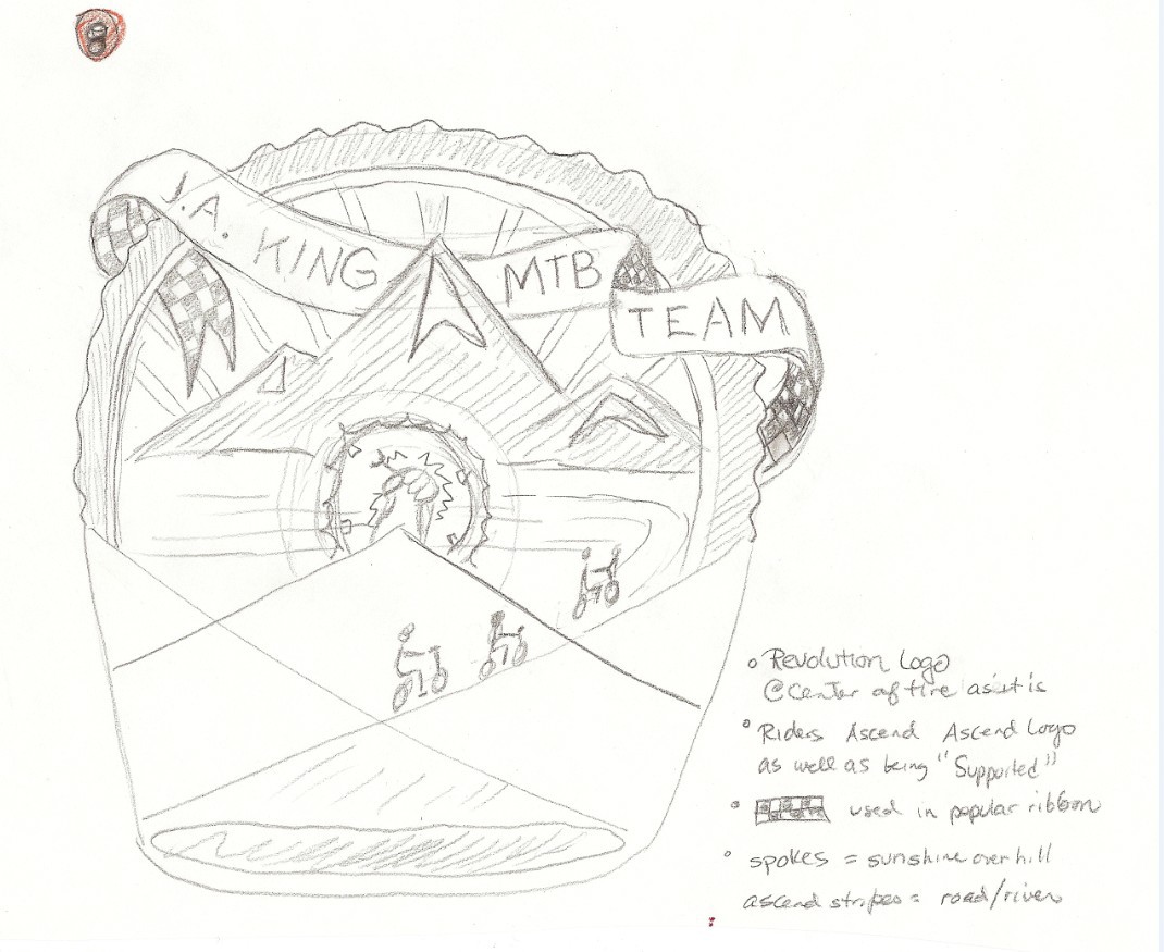

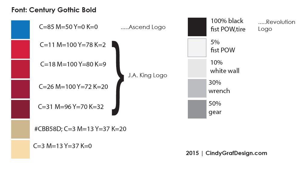
The Revolution Cycle logo went from off center with it's ribbon to the center so the rest of the spoke had to be reconstructed to match the rest of the hub as there was nothing behind the ribbon. Below are the colors that were kept from the original logos that would go into the new one. Approximate primary color scheme was used (red-blue-yellow/beige/tan).

Vehicle magnets were created for the team truck as shown at the Racing in the Woods event June 21, 2015 in Greensboro, NC's Country Park. The magnets were placed on the side door panels, front hood, and the ribbon from the logo also was used on the tailgate.


