A Degree Project
Could Hawker Signs be a bigger part of Singapore's visual culture? One that Singaporeans can genuinely relate to. As hawker culture continues to grow, their signboards are often neglected. The intention of the project was to evoke the excitement of graphic design in Hawker Signs. Studying current hawker signboards allowed the revelation of their core elements. Using this information, I wanted to re-imagine hawker signs but working within the limits of those core elements (Acrylic, Fluorescent, Colours, Fonts). It is a reminder of how non-educated design is part of our visual culture. I want to engage the audience to re-look and find a new appreciation for hawker signs.
See the process journal — click here
Follow the process — http://hawkersigns.tumblr.com
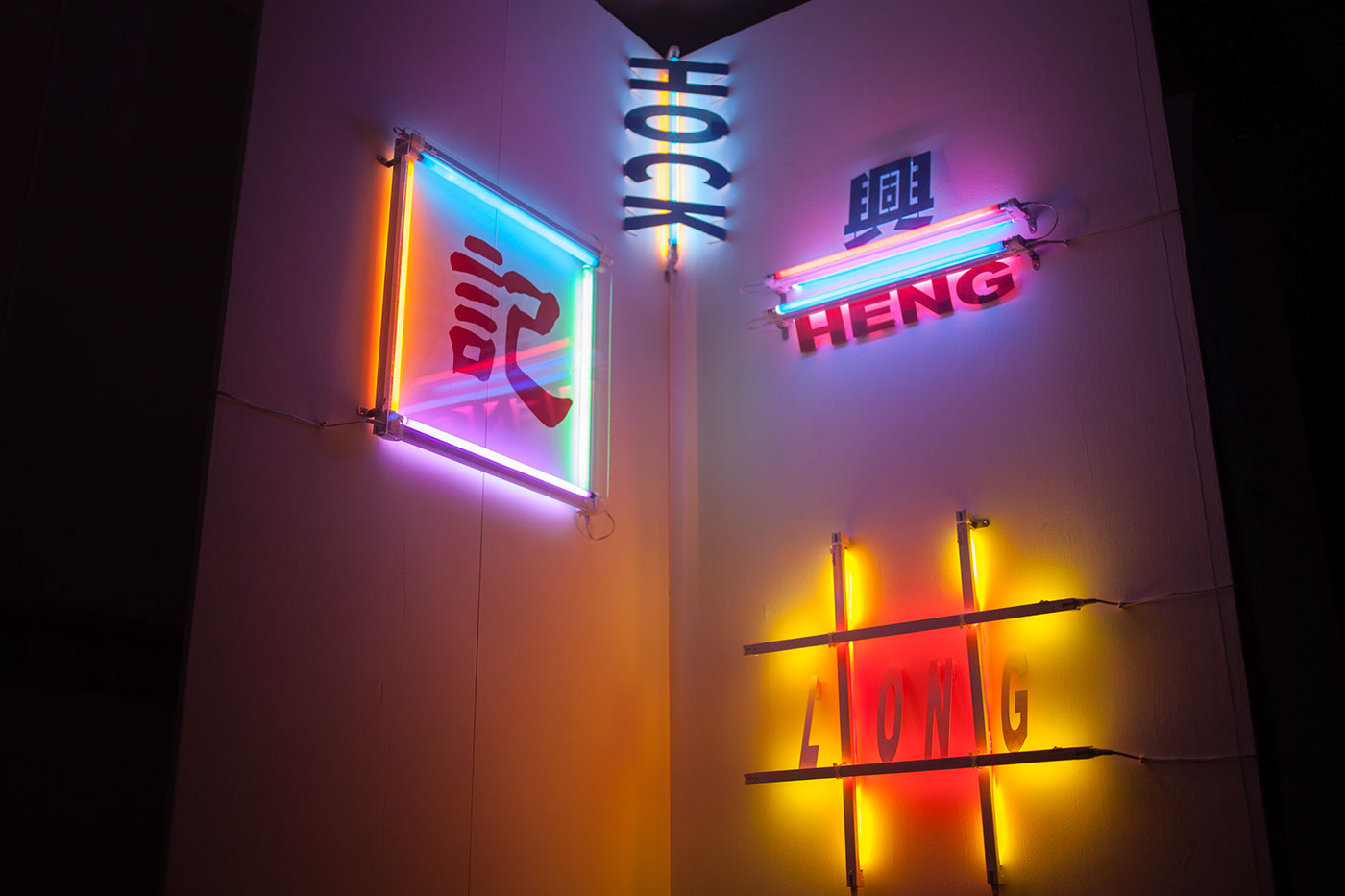
Flourescent Lights
I started by experimenting with fluorescent tubes and cellophane paper. I wanted to reimagine the signs, limited by it’s current elements. I found many arrangements that could give similar colours and gradients that mimicked the original designs. I have also experimented with type and how it was displayed with the lights. I was intrigued by how they reflected the light back on the wall. The new approach allows for a new but familiar visual, as the materials used are the same.
Light Installation
18 Flourescent Tubes
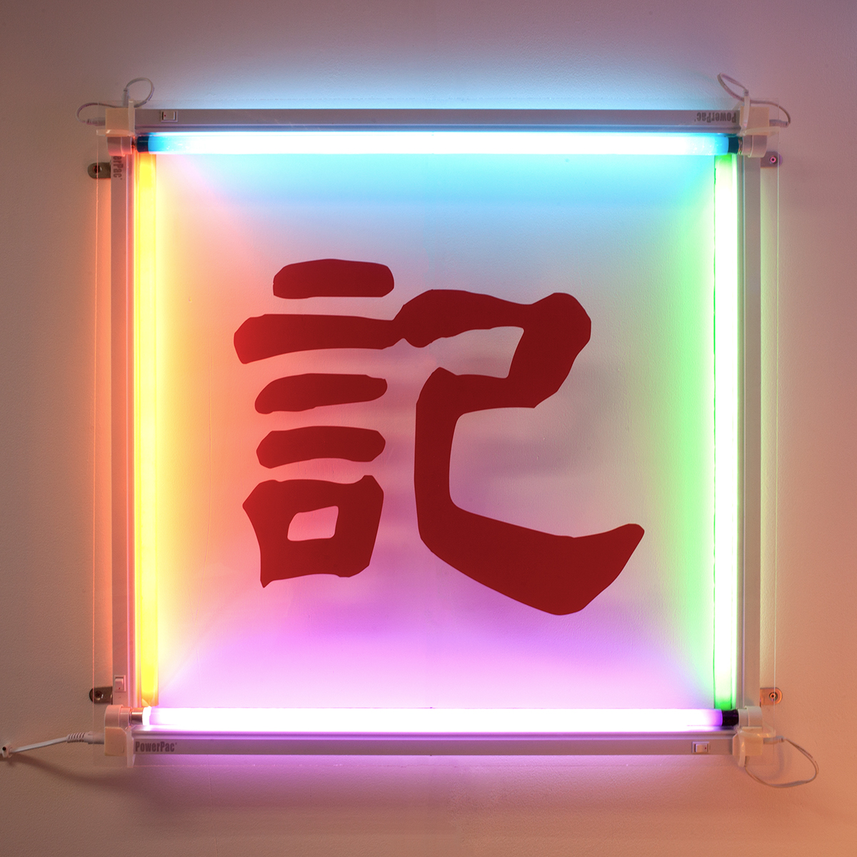
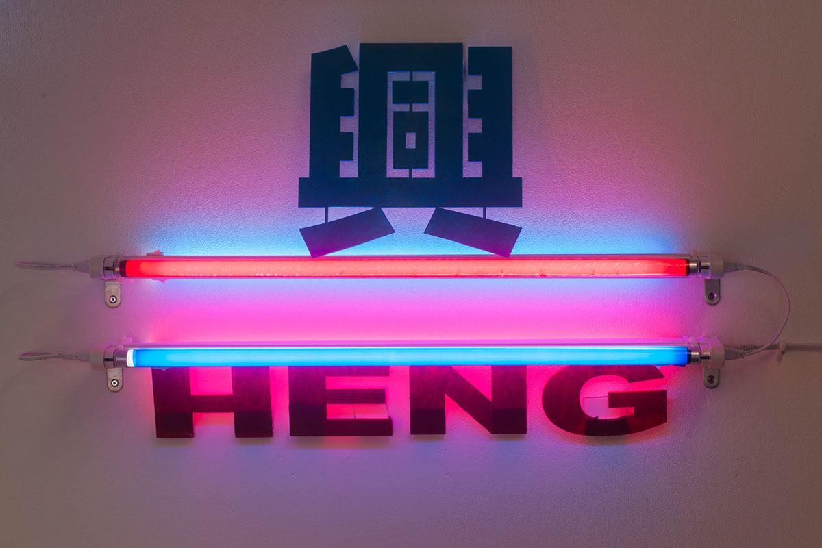
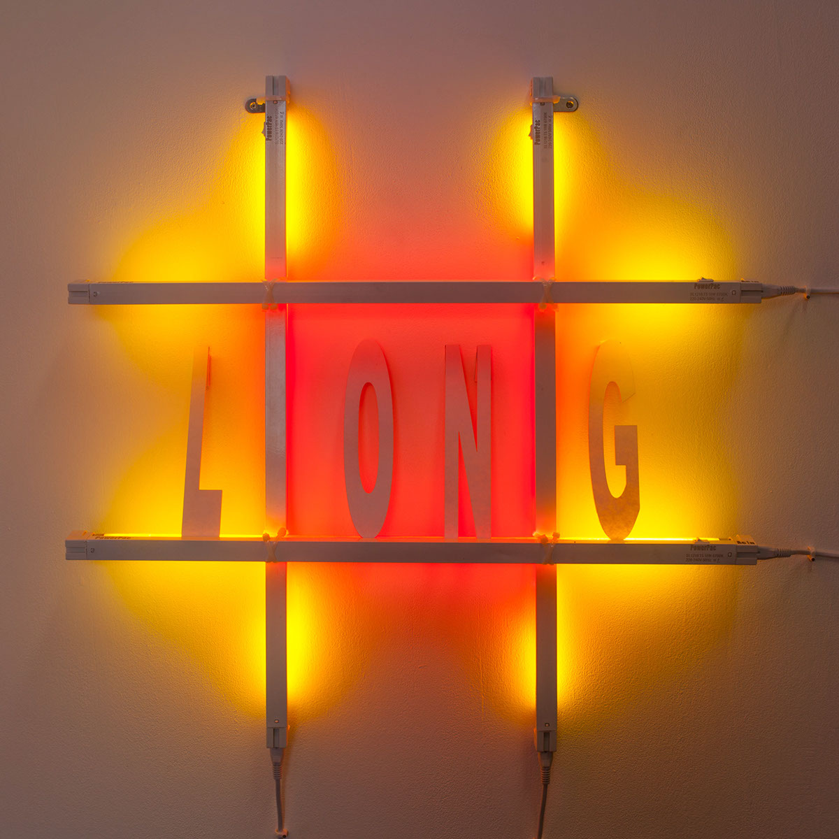
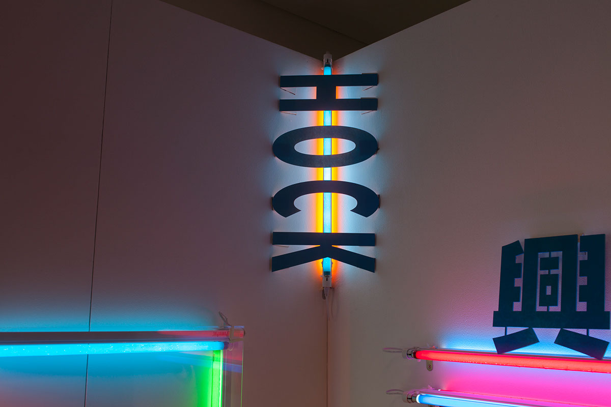
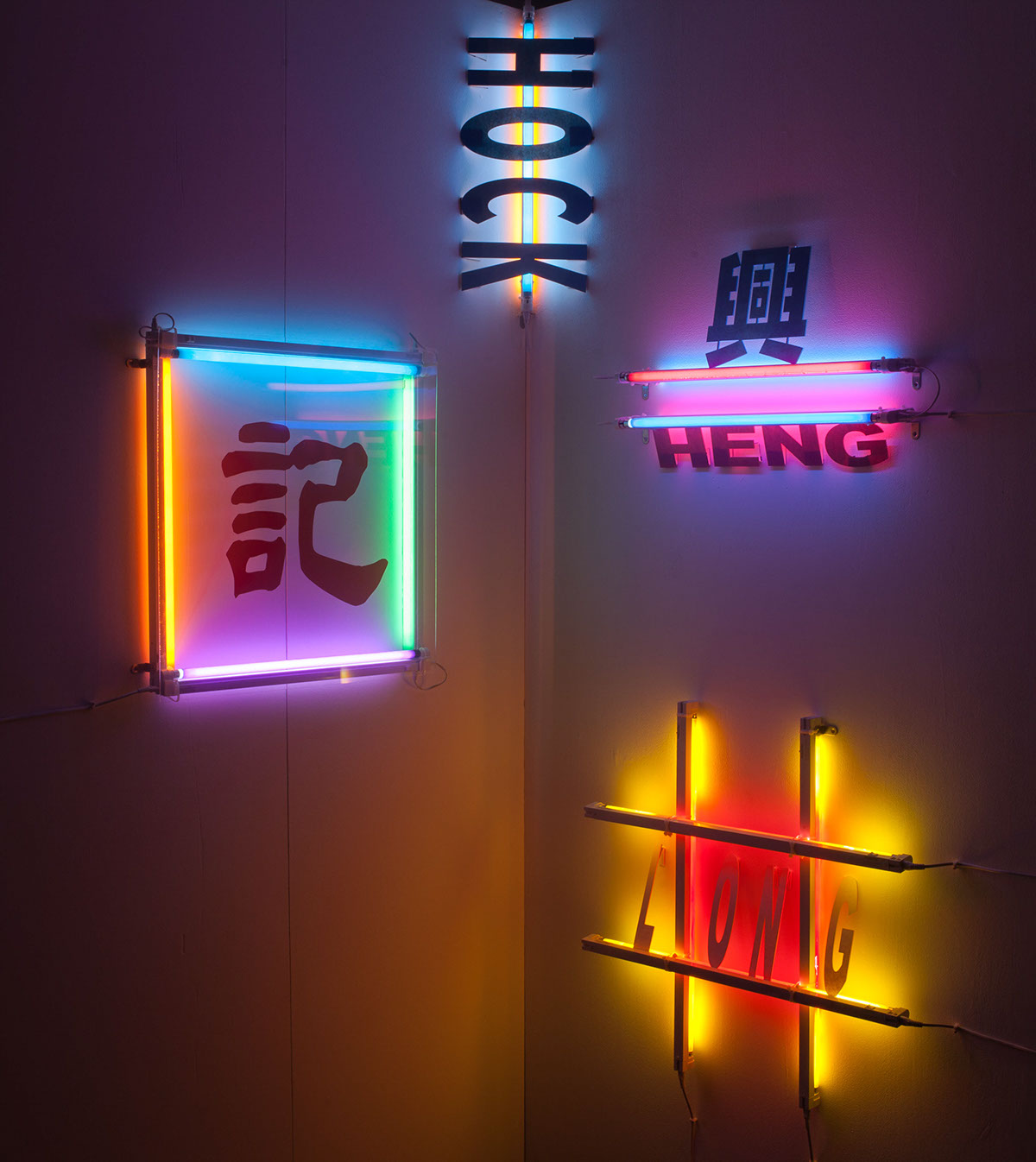
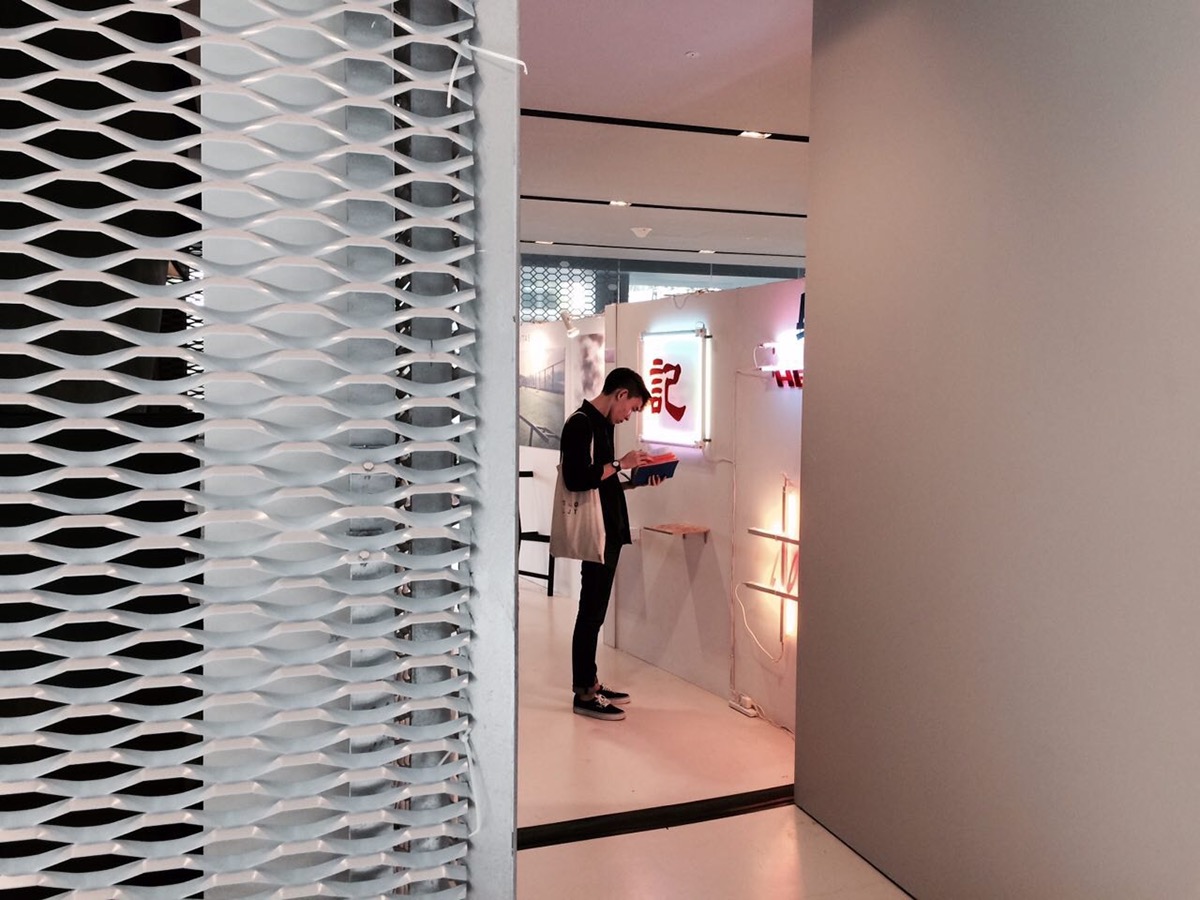
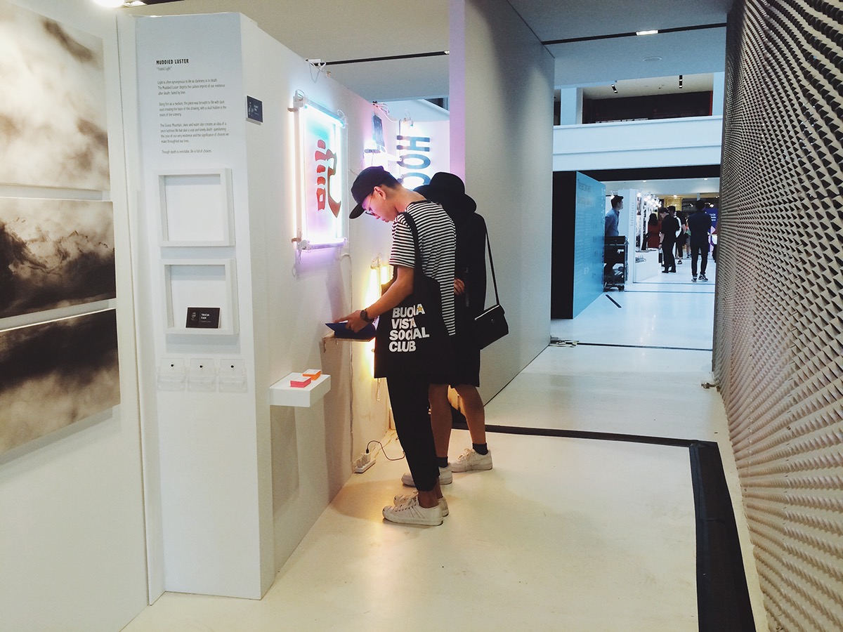
Displayed at National Design Gallery for GSA's Degree Show 2015
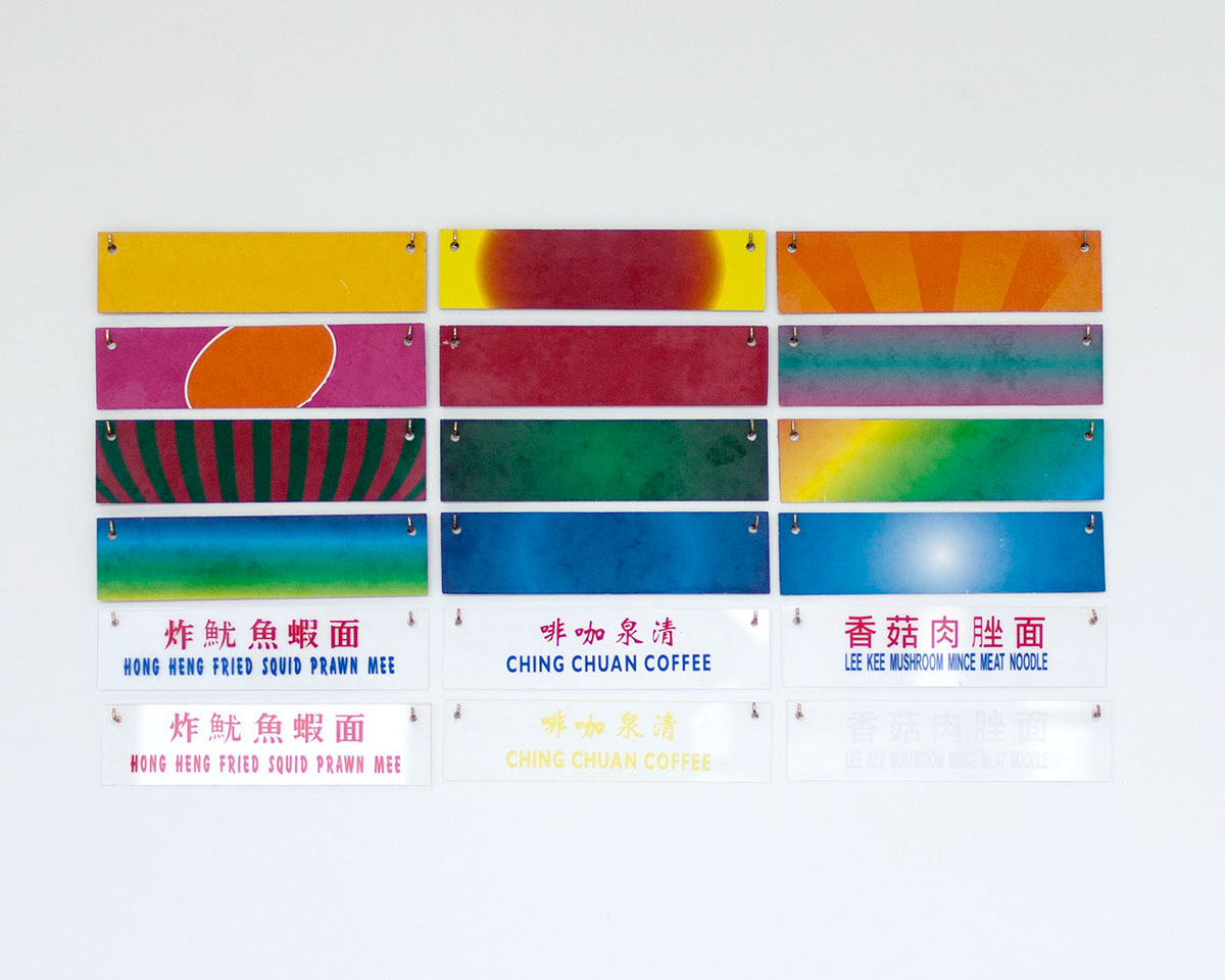
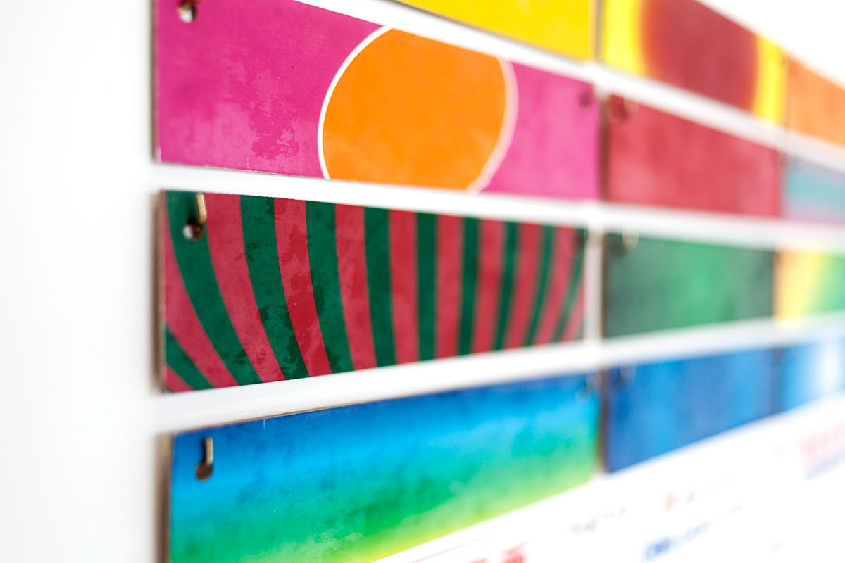
Swatches
The swatches is a simple way of letting the audience play with the elements from Hawker Signs. The background, fonts and colours are interchangable. It allows the audience to come up with different combonations and even create text effects. This interaction with Hawker Signs creates an excitement and interest amoung audiences.
Interactive Installation
Miniature Signboard Elements
Miniature Signboard Elements
Fabric Transfer on Card Board
Vinyl Sticker on Acrylic
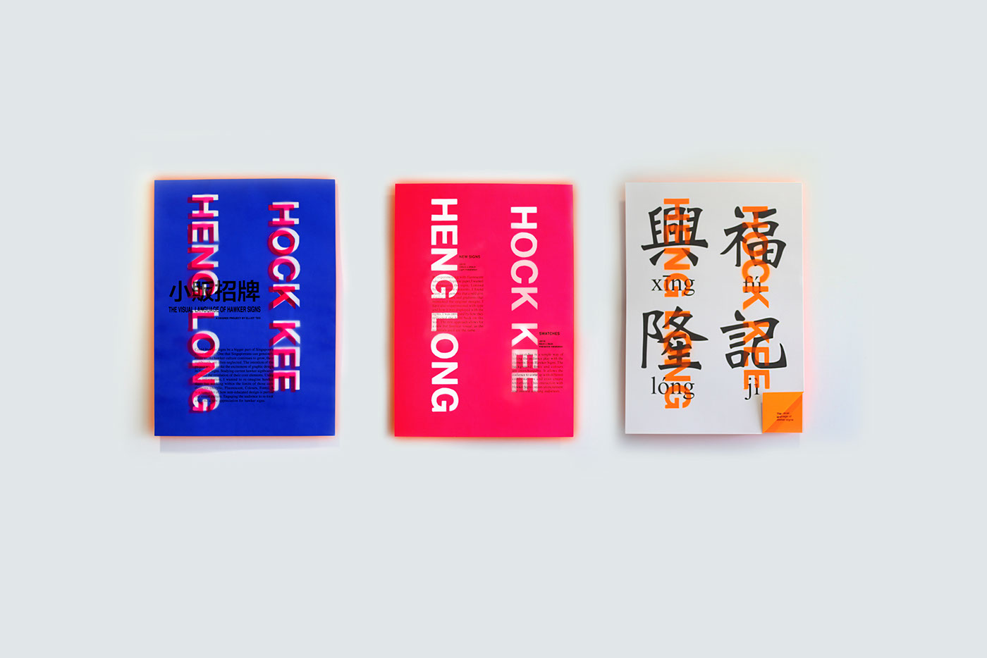
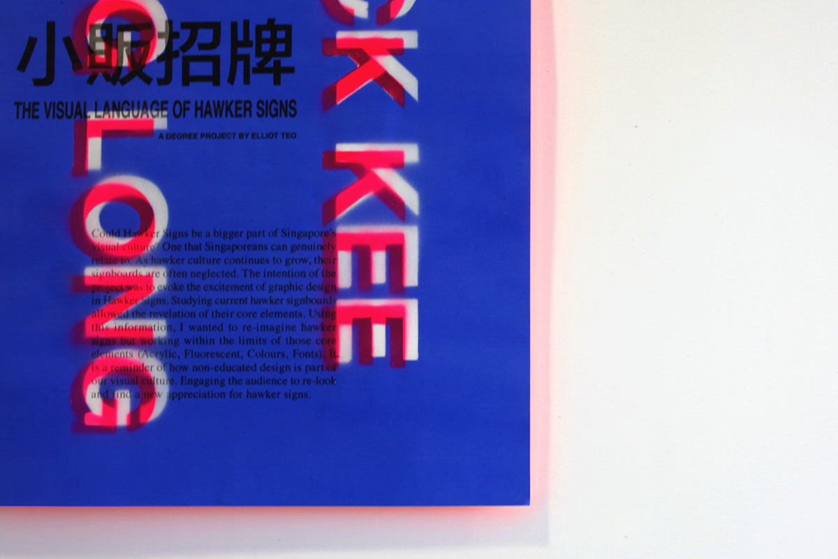
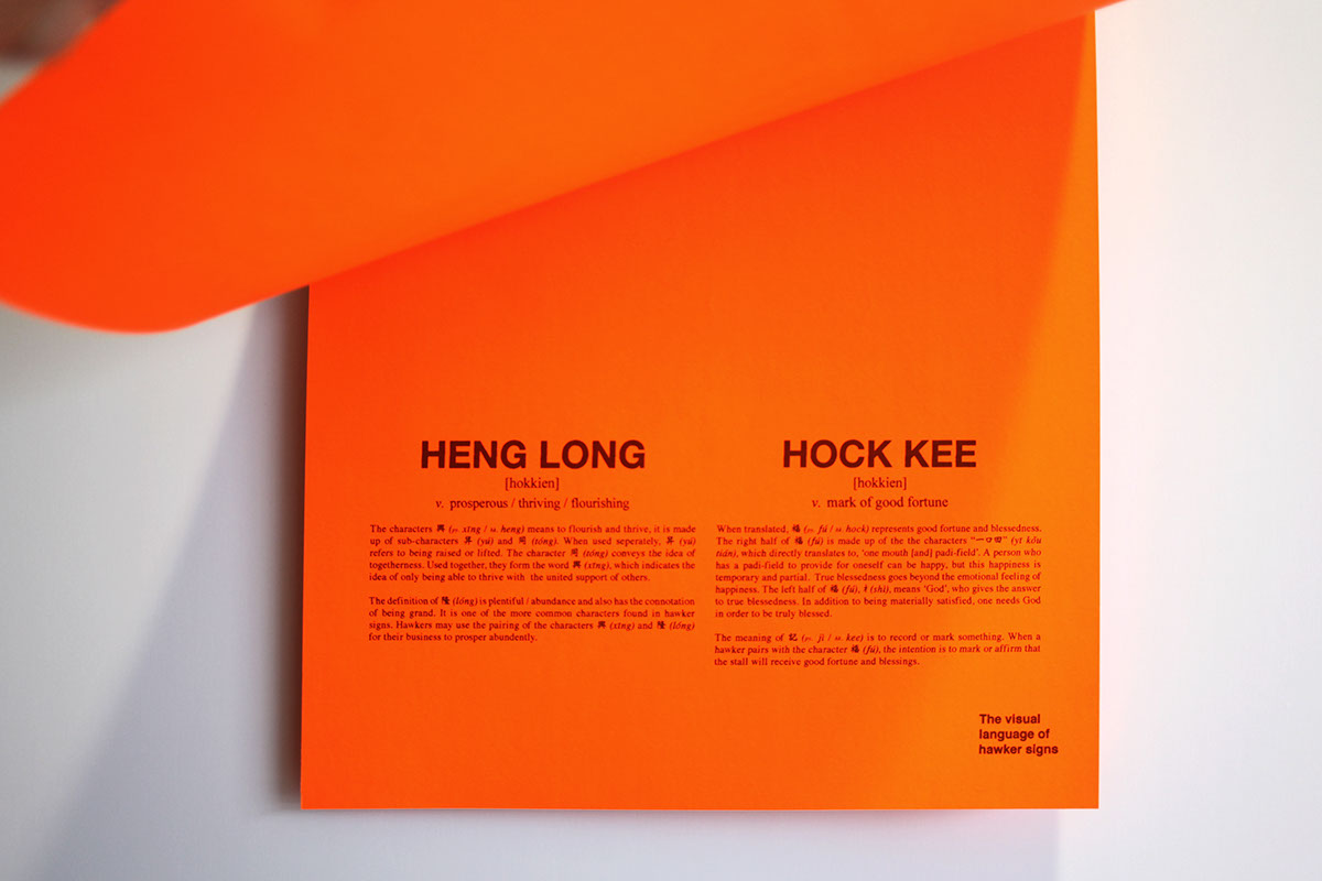
Posters
A series of A2 posters explaining the project, the works and the chinese characters. The intention is to inform and educate the audience and give more meaning to the works. The posters are slightly lifted from the wall, giving the poster an orange glow around the poster. There were many experimentations and accidents before the poster's final outcome.
A2 Print
Spray paint & Inkjet on Pacolight 98gsm
Work In Progress Video
A little video of compiled clips shot throughout the process of the Project, showing the making and experimentations.

