The Gingerminds agency is an independent digital agency created in 2005, the offices are located in Nantes. Their clients include Panasonic, Sowee, Gaz Européen, Lafarge and Saint-Gobain. In the spring of 2014, the agency's management asked me to design its new graphic identity, which it wanted to be strong, while respecting its positioning. The agency wants its work to be felt without seeing itself, to be forgotten behind sensations that produce positive effects on the end user.
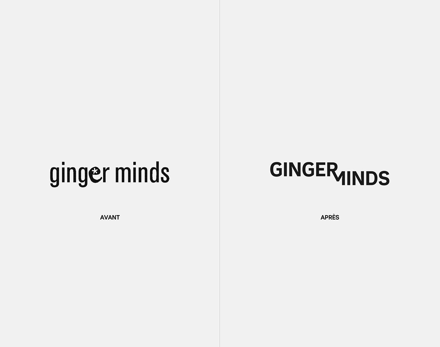
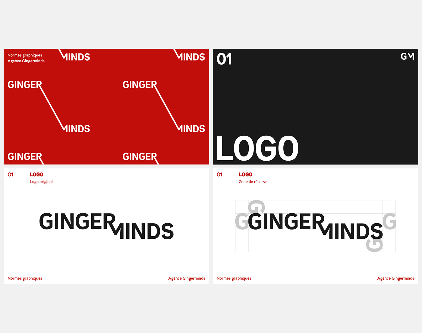
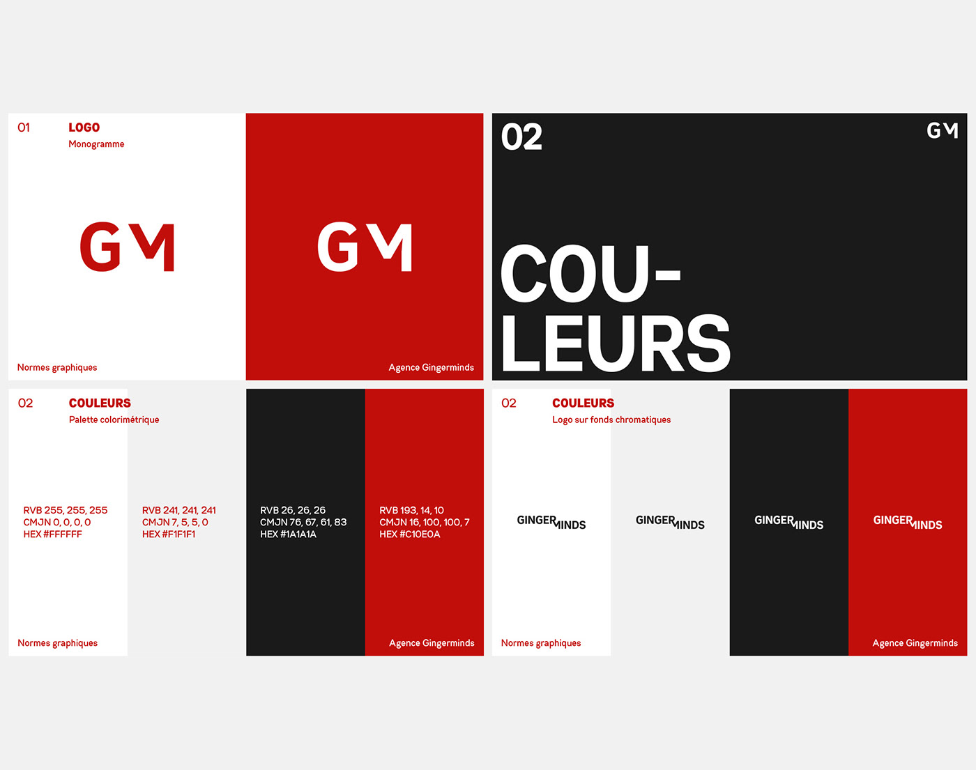
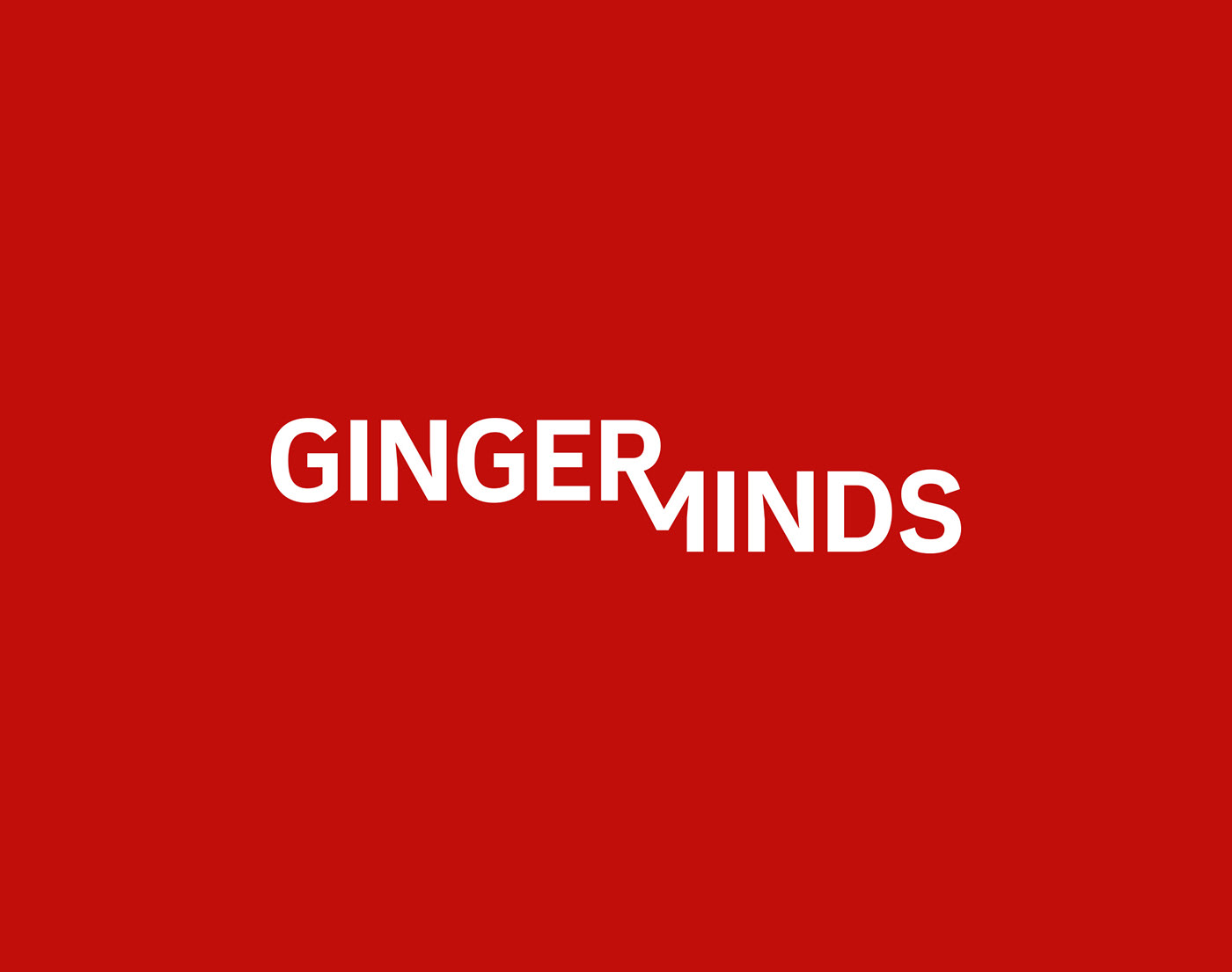
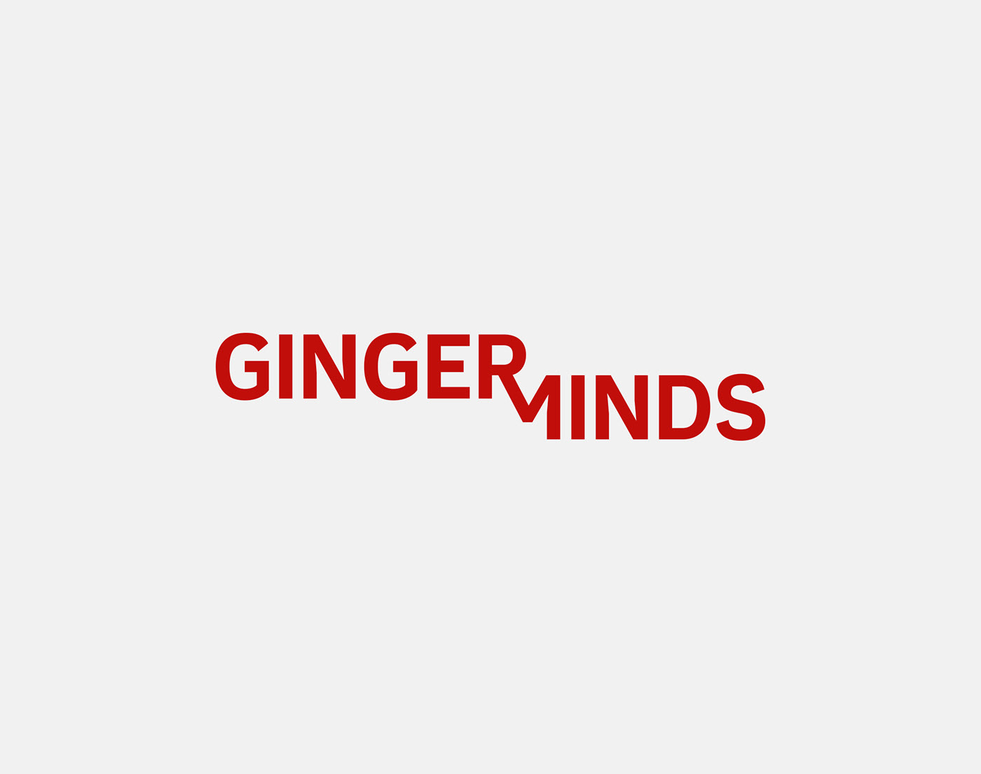
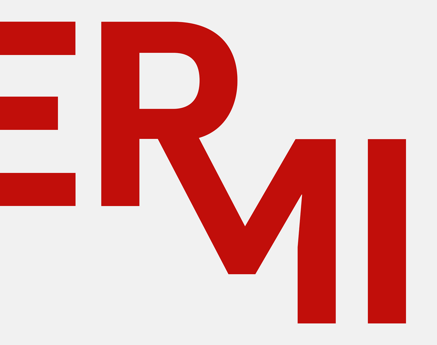
It is never easy to renew a logotype to go in another direction, and my first mission was to explain the need to change. The old logo of Gingerminds was illustrative and gave a sympathetic and even funny image of the agency, it no longer corresponded to the new positioning. I wanted to design a one-piece typographic logo, where the two elements GINGER and MINDS merge harmoniously. I underline the creative character of the agency by placing GINGER above MINDS, which by an optical effect in 3 dimensions places MINDS in the background. The GM initials assert themselves in monogram, the letter M abandons its left barrel for a counter shape which brings elegance to the whole. This monogram is naturally available as an avatar, in particular to identify the agency on social networks. The graphic identity is also carried by the dominant color, a « ponceau » red evoking strength and agility.
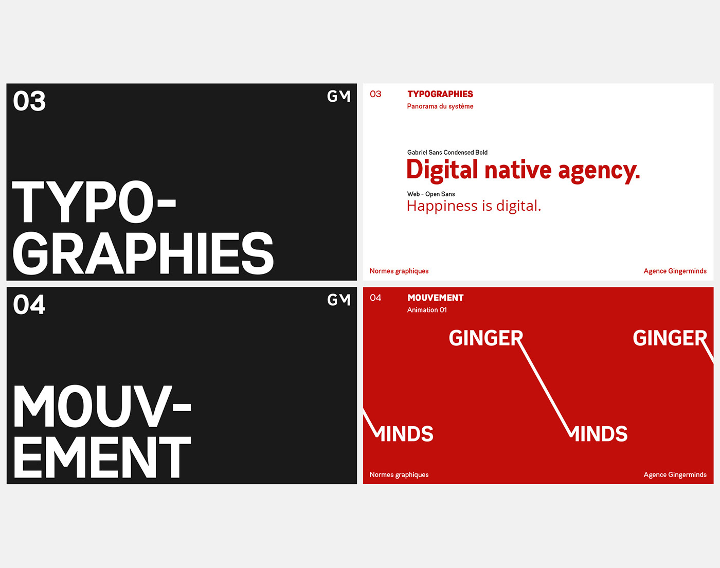
This graphic identity offers many creative possibilities, in motion design but also for the corporate communication of GINGERMINDS.
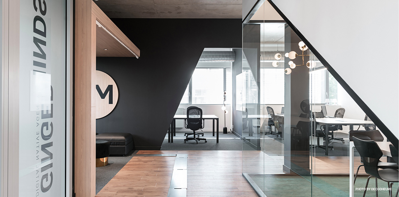
{Interior design: DECODHEURE}
L’agence Gingerminds est une agence digitale indépendante créée en 2005, les bureaux sont situés à Nantes. Ils ont pour clients entre autres, Panasonic, Sowee, Gaz Européen, Lafarge ou encore Saint-Gobain. Au printemps 2014, la direction de l’agence me demande de concevoir sa nouvelle identité graphique qu’elle souhaite forte, tout en respectant son positionnement. L’agence veut que son travail se ressente sans se voir, se faire oublier derrière des sensations qui produisent des effets positifs sur l’utilisateur final.
Il n’est jamais simple de renouveler un logotype pour partir dans une autre direction, et ma première mission a été d’expliquer la nécessité de changer. L’ancien logo de Gingerminds était illustratif et donnait une image sympathique voir amusante de l’agence, il ne correspondait plus au nouveau positionnement. J’ai souhaité concevoir un logo typographique monobloc, où les deux éléments GINGER et MINDS fusionnent de façon harmonieuse. Je souligne le caractère créatif de l’agence en situant GINGER au-dessus de MINDS, ce qui par un effet d’optique en 3 dimensions place MINDS au second plan. Les initiales GM s’affirment en monogramme, la lettre M abandonne son fût gauche pour une contre forme qui apporte élégance à l’ensemble. Ce monogramme se décline naturellement en avatar, notamment pour identifier l’agence sur les réseaux sociaux. L’identité graphique est également portée par la couleur dominante, un rouge ponceau évoquant force et agilité.
Cette identité graphique offre de nombreuses possibilités créatives, en motion design mais aussi pour la communication corporate de GINGERMINDS.
{Design d’intérieur : DECODHEURE}