Masthead
Old | New
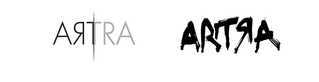
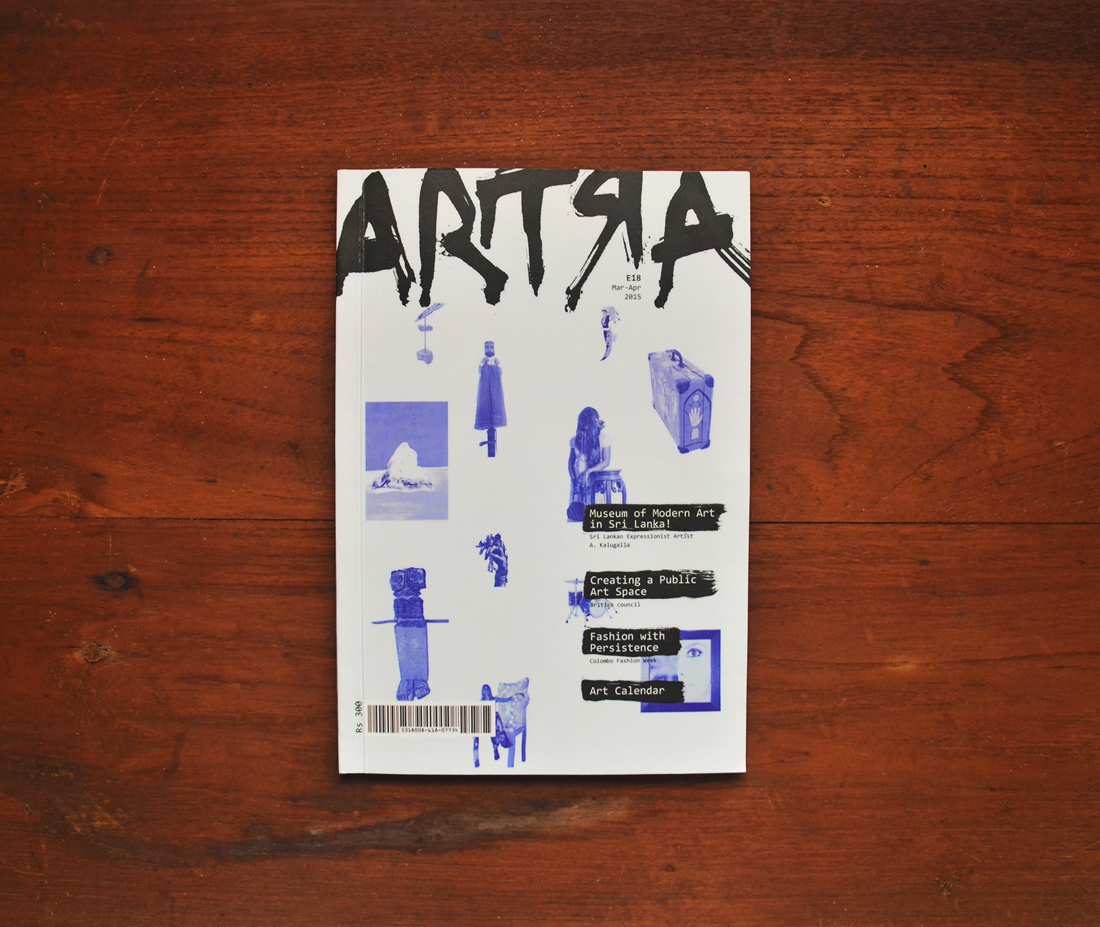
Masthead is completely recreated using rough brush scrip to signify bold, spontaneous, expressive feel. The challenge was to create the masthead according to the new concept without losing the essence of genuine Artra logo. Since the faded-grey line in the middle of the previous masthead was removed (on left) the letter “R” is flipped horizontally in the new masthead maintaining the idea of reflection of the word “art” (on right).

Cover
Old | New
The width of the magazine is increased by 33mm while the height remains the same. The cover contains at least one image from each article creating a texture while giving a sneak peek to the reader about what is inside the magazine.
New layouts - Article #1
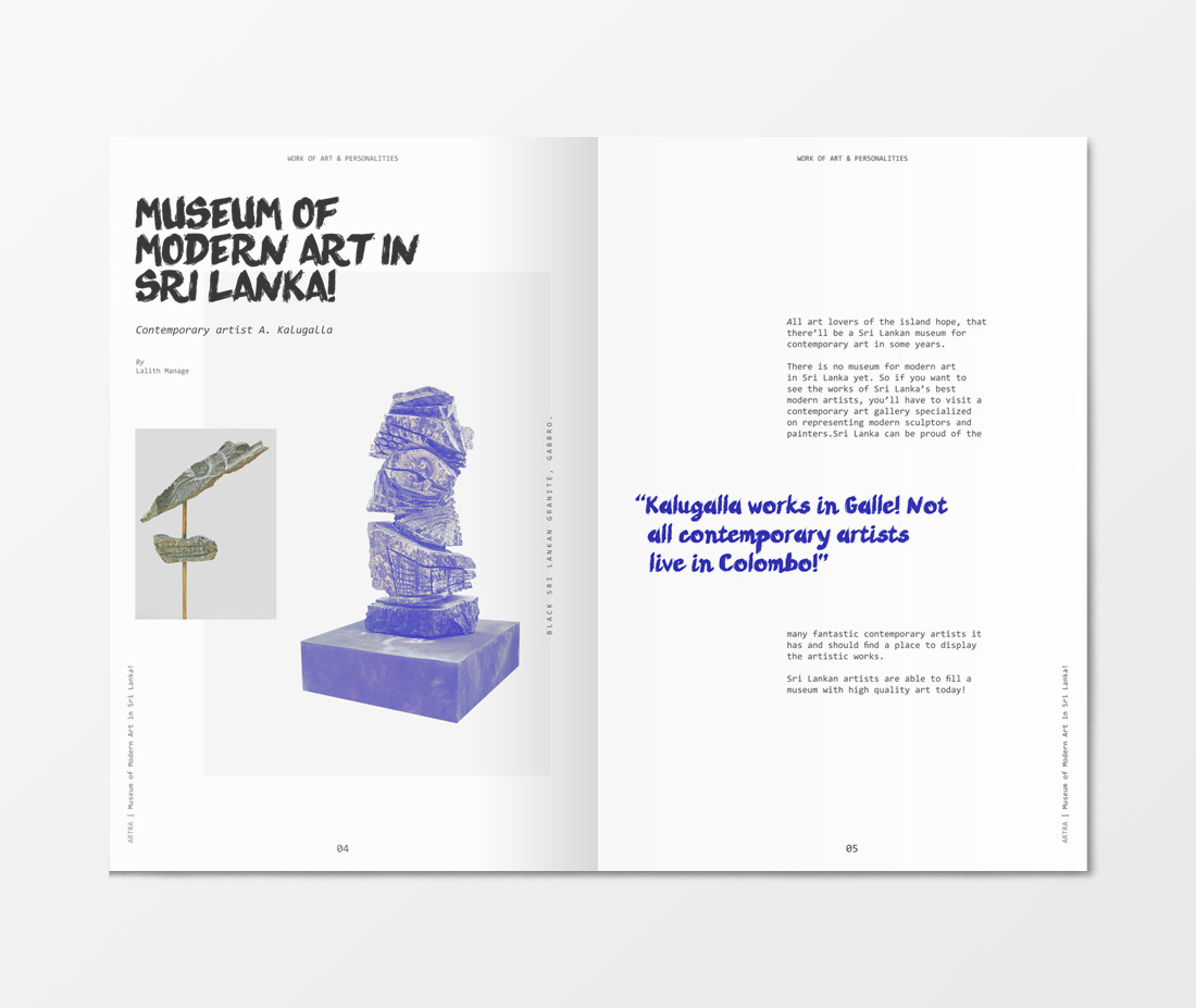
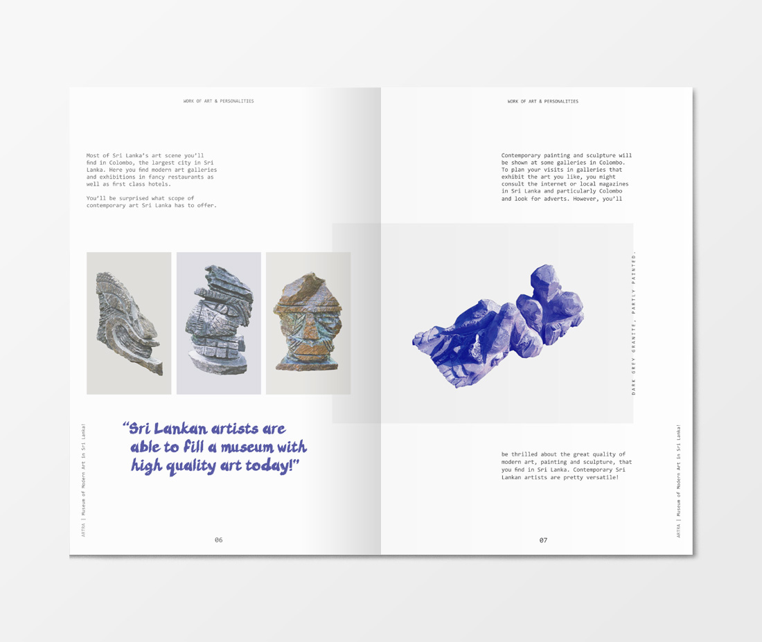
Layouts are mainly prioritizing the art work and the special quotations by the artist drawing more attention to them. The magazine is used two primary typefaces. A dedicated custom-made type inspired by the masthead for headings and pull quotes and a san serif type for body copy.
New layouts - Article #1

New layouts - Article #1
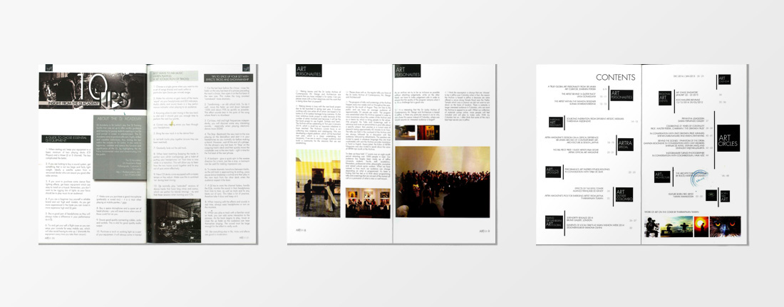
Old Layouts

Art Calendar

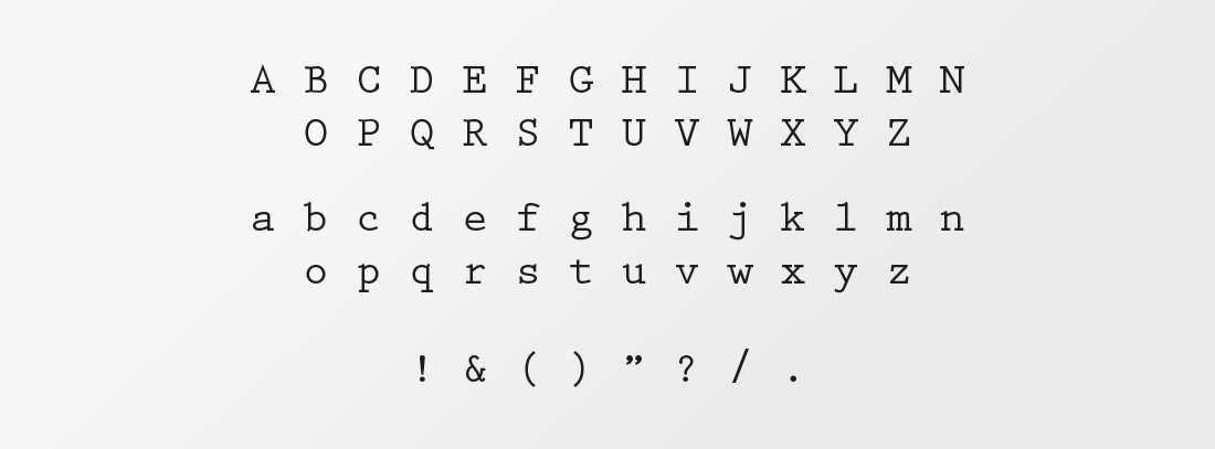
Primary ARTRA Typeface
Secondary Typeface
Final Execution

Final Execution


