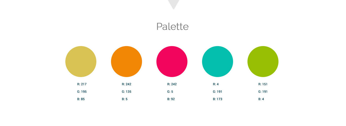
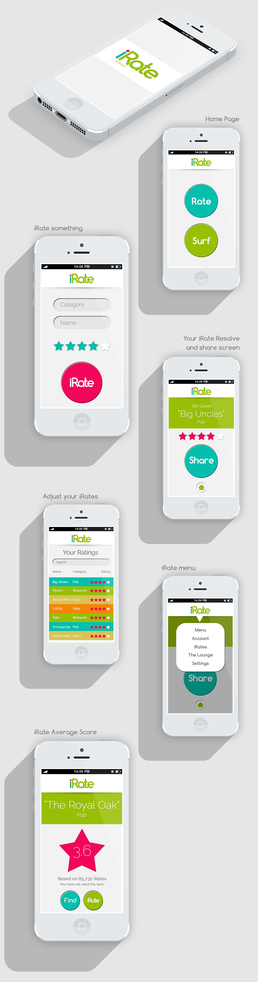
An elegant and approachable design with a unified color palette and touchable interactions makes this app design an addictive way to iRate everything! I also created the logo that features a pink dot over the "i". That color is exclusively used for the iRate button CTA and the rating stars.