Actavis Woman is the world’s first specialty Women’s Health pharmaceutical franchise, aiming at have the largest women’s health product portfolio in the world.

Creating the identity for such an ambitious franchise is a complex task. The main obstacles were to creating a coherent branding that could be easily adopted, replicated and at the same time be future proof.
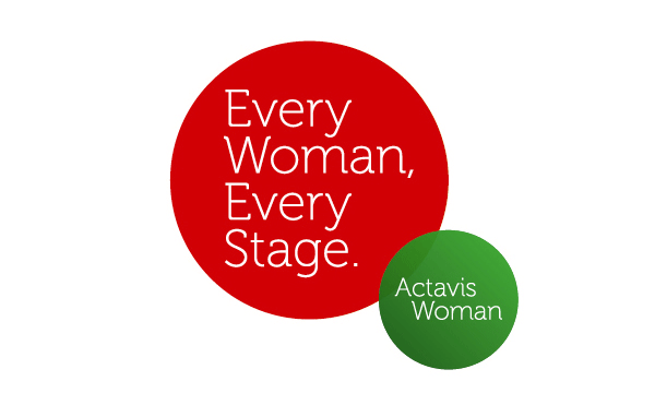
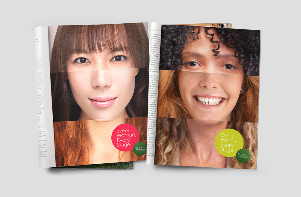
We developed an approach that aimed to stand for simpler and better health choice’s for woman everywhere and seeks to connect to the real needs of each and every woman – “Every Woman, Every Stage” and a visual identity that is in line with our optimism about how to help women live healthier lives.

We created four therapeutic categories to unify all products in the entire portfolio and created a visual language that is open and simple putting the needs of women and their healthcare providers first.
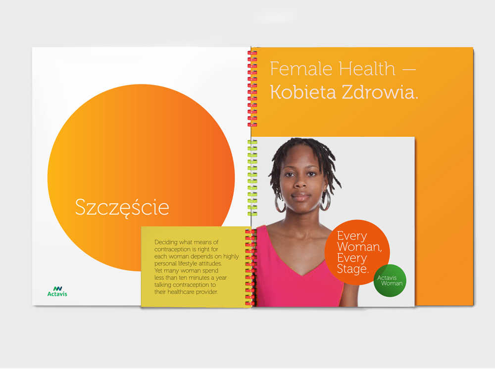
To ensure cohesion we looked to the parent brand Actavis, to inspire a colour palette that could organise and easily identify each treatment area. The font was chosen partly for its clarity but primarily because it has a full CE & cyrillic character set easing the global localisation process. A complete image library of women appropriate for product, age and local markets was built.


Every piece of communication was designed to be flexible, adaptable and instantly accessible to all the local markets. The portfolio booklet was designed to carry the full range of treatments covered by Actavis Woman but also be fully customisable as not all countries carried all products. The multi-colour ring bound system allowed individual countries to create there own content within a consistant branded communication.
This holistic approach allowed us to position Actavis Women as a unique leader in female health and grasp professional recognition, internationally.


