Mtec are a specialist international art logistics company that work with some of the worlds leading galleries and artists.
The brief was to create a new logo however after initial meetings it became clear we also needed to change the perceptions that lingered from the companies heritage of trucking and haulage and instead promote the wide range of services Mtec offered to the art community as a whole.
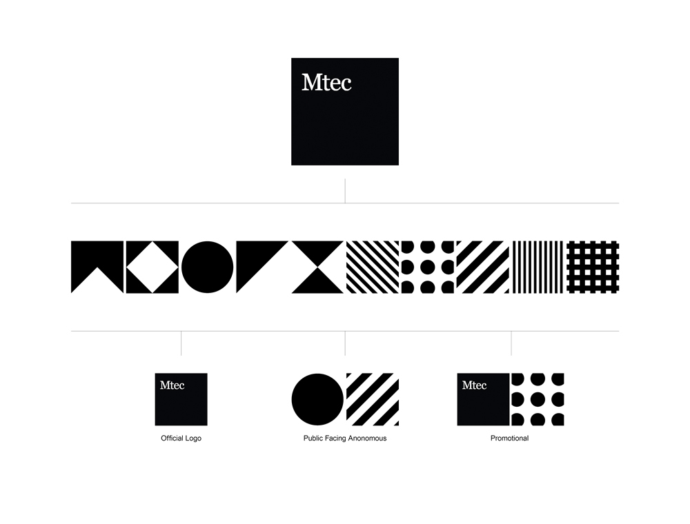
The approach chosen was to not just create an identity but to explore how one might be embraced both internally and by their existing clients and yet be striking enough to attract attention throughout the art community. With the caveat that on many occasions they had to remain anonymous when public facing.

We began with a pure form, simple typography and resisted using colour. Using these elements as a basis we created 10 icons representing the diversity of services that when combined are easily identifiable —belonging to the same source but ultimately anonymous. The result is a branding that is dynamic, adaptable and distinct.


