

School work - 2006
Here are some pieces I completed as part of my University studies in 2006. I like to include these as they are a counterpoint to my work for real clients, and there was a lot more freedom to express myself while studying.

A double-page spread. The brief called for a double-page spread from a book or magazine, the topic of which was someone who was inspirational. Charles and Ray Eames are two of my favourite designers - incredibly versatile, adaptable, insightful and forward-thinking. I was lucky enough to travel to Santa Monica in 2007 to visit the Eames House - something I will never forget.

A hypothetical re-brand - the typical Uni assignment. Here the brief asked to re-brand and re-imagine IPAustralia - the division of the Australian Government which represents Intellectual Property - Patents and Trade Marks, etc.
The challenge here was deciding on a tangible representation of something which by its very nature is intangible - an 'idea'.
The logo represents an idea (the green arrow) emerging from the mind (the grey box). The arrow is green, and pointing up and to the right - positive in both colour and orientation; the box is grey with rounded edges - indefinite, malleable, ambiguous, adaptable.
The overall scheme is befitting a government agency by being minimal and uncluttered, while still maintaining cohesion and continuity across multiple pieces.
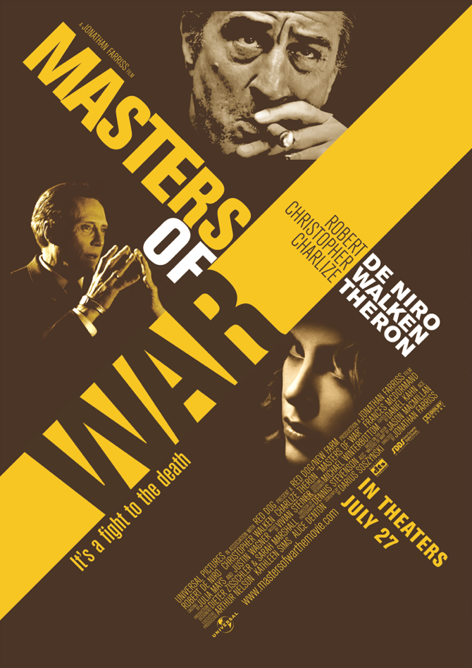
Fictional Movie Poster - 'Masters of War'
The brief was very open on this one - no restrictions were given except for the title of the film. I imagined this film to be a heist movie in the style of Ocean's Eleven, Ronin or The Italian Job.


