


KIVVE Arquitetura – Naming & Branding
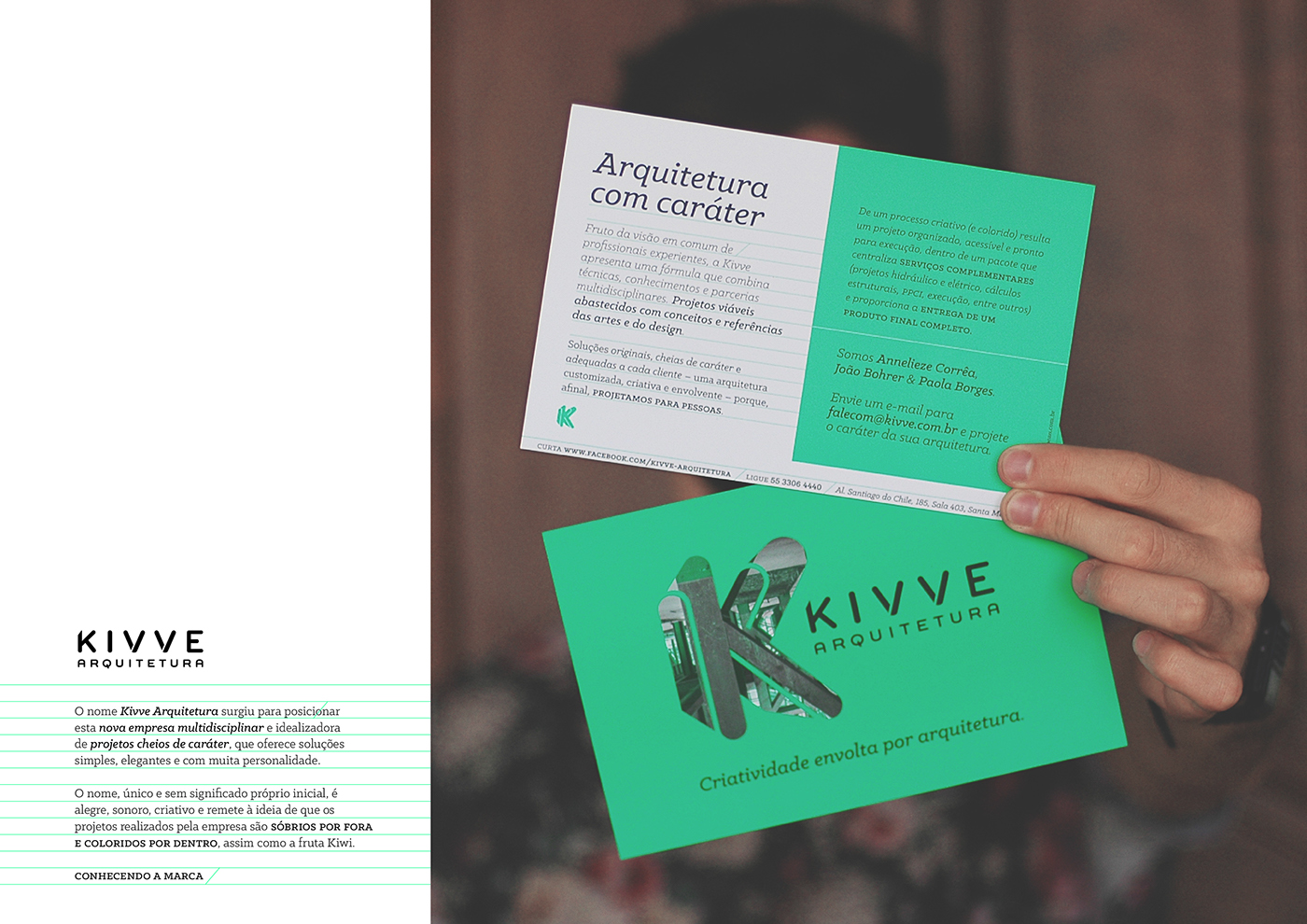
Entering into a market full of good companies is not always easy. You have to work the steps of good planning, analysis, conceptualization and studies, to develop a naming project and an identity design that stands out. The desire of three architects to operate in this area, resulted in Kivve Arquitetura, a multidisciplinary company whose designs are full of character, offering simple and elegant solutions with lots of personality.
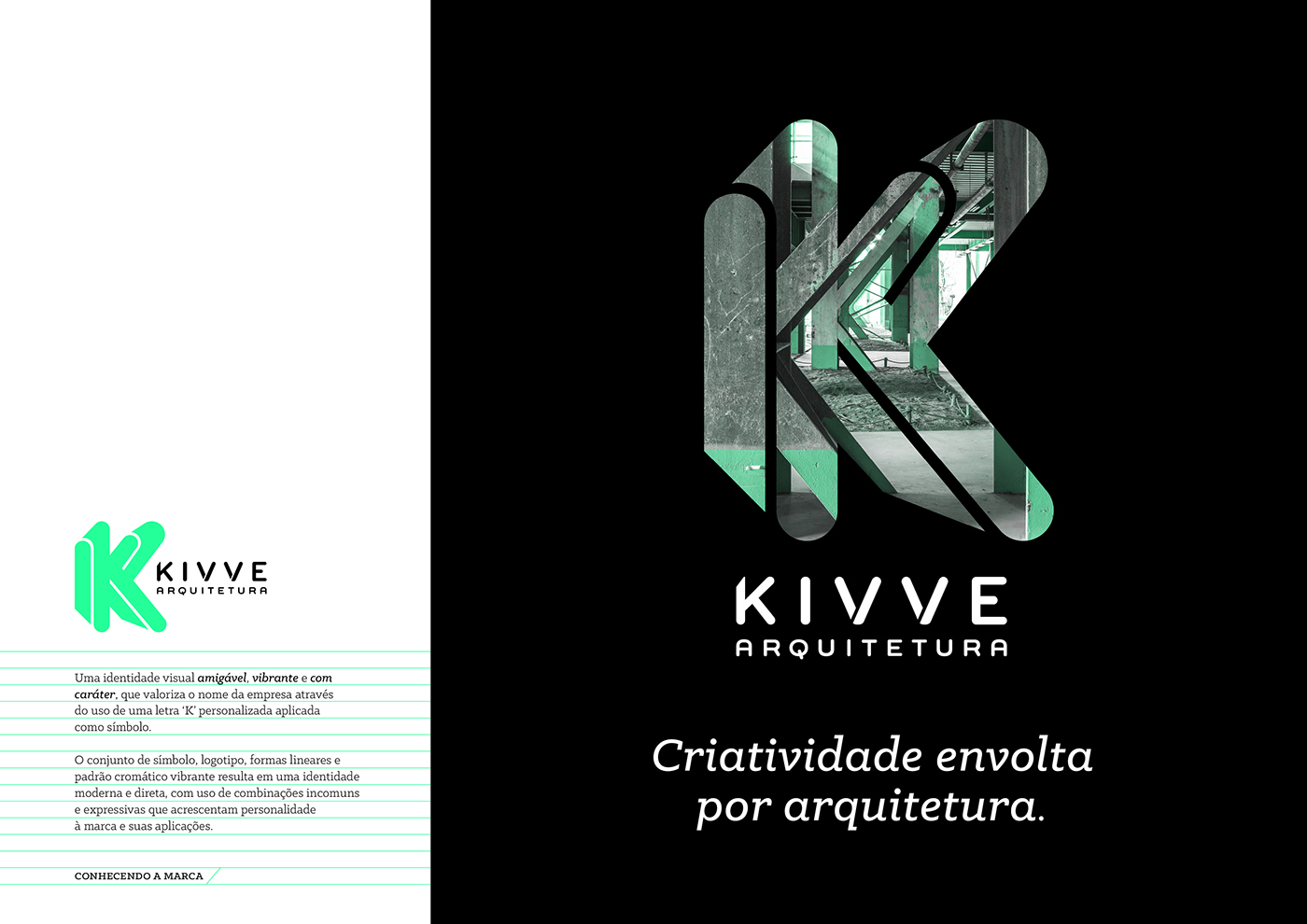
The steps of research and analysis for the naming project, resulted in the need of the company to present itself to the market wisely. That is why the exclusive and meaningless name, is cheerful, soundful, creative and refers to the idea that the projects undertaken by the company are sober on the outside and full of color on the inside, such as the as the Kiwi fruit, which served as inspiration for the project.
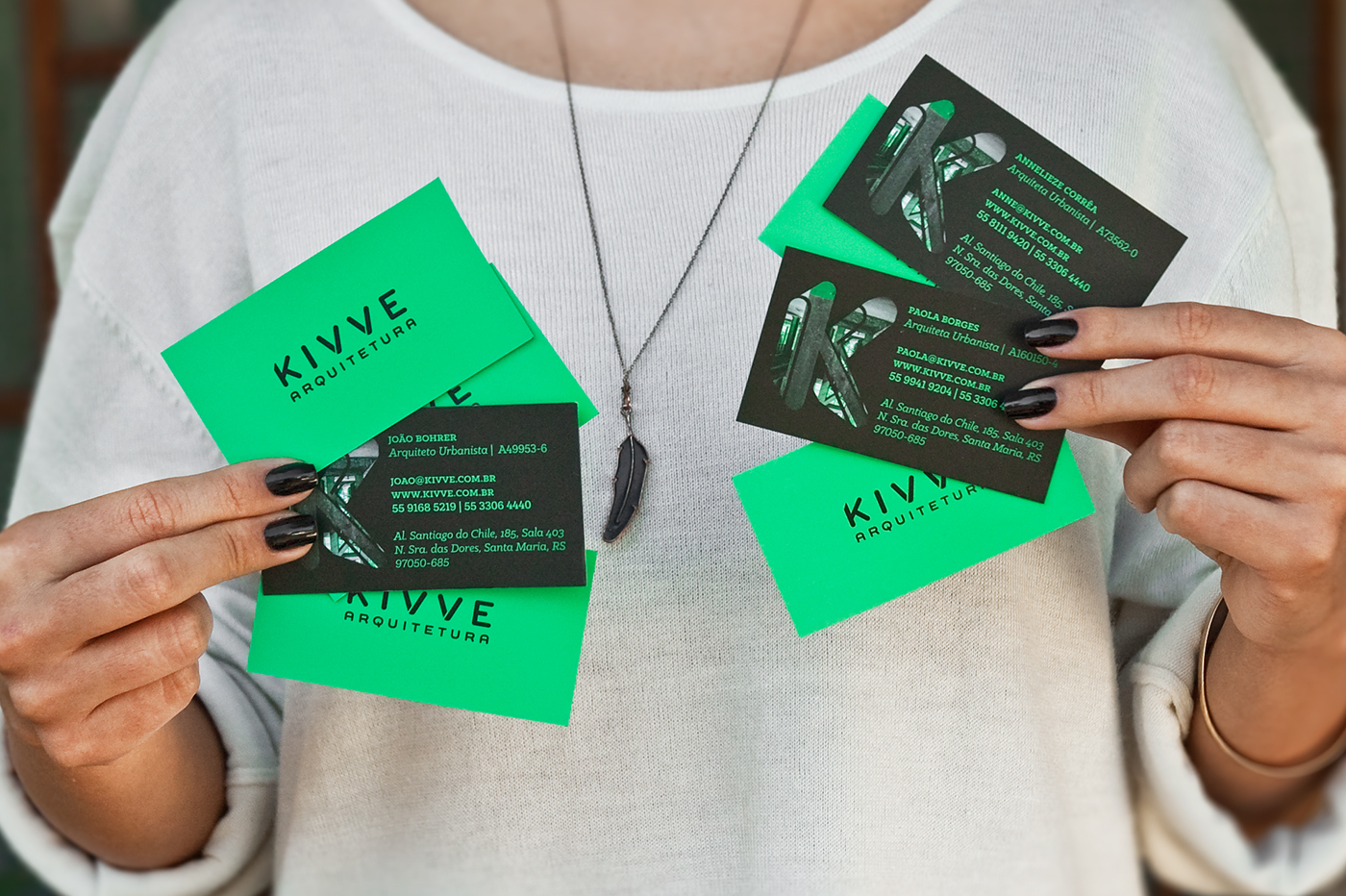
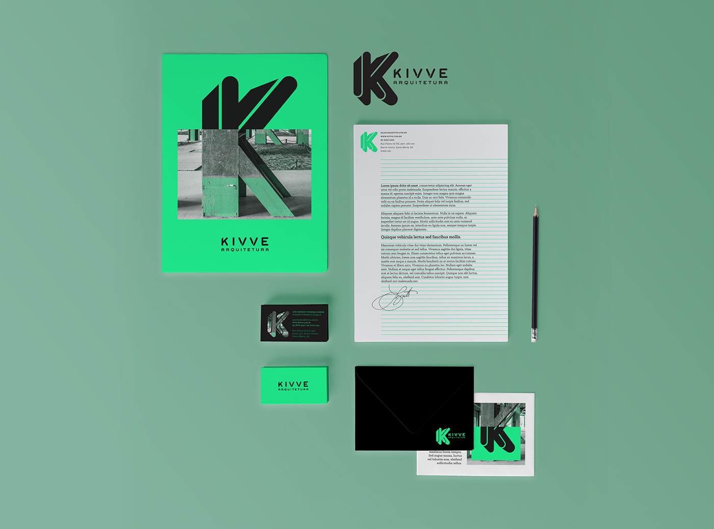
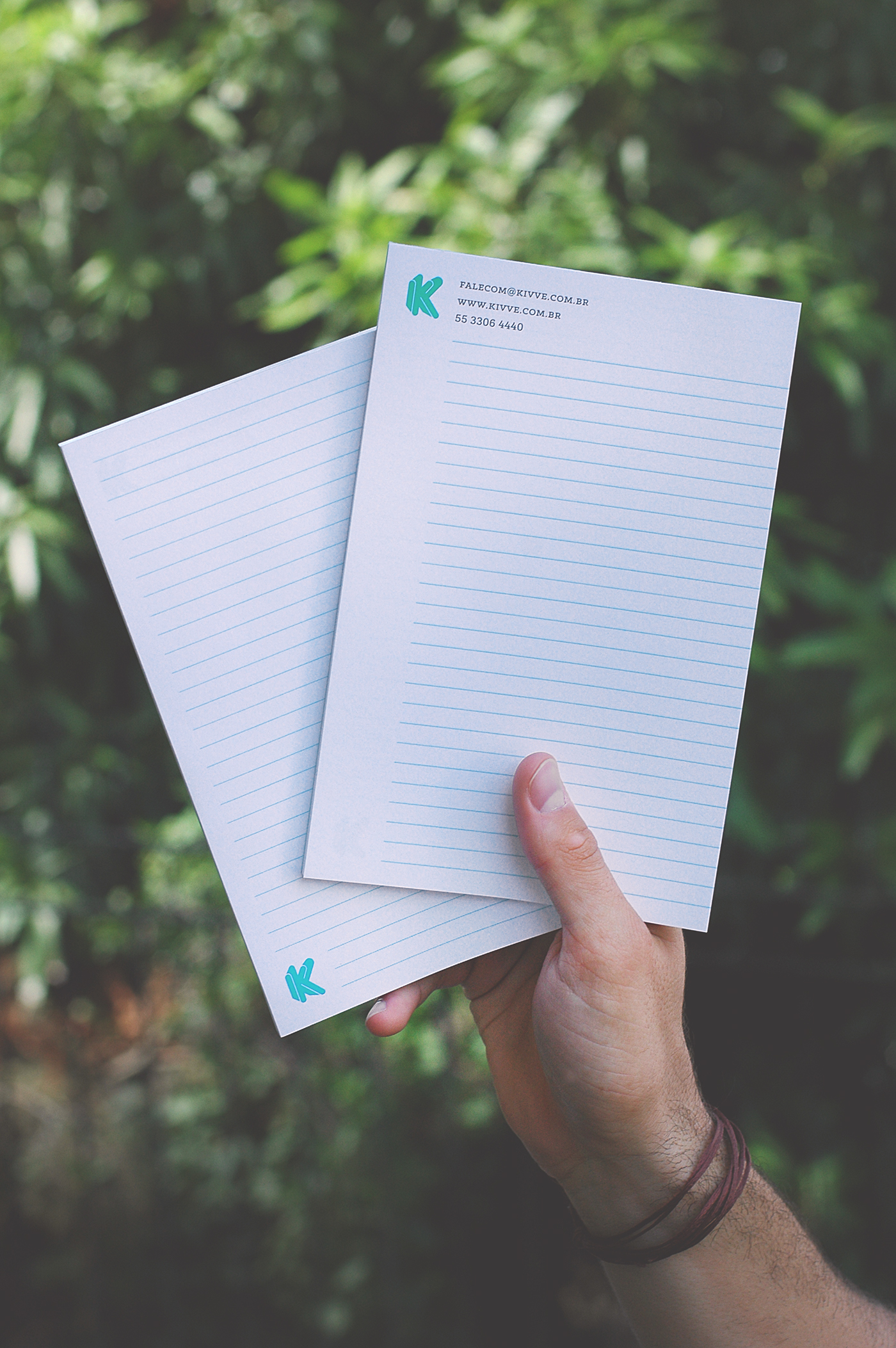
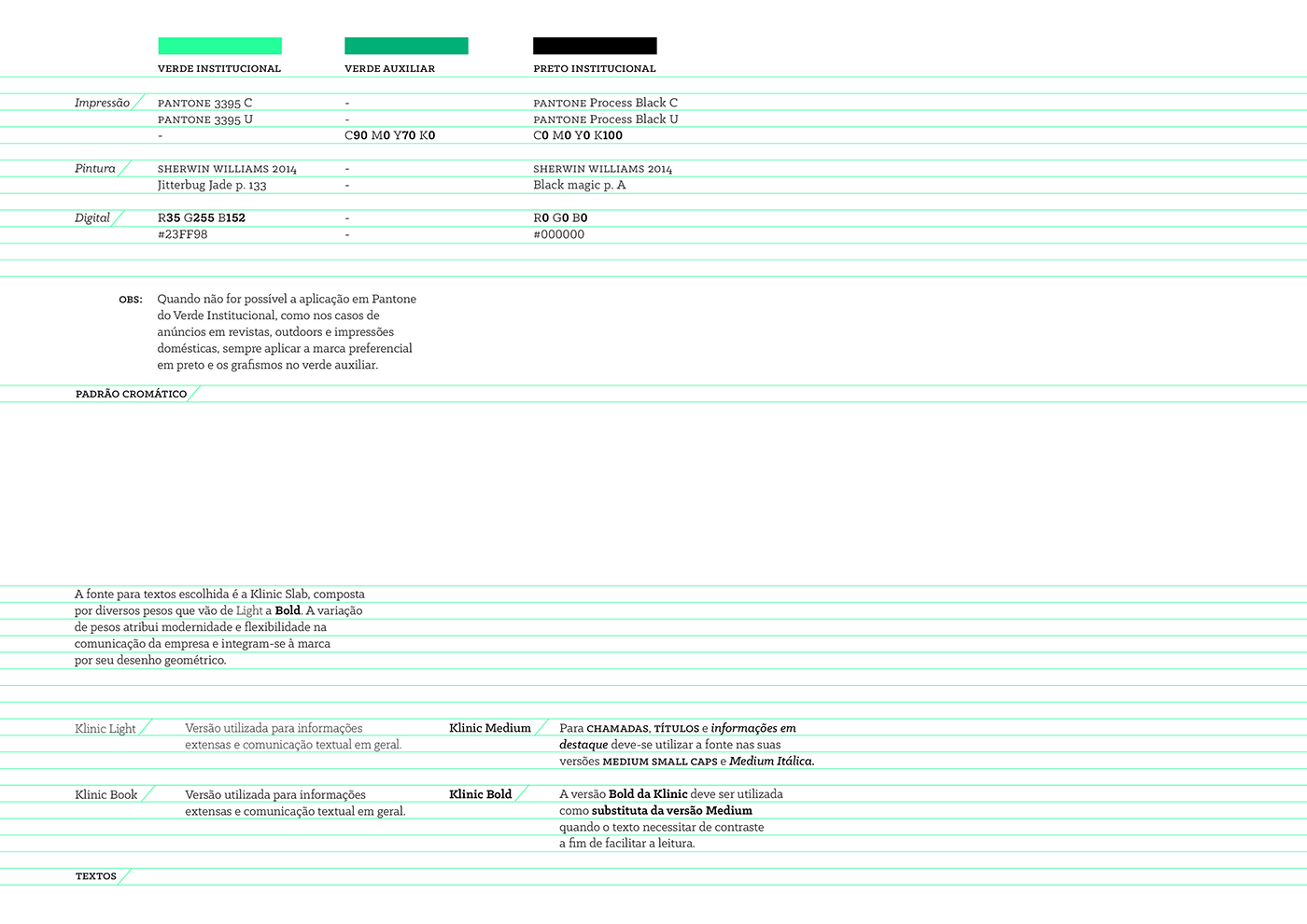
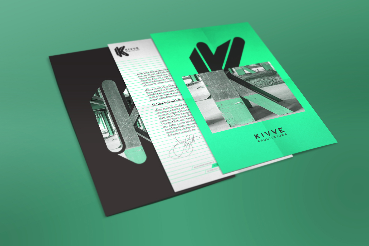
Validating the first step, the visual identity followed the same path. The combination of neutral colors like black and white, with a vibrant Pantone inserted the personality necessary to the project. The visual applications mix images related to the area of operation with the symbol, surprising on the look and referring to the combination between sobriety and personality.
Inserir-se em um mercado repleto de bons concorrentes nem sempre é fácil. É preciso trabalhar bem as etapas de planejamento, análise, conceituação e estudos para desenvolver um projeto de naming e identidade visual que se destaque. O desejo de três arquitetos de empreender nesta área de atuação resultou na Kivve Arquitetura, uma empresa multidisciplinar e idealizadora de projetos cheios de caráter, que oferece soluções simples, elegantes e com muita personalidade.
As etapas de pesquisa e análises para o projeto de naming, constatou na necessidade da empresa de se apresentar ao mercado de forma diferente e inteligente. Por isso, o nome único e sem significado próprio inicial, é alegre, sonoro, criativo e remete à ideia de que os projetos realizados pela empresa são sóbrios por fora e coloridos por dentro, assim como a fruta Kiwi, que serviu de inspiração para o projeto.
Com a primeira etapa validada, a identidade visual seguiu o mesmo caminho. A combinação entre cores neutras, como o preto e o branco, junto de um Pantone vibrante deu a personalidade necessária ao projeto. As aplicações que misturam imagens referentes à área de atuação junto da aplicação do símbolo, surpreendem no olhar e remetem à combinação entre sobriedade e personalidade.


CREATIVE DIRECTOR / Rafael Stecca
ART DIRECTOR / Daniele Vizzotto
DESIGNERS / Bruna Paz, Gabriel Pompeo
Follow us!
http://www.facebook.com/yellowbeandesign/
http://www.yellowbean.com.br


