
WhaTip (iOS Appstore) is a tip advice iOS app developed by Blahblahfire. I created the app’s logo, designed and implemented the interface, and created all visual assets for this app.
We’ve all been in a situation where you aren’t sure if you are supposed to tip or how much is expected. You also needed that information right at that moment. With that in mind, WhaTip needed to be faster than the normal calculator-type tip apps that are already out there.
First, I broke the types of scenarios into four groups and designed around that.
For the calculation screens I wanted the user to quickly know “should I tip in this scenario”, “how should I tip”, and “how much?” So, if there isn’t a tip or the tip is a flat fee, there isn’t an ability to calculate one. In this case, you are clearly shown the rule and if the tip is flat, how much.
For tips that need to be calculated, the rule is built into the interface and the recommended amount, the middle button, is always pre-selected. Then if the user wants to give more or less than the recommended amount, they can at the click of a button. Easy!
If you are interested in seeing my process, check out the pages from my sketchbook HERE.

After several attempts, shown in my sketchbook, I landed on the idea of a coin going into a jar or tip box. The “half coin” logo is the final result of that idea.

The WhaTip app launch screen, with the logo and tagline “Tip Wisely.”
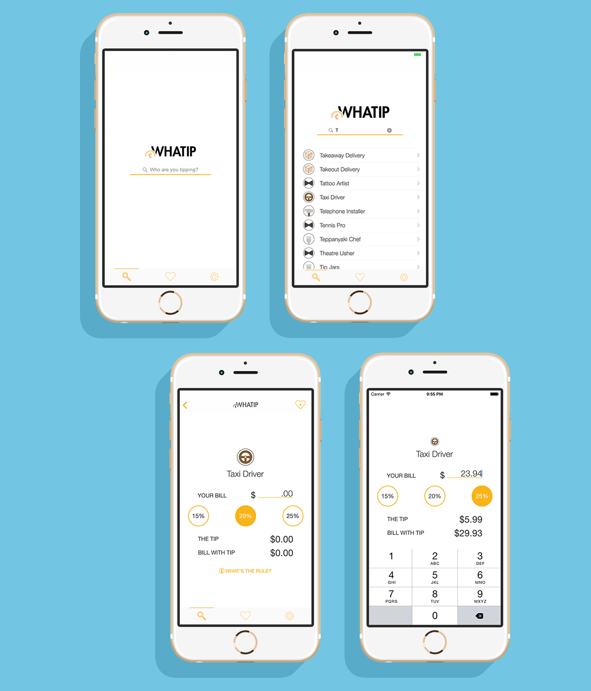
An example of a typical sequence that the user would see during use.
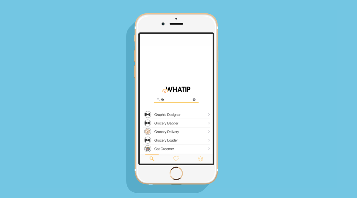
The search bar is the first useable screen that the user will see. The job search database is entirely offline and designed to quickly help the user get the tip advice that they need.

One of the tip type categories; tip based on number of items.
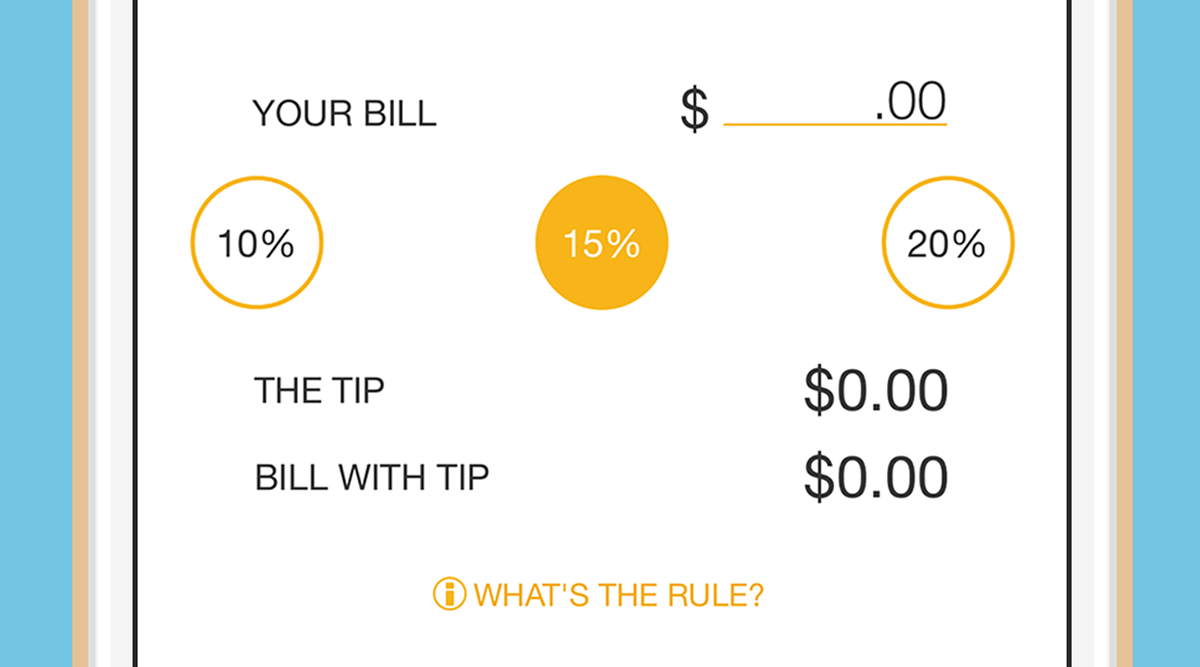
This is a closeup of what the user will typically see. An option to input either the bill amount or number of items, number of boxes for instance, and round buttons with tip amounts. All of the totals below are updated as the user inputs the numbers or clicks on the tip size.

If there is no obligation to tip the user sees a clear “No obligation to tip” and a brief reason why.

Since this app is about speed, there is an option for saving commonly used tips for even faster access.
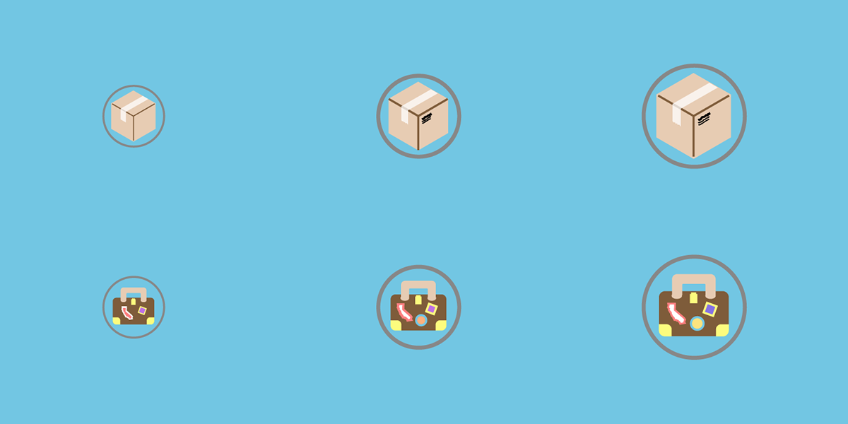
The category icons would be used in different situations and at different scales. Instead of using the same icons and just scaling them up and down, I created separate icons with more or fewer details depending on the size being presented.
I did it so that the smaller items didn’t become visually muddy with details and the larger icons could be larger and have more fidelity.

The entire icon set for the various job categories.
That’s it. Thanks for visiting!
Be sure to check out the app HERE.


