


Client
see.saw
Details them.co.uk
2014
Follow us on Twitter
Connect via Linkedin
Like us on Facebook
see.saw
Details
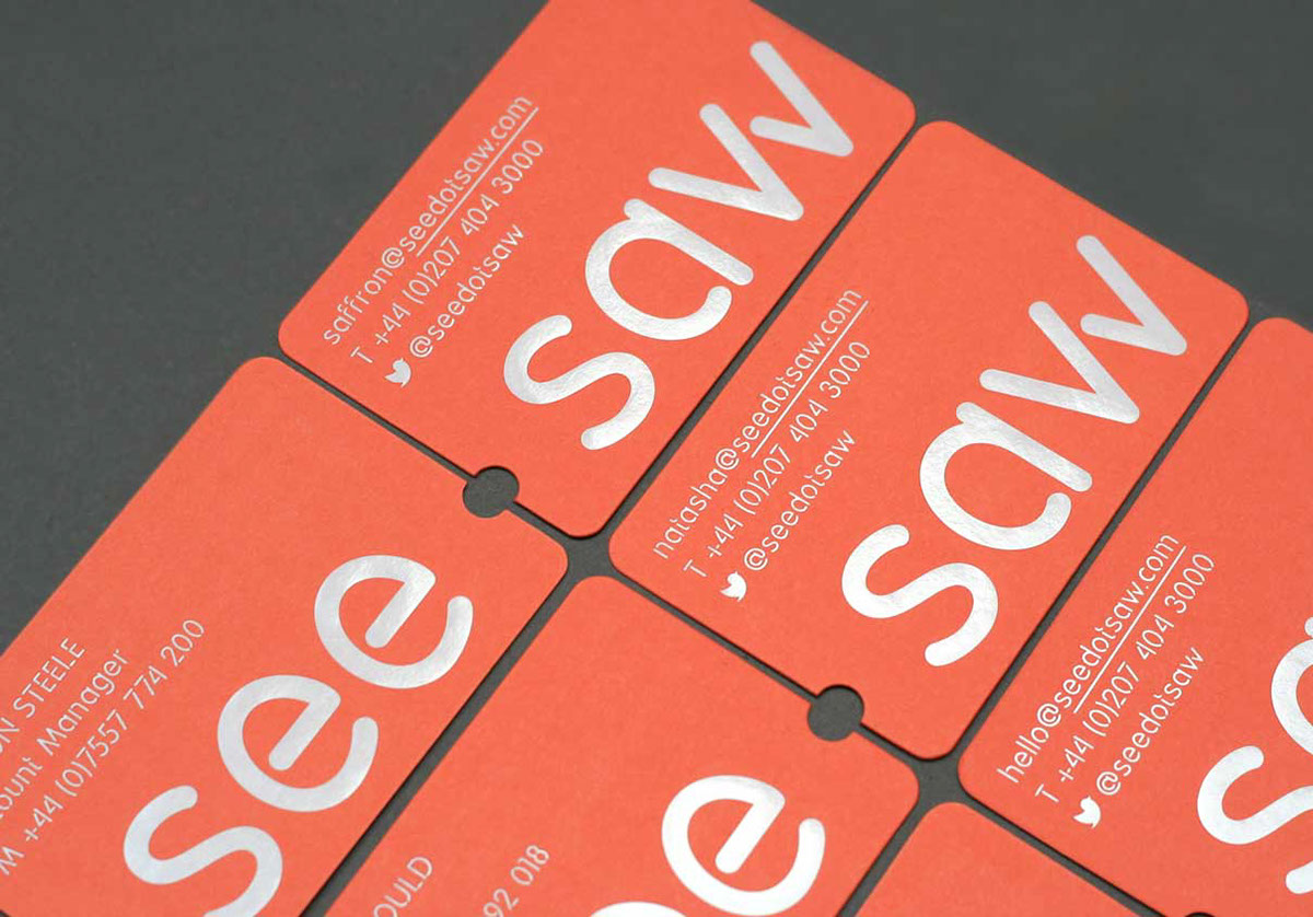
We worked with the dynamic PR agency, see.saw, on a brand identity that encapsulated their balanced yet flexible approach to every new challenge.
Developing a logotype anchored to a central pivot, a playful visual language was derived from this dot in an evolving series of icons used to express see.saw's dynamism and belief in tailoring bespoke solutions.
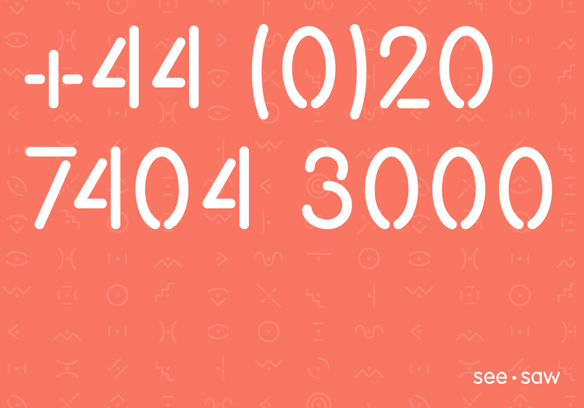
A toolkit of colours, icons and typography was produced so the branding could be easily incorporated into every piece of see.saw collateral – from website and presentations to stationery and branded packing tape.
2014
Follow us on Twitter
Connect via Linkedin
Like us on Facebook


