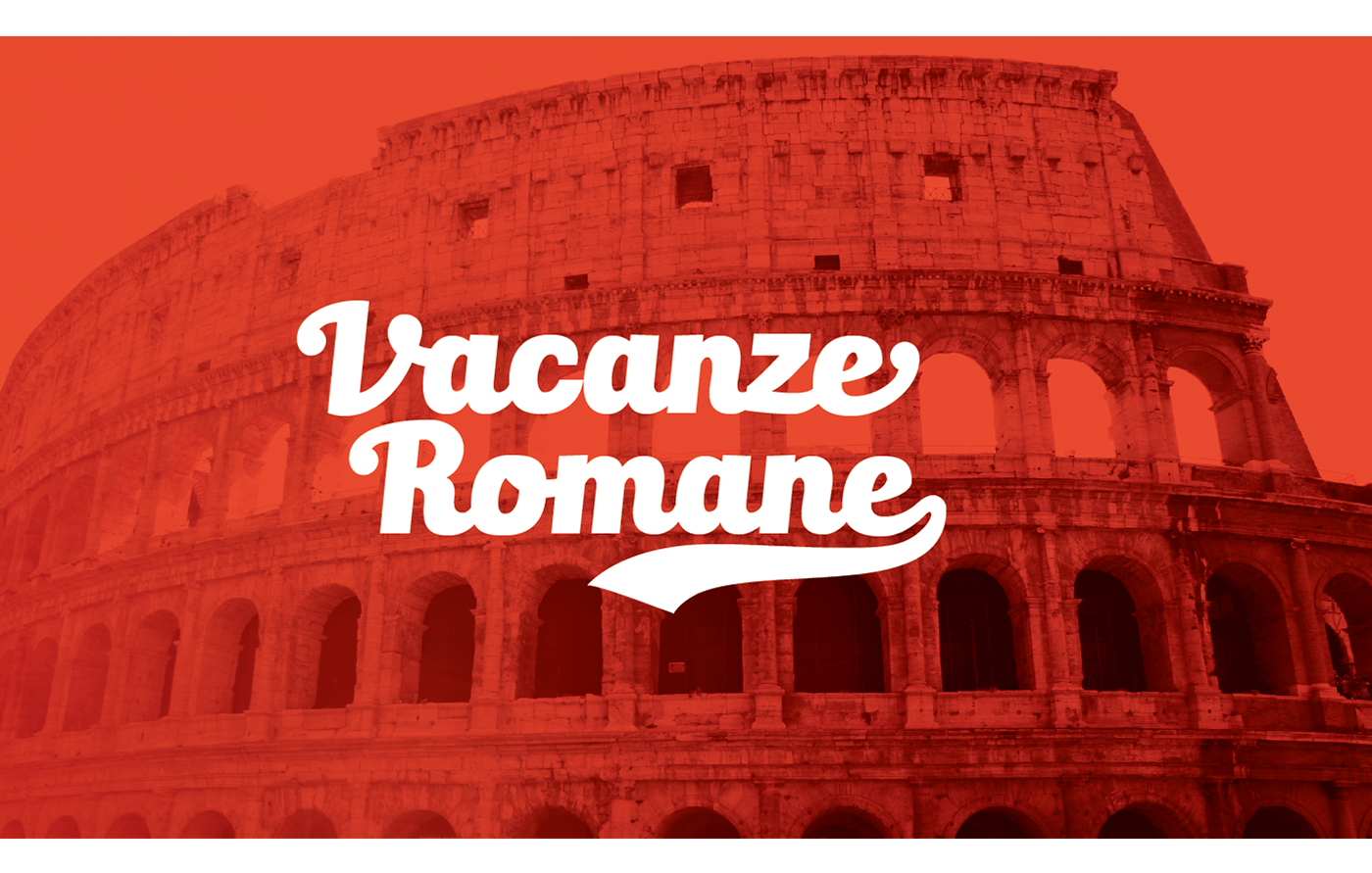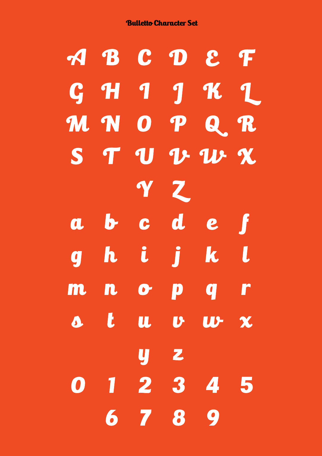
Bulletto was designed to maximize legibility in bold italic characters.
Its shapes take inspiration from Digitalino, the fat typeface
Its shapes take inspiration from Digitalino, the fat typeface
designed by Francesco Canovaro for Digitalic brand identity.
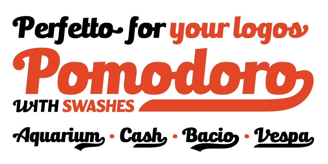
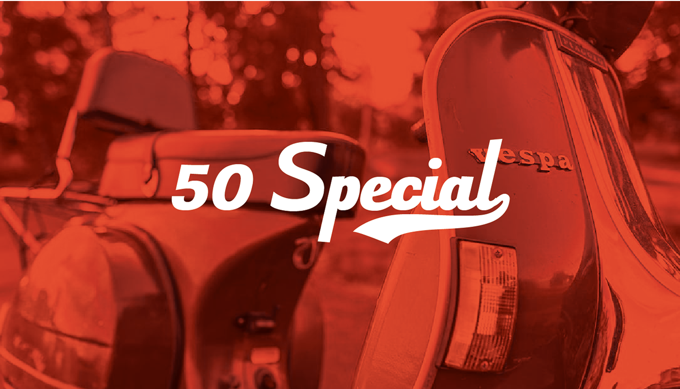
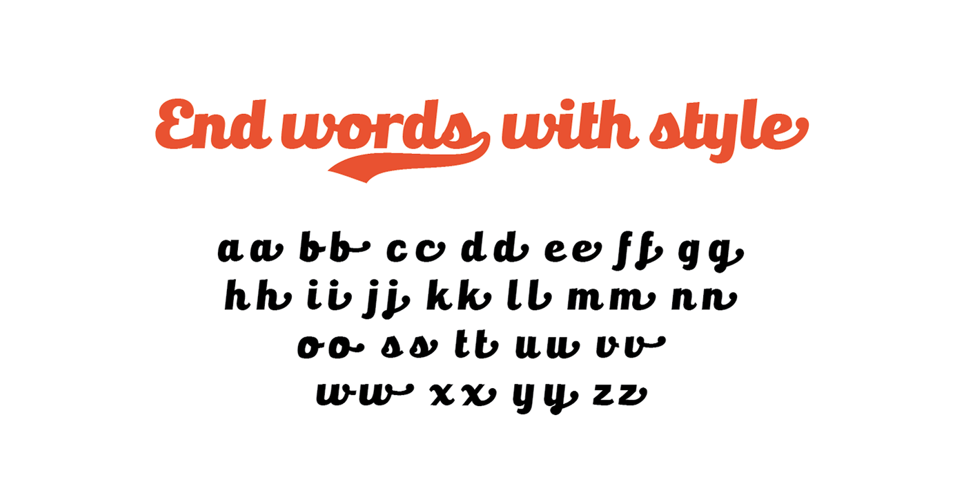
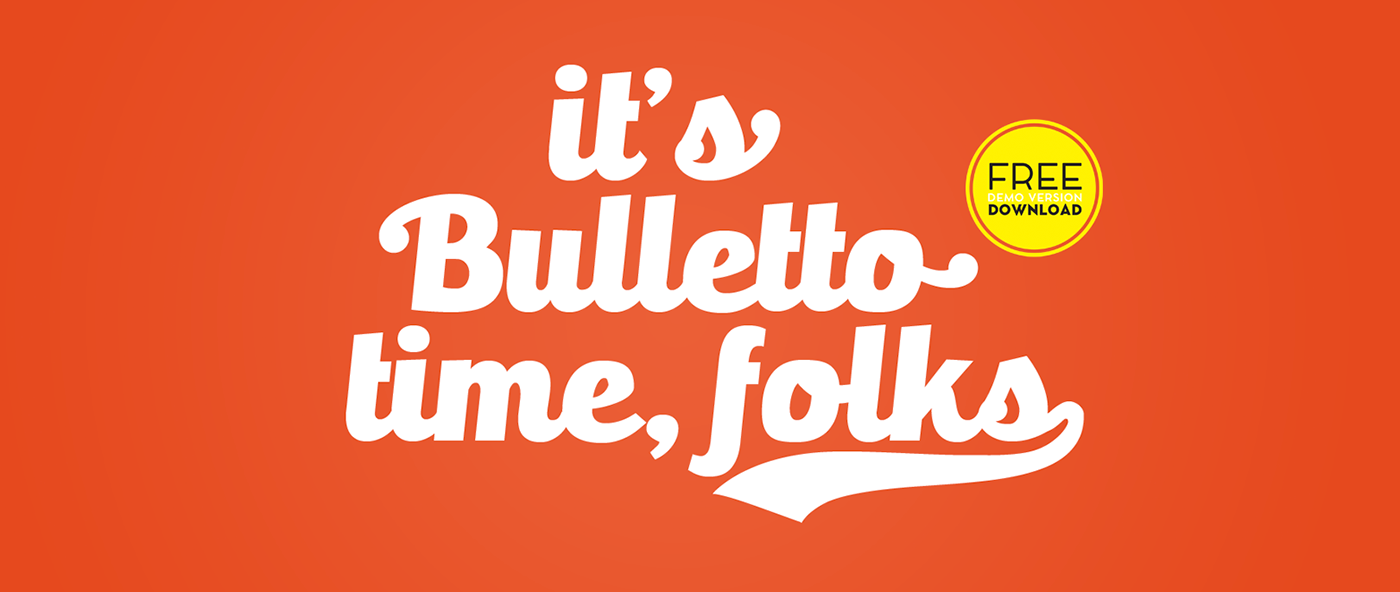
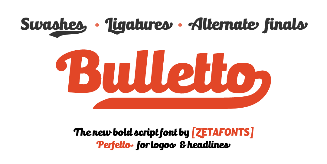
To avoid clashes between letters in all-uppercase words, a secondary set of uppercases was designed. A set of final forms for lowercases and some swash endings where added too.
This effect is obtained by open type substitution and can be disabled by switching off standard ligatures. To obtain the final form, allow opentype final form alternates or simply type two hyphens after the letter. Similarly, type one to four underscores after the last letter to get swash endings.The use of swashes and alternates makes creation of simple logos very easy.
From the original Bulletto design (Bulletto Killa), many different variants were developed. Bulletto Monoline, is a light monoweight version, while Bulletto Alto is a version with taller ascendants and descendants and a slight slant.
Like all Zetafonts typefaces, Bulletto is free for non commercial uses.