


The Brief
Design a brand identity for a not-for-profit and build a cost effective campaign to persuade the general public to take action on gay rights abuses in Russia.
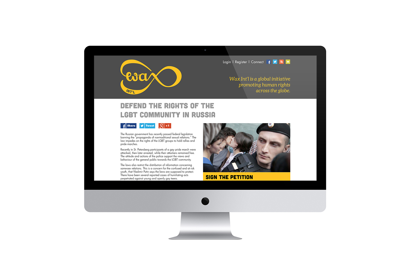
The Brand
Wax Int'l is named after the growth phase of the moon. Carrying this concept into the logo design with hand lettering solution that reflects the cycling of moon phases.
The Plan
To make a large impact with a little budget the plan was to use a common medium in an unexpected way. Filling elevators with large scale posters creates a dramatic impact in an otherwise unassuming space. Elevators in shopping malls and near public transport have the potential to reach a wide audience and facilitate immediate action.
The Poster
Will you turn your back—the call to action plays on the expectation that people turn to face the doors as soon as they've entered the lift. The design and copy take inspiration from newspaper headlines to emphasise the importance of the issue. Flyers handed out by nearby volunteers include a QR code and web link to the current petition.


