

Brief
Asked to envisage a company competing the same market sector as Contiki and Topdeck—Embark Tours is a theoretical company devised in response to that brief. Embark Tours is an exuberant company that values local connections and outdoor adventures.
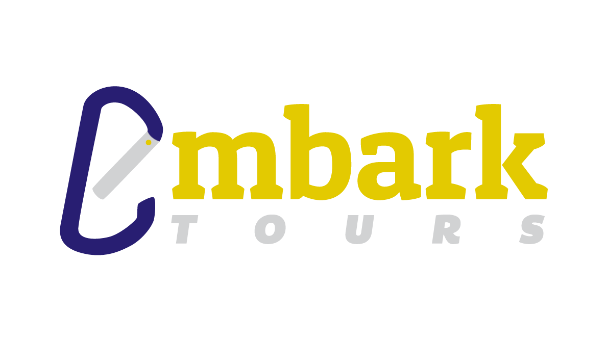
Logo Design
The carabiner is a prominent design feature of the logo and has a sense of forward momentum. It visually represents the outdoors and adventure sports. Having the carabiner open, not only allows it to be read as the ‘e’ but it also evokes the sense of a being equipped and ready to start an adventure.

Campaign Launch
The campaign centres around a set of tongue-in-cheek print ads. It positions the company as one focused on experiences rather than consumption. Taking the humble souvenir shirt and using it to highlight some of the adventures one might have on an Embark Tour—
it shows that the stories you collect on a trip the ultimate goal.
it shows that the stories you collect on a trip the ultimate goal.


Alternate Logo
Using the carabiner as an abstract feature creates emphasis on the logo mark—giving it the potential to grow into a prominent symbol for the company. The fact that embark is read the same with or without the ‘e’ makes this design alteration possible.


