
The One Academy
Rebranding
The team: Stephanie Yeoh Pei Yee & Tan Ker Seng.
A guide towards success in the art & design industry.
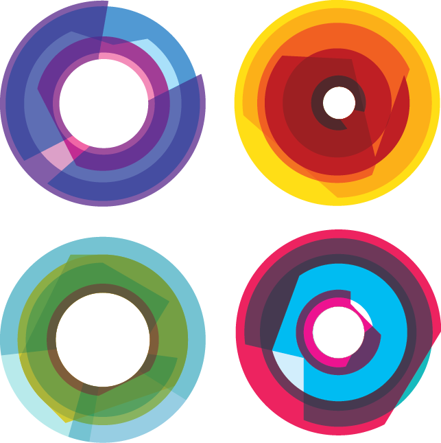
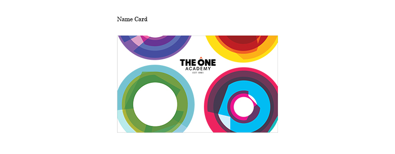
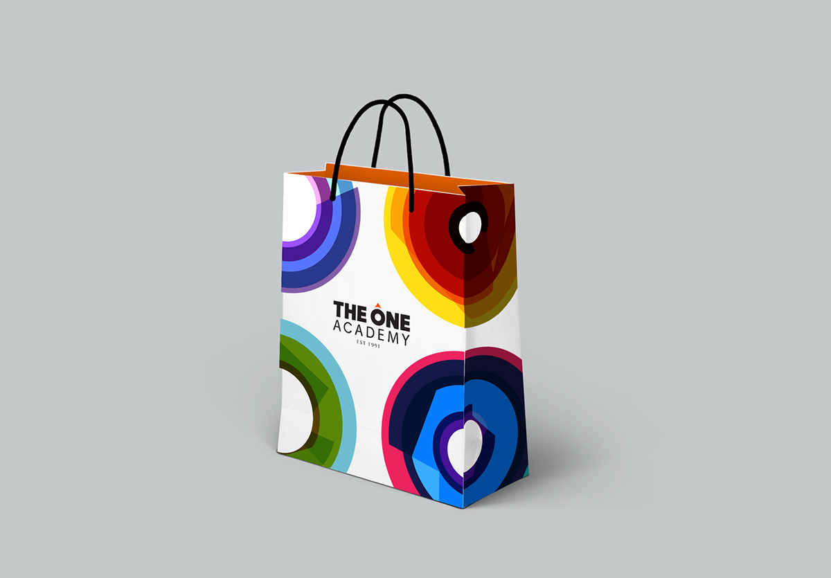
The compass is an existing concept used by The One Academy. To fully apply this concept consistently, the identity is redesigned to incorporate this idea.
The One Academy wishes to keep their existing directions and concepts, but to ‘face lift’ their already
25-year-old identity. We applied the compass concept throughout the identity, at the same time making sure the identity is strong and creative.
25-year-old identity. We applied the compass concept throughout the identity, at the same time making sure the identity is strong and creative.


The logo is bold and strong, but does not deliver the brand’s main message.
The new logo features a simplified compass, delivering the brands message to provide guidance
towards success.
towards success.

This is a tech-inspired and futuristic take on applying the campass concept. The identity is made to look fun, creative and strong – which is how The One Acamdemy want to be perceived as.


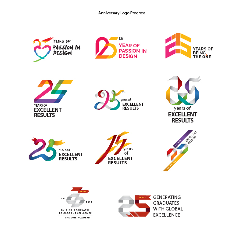

The 25th Anniversary logo is inspired by origami folding, symbolizing art, design & creativity.
The colourful and ribbon-like look also makes the logo feel celebrative and happening.
The colourful and ribbon-like look also makes the logo feel celebrative and happening.


