


ROCK ON! POSTER
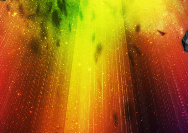
This poster began with the word "Rock On!". I wanted to create typography which looked like the typography used for rock/metal bands. After that I put it in a space scene and created a powerful explosion.
This poster began with the word "Rock On!". I wanted to create typography which looked like the typography used for rock/metal bands. After that I put it in a space scene and created a powerful explosion.

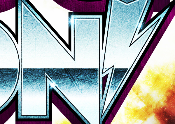
For the text I've used Century Gothic as the base which was then modified. I gave the letters a bit more body and added some "rock-like" features including the sharp points on the "R" and the "N". Also I created a custom exclamation mark in the shape of a lightning bolt.
The poster is made on A1 format at 300 dpi.
The poster is made on A1 format at 300 dpi.
CLOSE UPS


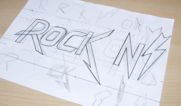
ORIGINAL IDEA'S / SKETCHES

PROCESS VIDEO
INSPIRATION
Inspiration for creating this poster came from many different artists, however there's one artist that started my interest in 80s typography. This is James White, also known as Signalnoise.
I also took inspiration for the lightning bolt from the cover of the album "Ride the Lightning" by Metallica.
With this artwork I've inspired Leandro Coelho to create an artwork of his own called Go Rock.
I also took inspiration for the lightning bolt from the cover of the album "Ride the Lightning" by Metallica.
With this artwork I've inspired Leandro Coelho to create an artwork of his own called Go Rock.


