For the Design Process course I was tasked to develop a logo that will represent me as an artist and designer. Because I am leaning more towards animation for my professional career, my goal was to portray myself through this logo in a way that would have animation involved in some way.
As I started to think of ideas for a logo in which I could somehow portray the illusion of motion, I remembered I had once heard of futurism. I vaguely remembered that it deals with static movement of shapes or bodies in a two-dimensional surface. I decided to further my knowledge on futurism, which led me to discover that cubism had greatly contributed to the formation of this Italian artistic style.
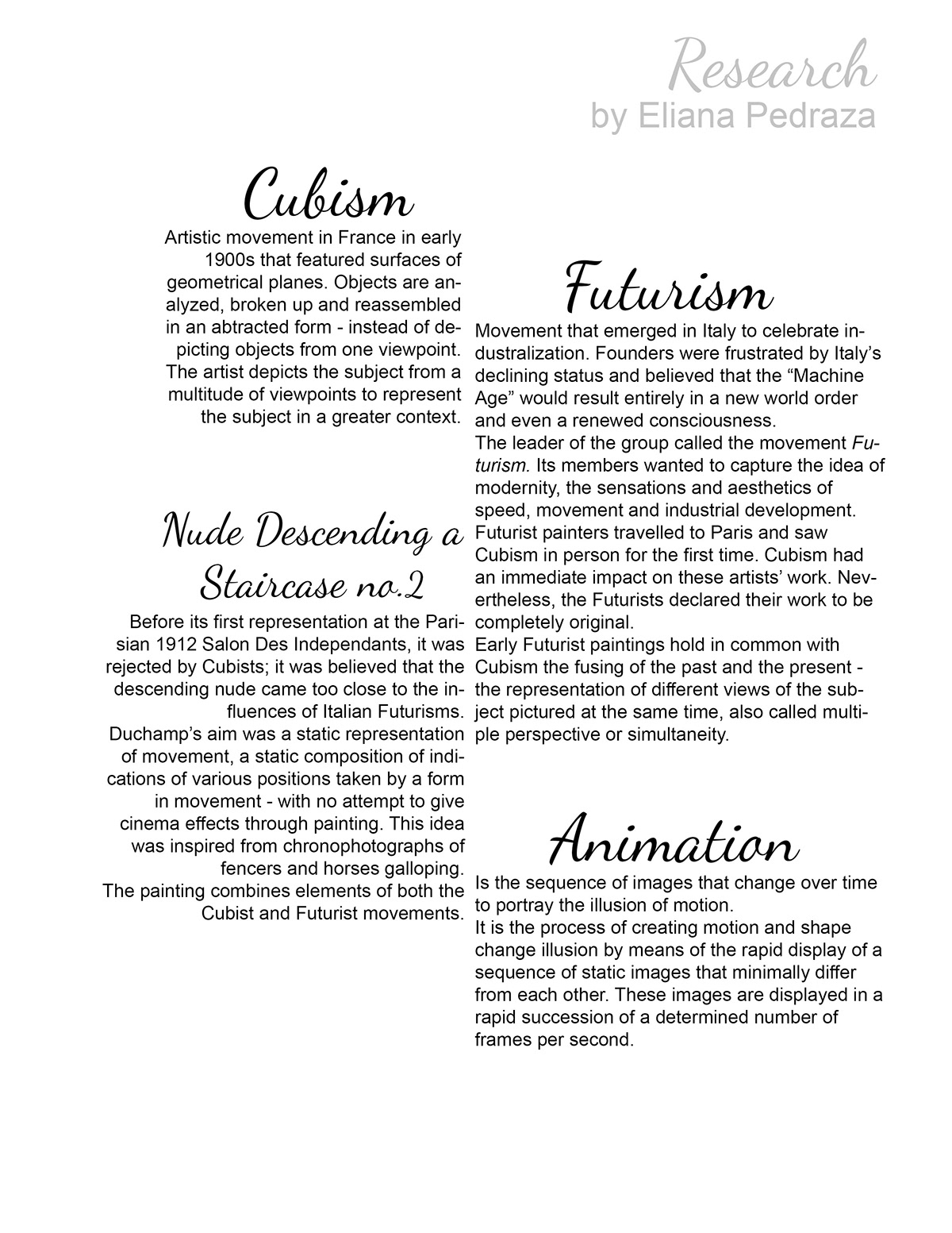
I came across several artworks that depicted cubism and futurism throughout this research. There was one that I found particularly interesting, "Nude Descending a Staircase". I learned that this piece was made using both styles.

1. Cubism - Pablo Picasso, "Girl with a Mandolin" (1910). Oil on canvas. 1.00 m x 74 cm.
2. Futurism - Umberto Boccioni, "Materia" (1912), Oil on canvas. 226 x 150 cm.
3. Cubism & Futurism / Cubo-Futurism - Marcel Duchamp, "Nude Descending a Starcase No.2" (1912).
Oil on canvas. 1.47 m x 90 cm
1. Developing the logo itself
To start off this decision-making process, I decided to doodle some ideas down in thumbnails. I tried out having my first name and last name all spelled out, and using only my initials as well. As I was trying different ideas, I noticed that I unconsciously kept going back to a cursive type of font. I had picked a font style without realizing it. When I went on to make it digitally, I chose the Good Vibes font.
Additionally, I tried making the letters in a cartoon-ish kind of way as an attempt to embody animation, but I didn't actually like it. I decided it would be a good idea to somehow incorporate the research I had done into my logo, so I came up with the idea of creating a transformation from an E to a P, all in one two-dimensional frame. Considering I can't do cursive writing neatly and effectively, I decided to work digitally from this point on.
I used Adobe Photoshop CS6 for these digital thumbnails. By utilizing the timeline, tween tool, and placing my initials on different layers, I was able to create a smooth transformation from one object to the other.

Drawn and digital thumbnails of how the idea developed.
Because it is a logo, I didn't want it to have too much of a complex design, but not too simple either. I decided to have 4 photograms. These photograms were divided into 4 pieces. In my opinion, divisions into 2 and 3 pieces couldn't quite portray the illusion of movement, and would be rather simple. However, 4 could easily give the effect of motion, and because it is an even number, simultaneously make it somewhat symmetrical.

Phtograms, each one divided into 4 equal pieces.
I truly like how the final product turned out. It almost looks as if one were looking at these neat letters through glass, effectively giving the sense of movement.

2. Business Card

3. Envelope

Rough ideas for the envelope.

Final product.
4. Letterhead

Thumbnails for letterhead.

Final product.
I decided on this type of design for my business card, envelope and letterhead to mantain to aesthetic design of the logo and build a harmonious pattern.
